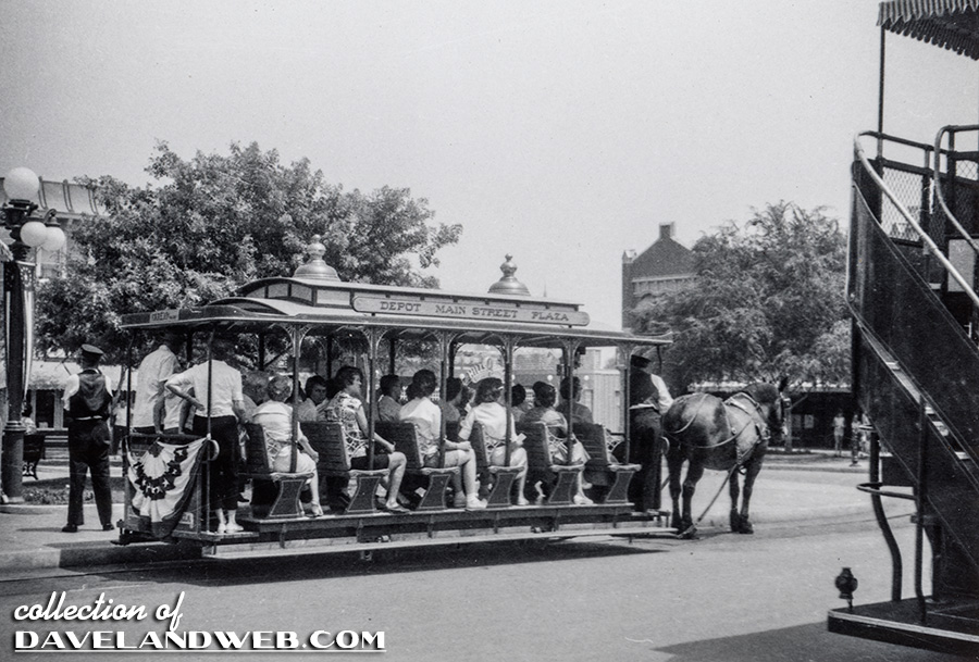
Just two more shots to finish out this short black-and-white series. For our journey to the castle, choose between the Horse-Drawn Streetcar on your left, or the Omnibus on the right. Typically, I usually choose the upper level of the Omnibus. Makes for some great pictures, and for some reason, just seems really cool to be so high up driving down Main Street U.S.A.
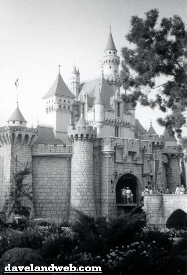
The castle has remained virtually the same over the years, other than a few color scheme changes and bling-bling ornamentations. Here are a few of my favorite shots through the years, starting off with 1956:
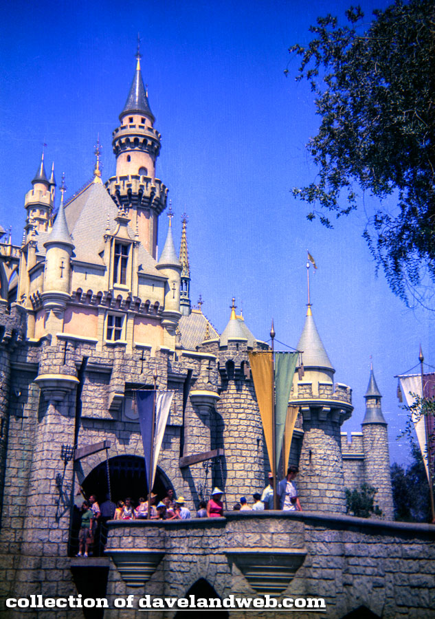
Spring 1960:
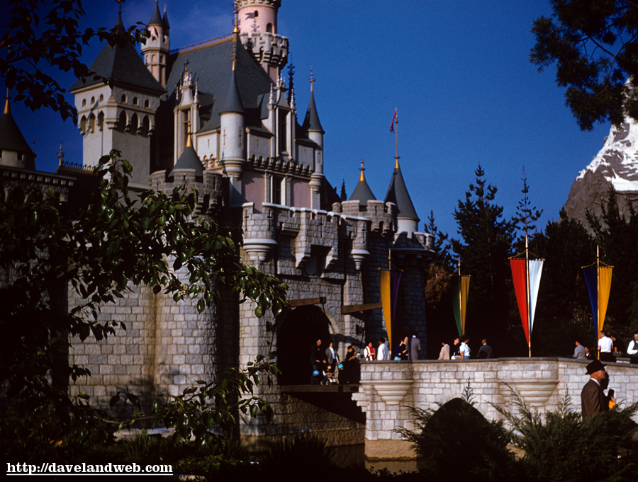
June 26, 1966 (note the addition of the Disney family crest above the drawbridge):
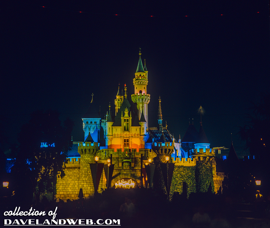
October 1970:
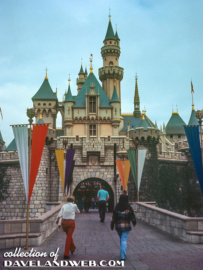
And today:
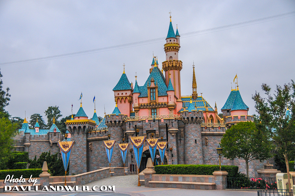
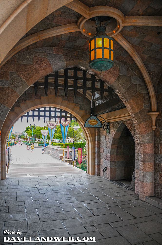
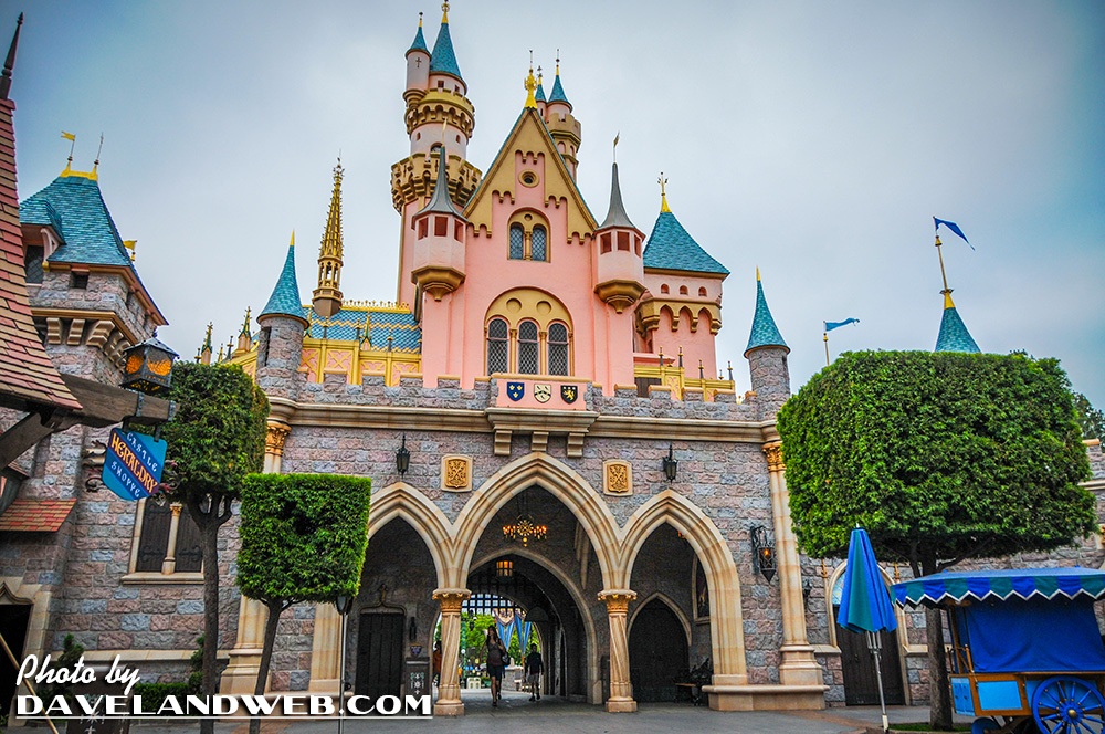
Taking these shots without any people in them was not easy—try doing that during the summer! See more Disneyland Sleeping Beauty Castle photos at my website.

4 comments:
Nice post Dave! I like the top deck of the Omnibus and how the high viewpoint drastically alters the "forced perspective" look of Main Street.
The 1970 vs. Today shots of the castle are interesting; if they could just mute the pink on a few levels & tone down the turquoise roof, it would look exactly the same. Do it for the 55th!!!!
I think that my favorite picture for today is the one that you took inside the Castle's archway - a view that I don't think I've seen in any photo.
As for today's color scheme, Vintage Disneyland Tickets has it right on the money. That salmon pink especially needs to go!
Ditto on the Castle color: the pinks and blues need to be toned-down.
You know I'm so glad the inside of the castle was graced by a beautiful and fully worthy restoration and enhancement of the attraction. However I have to completely agree, boy does that castle need some dignity in the outside colors department. Pink looked great on a 1955 mid-century modern home, but this salmon, pink, turquoise gold bling thing for this castle is ah, not so right. It looks like they fixed something that wasn't baroque!
Those are nice choices Dave. The 66 looks majestic, 70 looks lonesome somehow, 56 has a warm glow *fuzzy* and the 60 has a wonderful depth.
Post a Comment