Sometimes when I acquire slides, they come in batches that are labeled and date stamped. Other times, they come in random groups, no dates, no labels, and I need to use my powers of deduction to figure out if they go together or not and from what era they hail from. Whew...it makes me tired just thinking about it. Here is a group of random 1950’s color images that I have attempted to assemble into a journey around the park. Disclaimer: It is highly likely that I may have already posted a few of these previously, but just act like they’re new and attempt to enjoy them a second time. Surely there might be a detail that you missed the first time around!
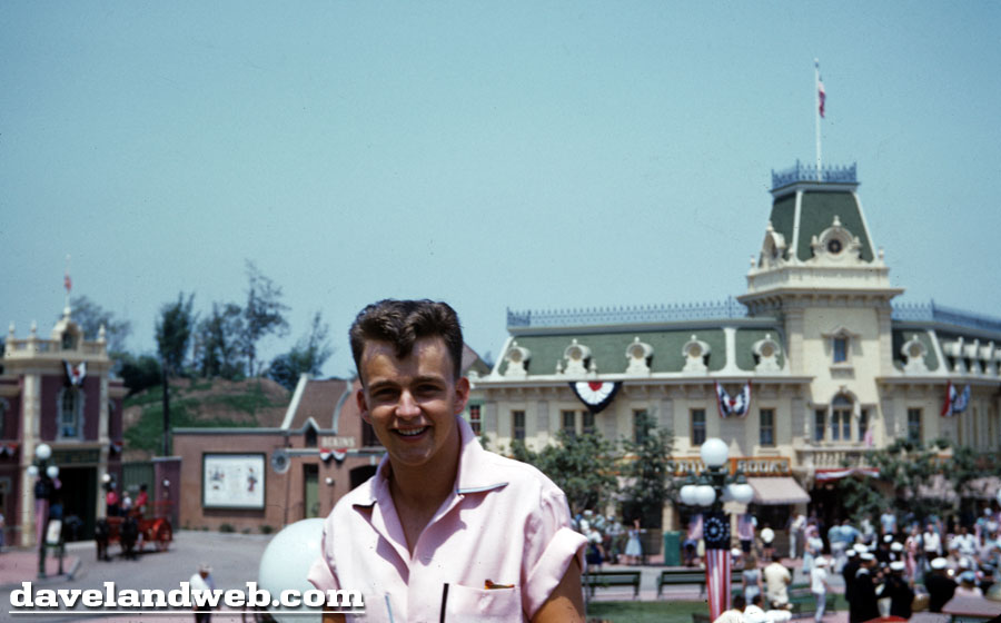
This particular guest has obviously been influenced by the teen idols of the day; check out that hairdo! The patriotic bunting in the background alerts us that it must be summer! From the sparse landscaping, I’d also hazard a guess that it might be 1955.
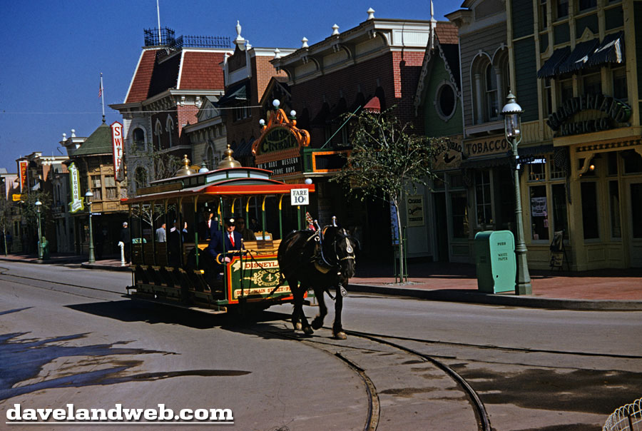
Traveling down the street in the Horse-Drawn streetcar, we can get a smoke at the Tobacco shop or watch William S. Hart at the Main Street Cinema.
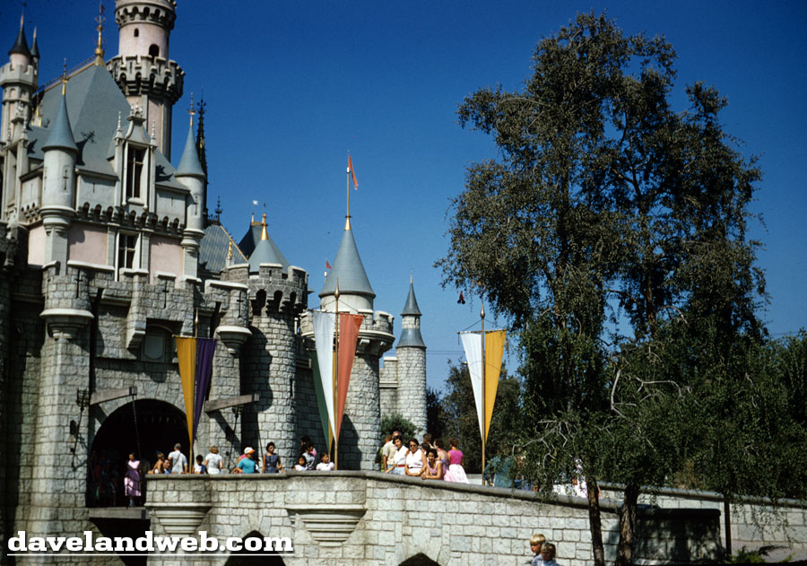
Anyone care for a frozen treat at the castle?
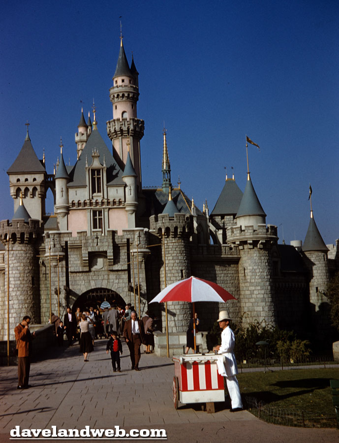
I’ve said it before and I’ll say it again: I truly prefer the original subdued color scheme of the Castle.
More random 1950’s images to come...
Follow my updates on Twitter. To see more Disneyland vintage and current photos, visit my regular website.
5 comments:
Oh man - those Castle shots are incredible, the original colors need to make a triumphant return. Epic blue sky....
Pic#1 - There's that poster again, the one to the left of Bekins :-)! That hairdo seems a much even for then - is that a pink shirt he's wearing?
These are GREAT!!! Loved seeing all of those sailors in the first photo. Yes, the castle is BEAUTIFUL - let's start a campaign to tell Disney we want the castle returned to it's original color scheme.
Terrific castle shots. And yes what a BLUE sky!
Dave, I thought that was you for a moment in the first picture. (Meant as a compliment).
I'll look at any of these pictures any day.
I agree that I prefer the subdued colors of the castle, but I can see the appeal of the brighter look too. I doubt that the current look will last. The key to continued sales is constant subtle changes to make last year's perfectly good (insert consumer good here) seem dated and in need of replacement.
We will get our quiet colors back, but probably only with the loss of something else.
JG
AT LAST! Someone who like the old castle color scheme like I do. Who's idea was it to progressivley make it more pink more blue and more purple? Personally it looks like pretty girl with WAY to much makeup.
Post a Comment