
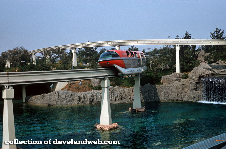
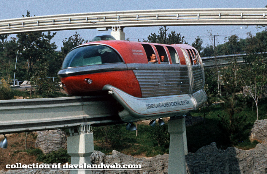
Although I still love riding the Monorail, there is something about the original sleek design that the current one can't hold a candle to. Here's how it looked only a few months out of the gate, circa October 1959. I really miss the cool bubble up top. Anybody out there know why they got rid of it?
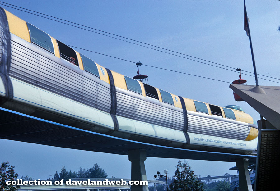
Best known for its red color, the yellow is pretty impressive, too, as seen in this October 1962 image:
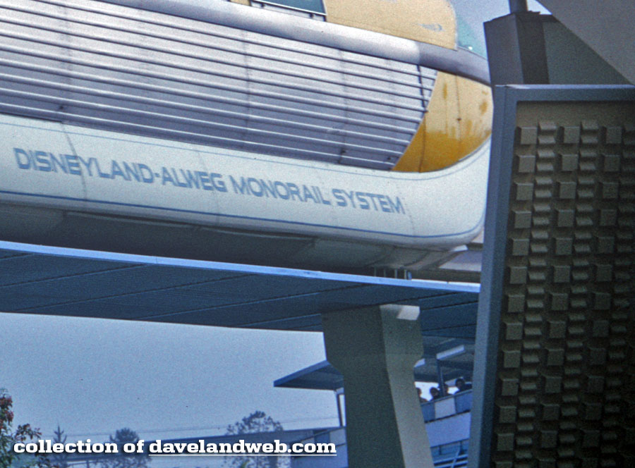
Zooming in to see the Monorail name and tire tread design from the Yacht Bar below:
See more Daveland Disneyland Monorail photos at my main website.
1 comment:
Interesting view of the Yacht Bar tread design. There always seems to be something new to discover about Disneyland's past.
The Mark III was my favorite. It had great windows and still kept the cool look of the Mark I and II. Mark I and II were great too in a Buck Rogers sort of way. Mark V wasn't bad (it had a great interior) even though it was more imitative of the Walt Disney World Mark IV's.
I don't care for the new Mark VIIs at all. They just look and feel too plastic and cheap. The interior almost reminds me of a public transit bus. I feel the same way about the new bobsleds. Unappealing design and uncomfortably hard seating!
You can never go wrong with a monorail post. I love these. Thanks, Dave.
Post a Comment