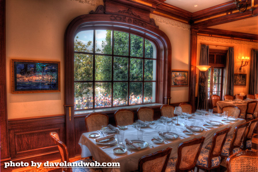
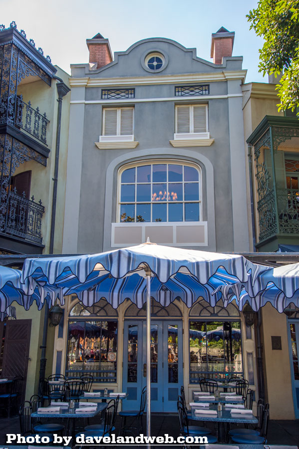
Time for dinner at Club 33! I finally got to see the OTHER side of this unfortunate window that has caused a little bit of a furor in the fan community. If you can't see the reason for the commotion, then maybe you shouldn't read the rest of this post.
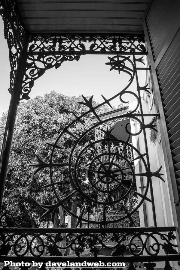
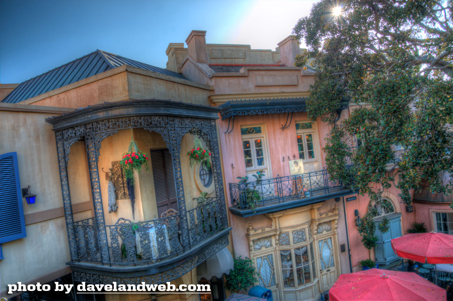
While we're outside, here are a few views from the balconies:
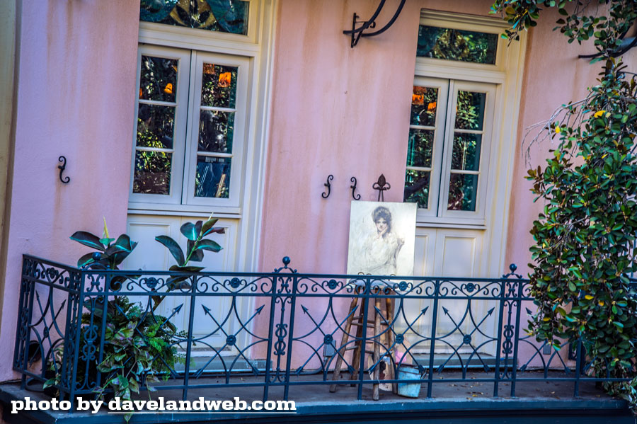
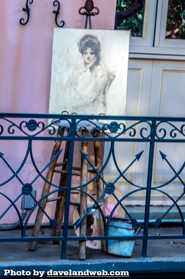
Had to zoom in for a closer look at this beautiful portrait, reminiscent of the Gibson Girl era.
And now back to the dining room. It seemed somewhat familiar, but the remodel has not done it any favors. Like so much of the Park, it now seemed more congested and crowded with tables.
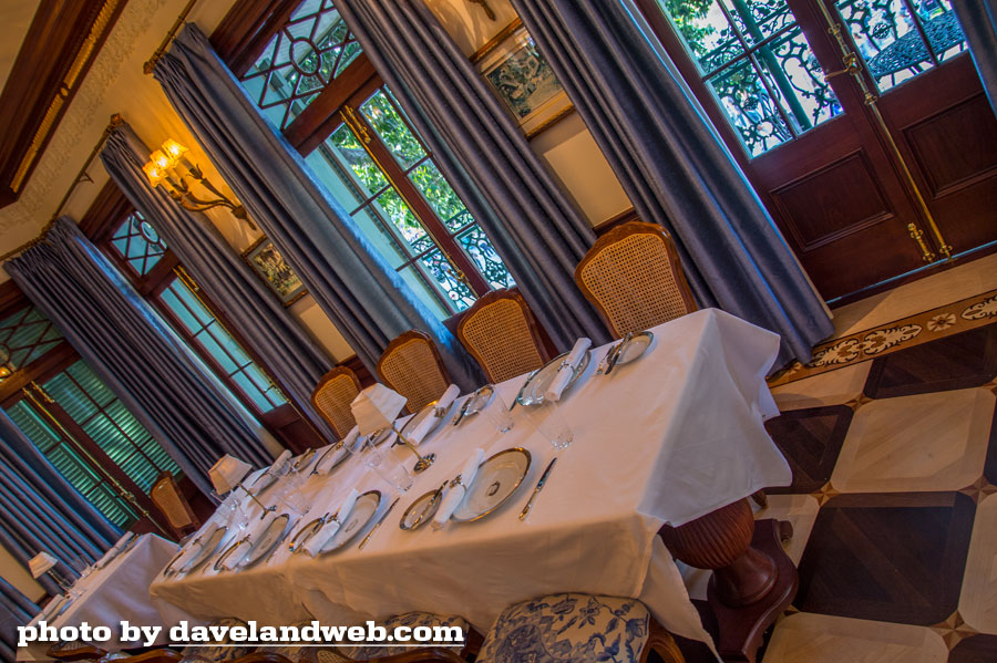
Surprisingly, the window treatments were less ornate. In fact, most of the dining room seemed less formal. Wicker seats strewn throughout, a lighter color palette, and the profusion of cheap looking ornamental trim on the walls (which was very poorly installed).
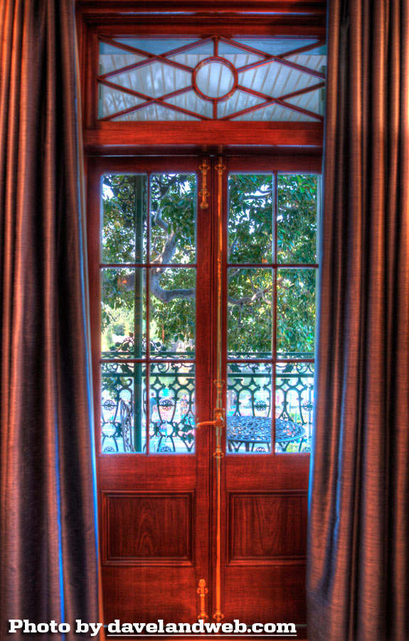
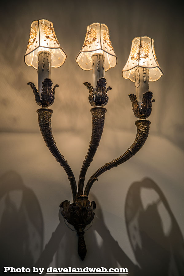
Most of the light fixtures remained.
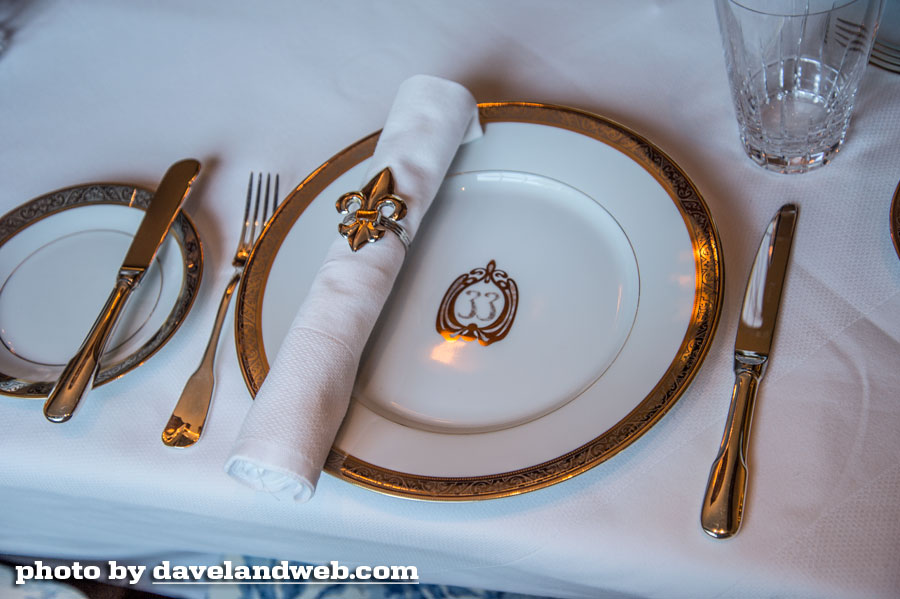
The china now has the Club's melting door knocker logo on it.
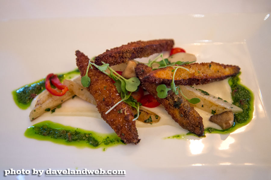
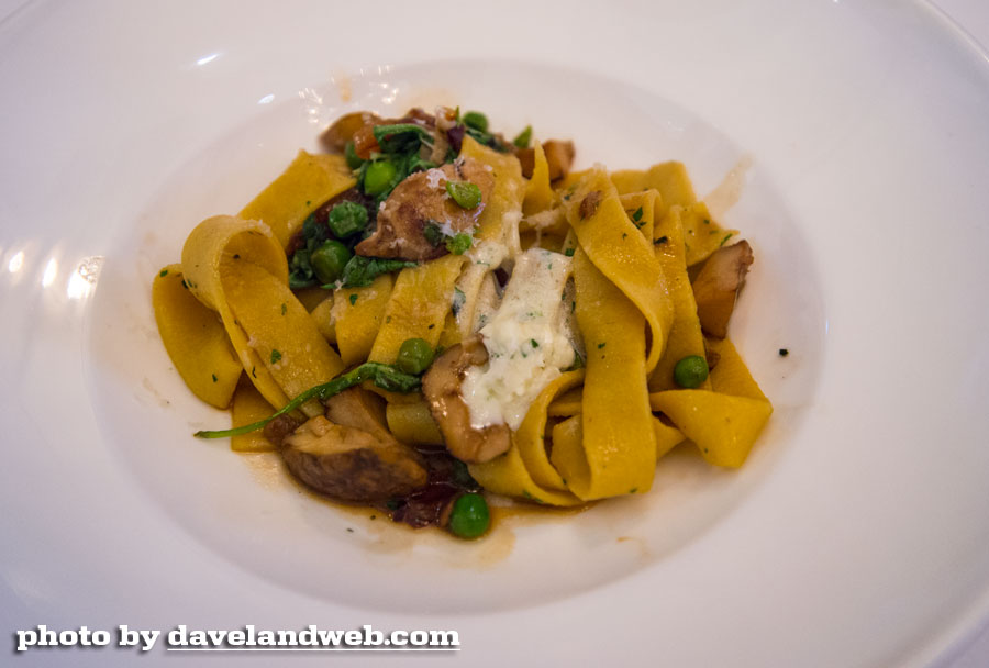
On a positive note, the food was delicious, which is not a surprise since Andrew Sutton is involved. Here is a shot of our amuse-bouche:

The downside is that you could go over to Napa Rose and enjoy a very similar meal but in a much warmer more inviting atmosphere.
I would also add that the service is much better at Napa Rose. The staff at Club 33 seems as if they just finished a crash course in how to serve dinner in a classy joint, and are having a very difficult time remembering. Some also seem afraid that they might be beaten if they screw up.
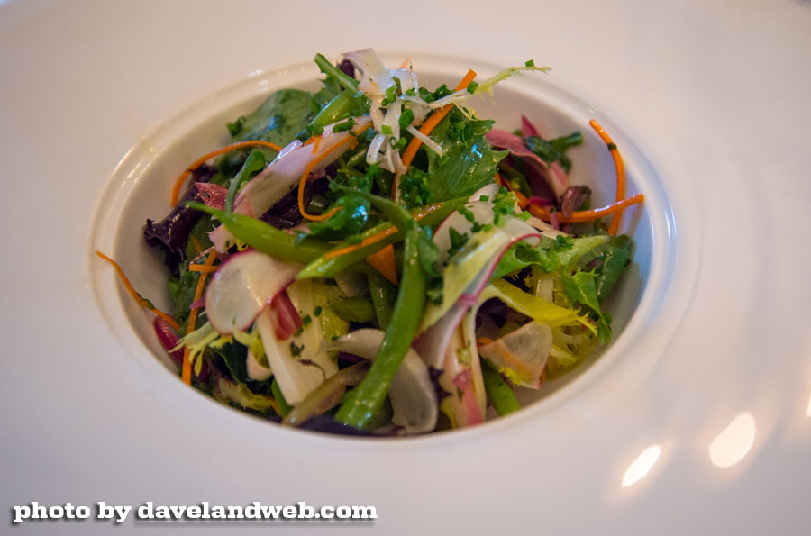
Guests have the choice of choosing a 4- or 5-course meal.
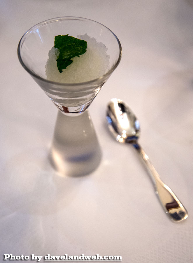
The palette refresher was a nice little touch.
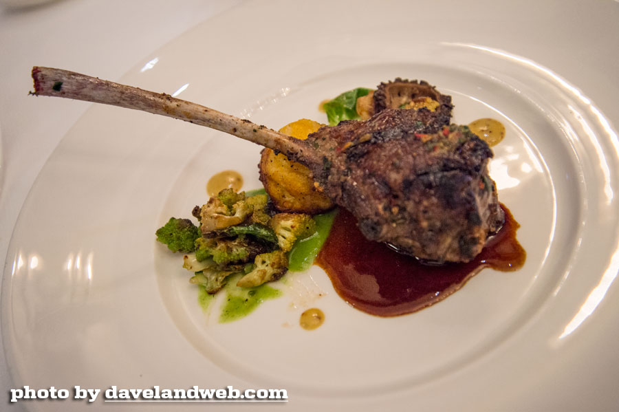
When it came time for the entree to be served, some of our table was out on the balcony enjoying the view. The wait staff arrived with the silver trays and were having a somewhat frightened discussion about whether they should serve the entrees or not. Eventually they decided to throw caution to the wind, remove the silver lids, and hope that the missing patrons wouldn't mind missing the show. And yes…that's one lamb chop. With a multi-course meal, I can understand small portions, but one lamb chop for an entrée seems laughable, especially considering the prices being charged here.
The dessert was delicious and as is typical at most high-end restaurants these days, the emphasis is on the presentation.

Despite the negatives, the views from the balcony at night are still spectacular.
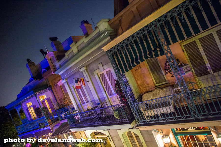
Even the mangled Court of Angels regains SOME of its luster at night.
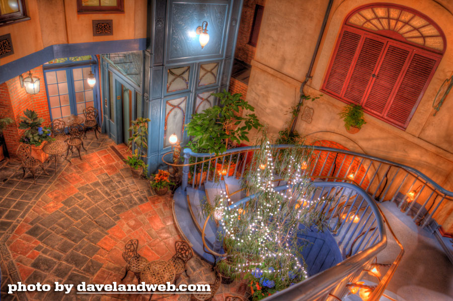
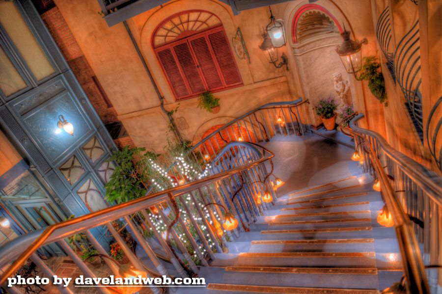
As I was leaving, I looked back up at the Club. My tinge of regret was knowing that I really didn't care one way or the other if I returned again.
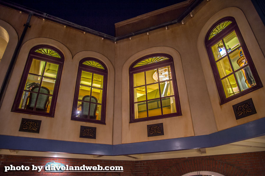
I came, I saw, I photographed.
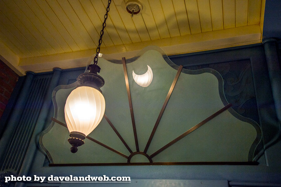
Sadly, unlike my visits to the previous incarnation, I did not feel as if I had experienced the exclusive magic and rich history of what Club 33 originally stood for. Now, it just seems like any other formatted high-end Disney restaurant that you could find in Orlando…only not quite as good.
See more vintage & current Club 33 photos at my main website.

3 comments:
Wow, I winced when I saw the off-center window last year and consoled myself that there must have been an important reason on the interior to have overlooked that horrid blunder.
Now, you show a picture of the interior and it's just a mundane dining room. Looking at that interior, it seems there might have been three or even four ways to move that window to the right (from interior view) and center it up on the elevation (from exterior) while still balancing the interior, or to add elements that would make it appear balanced on both interior and exterior.
Extra pieces of woodwork trim, pilasters, even light fixtures can be used to disguise an unbalanced or offset elevation when there is no powerful composition requiring symmetry, as there is on the exterior. This kind of balance is part of what I used to call "architecture" when I did it, and it's one of the ways to tell the good from the bad.
Appears to be lack of skill or insufficient supervision. It's hard to believe that there's some hidden existing structural element that's too costly to move that's keeping that window where it is. In my day, we drafters would have been smacked (figuratively) by the architect for doing something so crude.
Thank's Dave, for pictures of the interior that I will never have a chance to visit. After this, I don't feel bad about being shut out, It's clear I'm not missing anything.
JG
Those are the words I can hope TDA hears loud and clear. "It's clear I'm not missing anything."
They turned it into a Disney cruise ship, stripped away the rich history and classic details that made it something special, and then validate their decision by only the metric of "Were we able to get enough people to join and buy memberships?" It's like deflating footballs to win the superbowl then pointing at the championship ring on their finger to justify the means to their end. As long as their tragedy sells, it's therefore okay.
Pressler, Staggs, Iger... I never thought I'd say that I miss Michael Eisner but wow.
Beautiful pictures. I understand wanting to see history and getting a "do-over". I just hope I get to return to Disneyland one more time. For now I content myself with WDW.
Post a Comment