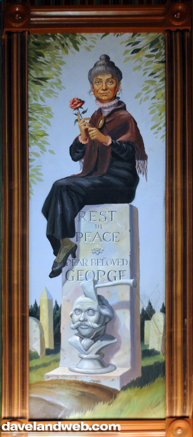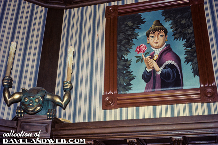
Here’s the 3rd in a series of 4: the stretch-portraits (originals by Marc Davis) from the HM elevator.

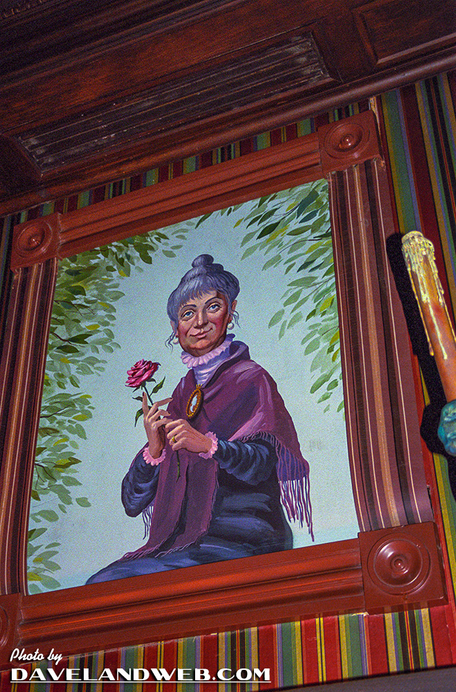
This recent acquisition is, alas, undated...but judging from the slide mount, it appears to be a 70’s vintage. It definitely shows that the stretch portraits in the mansion have changed significantly over the years. Compare with this present day shot of the Widow Patecleaver:

They don’t seem to have as much of the Marc Davis humor anymore.
Daveland reader Luke sent in this comment:
Notice the right and left sides of the stretching portrait frame. The older one was temporarily fitted with a foam frame, to see how long the foam would last through the constant shifting of the portrait. The newer picture of the portrait has a painted canvas frame, telling us that the foam frame test didn't go so well. Keep in mind that during the "foam frame" testing, it was only the portrait of the Widow that had the foam molding, not the others.
See more Disneyland Haunted Mansion photos at my website.

9 comments:
Personally I'd be fine with this effect being updated - perhaps some screen tech that wasn't possible in the '60s - that might work even better... provided that Marc Davis' original art could be used as the art for the new effect. That could be a really cool upgrade while still keeping the ah spirits right.
I like the original Marc Davis artwork much better! Any shots out there of the other 3 original stretching portraits?
The effect of the stretching room on the original (1969)audience was unspeakably impressive.
Nobody knew what to expect (apprehension), then the room stretches (amazement), then the punchline when the bottom of the paintings were revealed. (humor), then the lights go out.(Boo!)
Like any really good theater, it's the constant massaging of the audiences' emotions that makes it work so well.
Widow Patecleaver! Very clever, who thought that one up?? Is it official or a CM addition?
What could POSSIBLY be the reason for altering Marc Davis' original portraits? I could understand it if they were somehow improved, but they are all sorts of yuck. Arg!
I agree, I like the original Marc Davis painting...she's looks much more sinister.
Another weird thing is that I would've guessed Marc's paintings were the modern ones! The updates look less like the modern Disney would have done them. Weird. Oh I think the newer ones are well done but Marc's does have a more singular feel.
Oh wow, I really like the vintage ones much better!
The newer ones arent necessarily better, just different in that they are more life-like, whereas the Marc Davis originals were more cartoonish. That's the only difference. Marc Davis' dark humor is still present in all the new portraits.
I think I actually like the newer ones better, in that they look more like the kinds of art you'd find in a house like the mansion. The Marc Davis portraits, while awesome, do have a more cartoonish flavor that doesn't seem as appropriate. Especially when compared to the changing pictures in the hallway that comes next.
Post a Comment