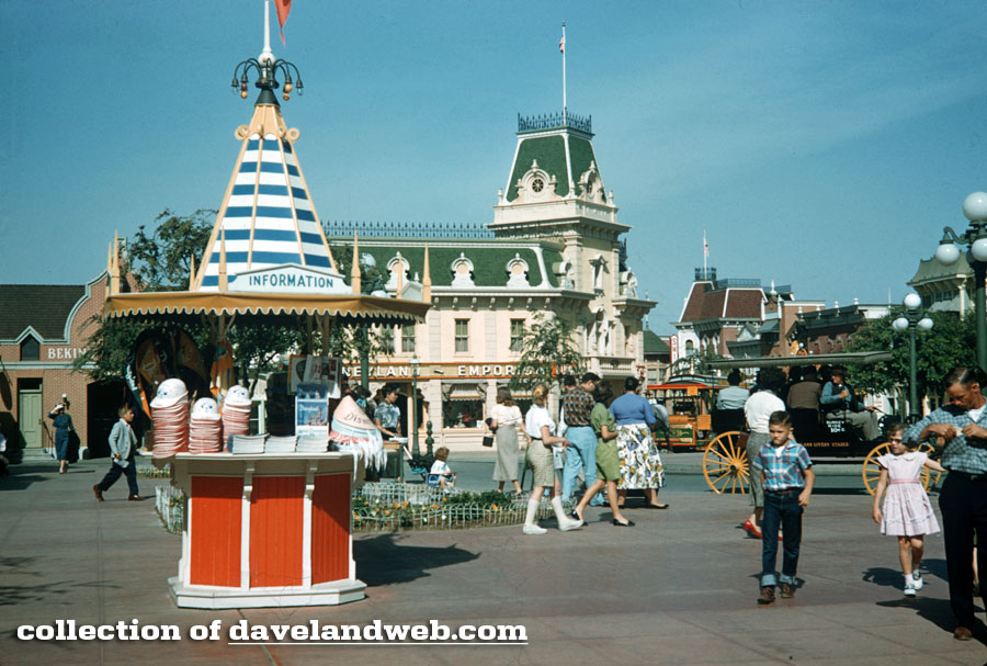
Recently, one of my followers on Twitter brought up how out-of-theme this Souvenir/Information Kiosk was for Town Square/Main Street, U.S.A.
It is so common today to debate whether a change to the park should be made or not and whether it's "on-theme," citing the recent Fantasy Faire addition to Central Plaza that replaces the former Plaza Gardens. Somehow, it never occurred to me to scrutinize early park photos for "violations" of theming when this little kiosk so obviously cries "foul"!
It seems to have disappeared by the 60's, and although it's very festive and eye-catching, it truly seems out of character with the other muted buildings and shops that guests found on Main Street, U.S.A. back in the 1950's.
Of course, this won't stop me from zooming in so that curious readers can see the merchandise being offered in this 1956 photo:
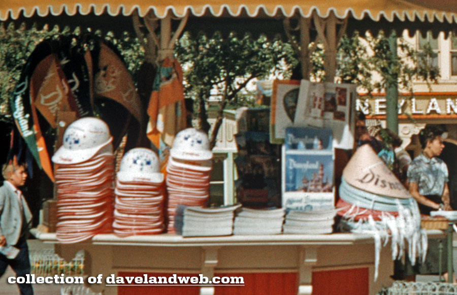
How about those souvenir construction-style hats?
While we're near Main Street, as a follow-up to my recent post on the Silhouette Studio, Daveland reader Cherie generously sent in a photo of the portrait she had done at Disneyland back in 1960:
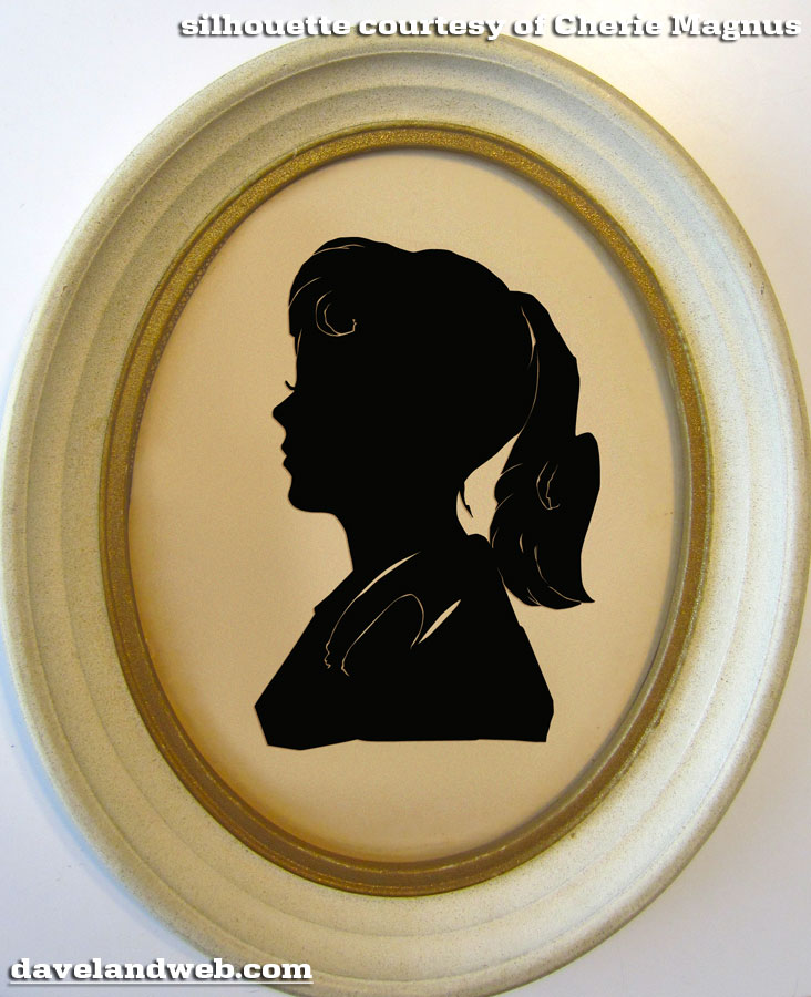
As she recalls:
I went to Disneyland in 1960 on Thanksgiving Saturday when they had a special Date Nite. I was a freshman at UCLA and my new boyfriend invited me. It was a cold, gray, sprinkly day but I had so much fun. We danced a lot in the Carnation Plaza to great big band music. I had never been there after dark before.
I lived in the Valley and my mother took me and three girlfriends to Disneyland shortly after it opened. But this Date Nite was very special. And I cherish the silhouette.
Thanks for sending your photo, Cherie - it really is a beautiful piece!
"Frankenweenie" is out on home video now. I skipped this movie in the theater; I was determined not to like it, since I was so enamored with Burton's original short live-action version of this story. However, I watched it last night and truly enjoyed it. Although the story is similar, it (obviously) has been expanded, and definitely stands on its own. The stop-action animation is breathtaking; the details blew my socks off and put 'em in the wash! Note of caution; I do feel that this movie is quite a bit more emotional, as Sparky the dog is much more endearing, and the relationship between him and his master gets fleshed out. Whereas the original movie seemed more tongue-in-cheek, this version is a bit more serious. If you are a dog-lover, get the hankies out.
See more vintage and current Disneyland Town Square photos on my Town Square photo web page.
6 comments:
The green color tones on the Emporium are no more muted than the red and blue colors tones on the kiosk. It stands out as eye-popping because it's in the foreground. In other photos of this kiosk it’s hardly noticeable and blends in architecturally, especially when it's in the background. JMO.
http://davelandweb.com/townsquare/popup.htm?images/KTPBKYC_3_59_N12R.jpg
http://davelandweb.com/townsquare/popup.htm?../disneyland/images/8_58_N32.jpg
While I prefer Carnation Plaza Gardens, Fantasy Faire is no more out-of-theme than seeing a European castle at the end of a turn-of-the-century American main street. Disneyland is full of this, whether it’s an American circus theme (Dumbo/Casey Jr.) intertwined with the European village storybook setting of Fantasyland or the mix of locales used on the Jungle Cruise and along the Rivers of America. I’ve always felt Disneyland was more about ideas and atmosphere than accuracy. It’s fantasy.
Thanks to Cherie for sharing her silhouette and story! What cool memories, and right on theme ;)
And I have a pastel profile that was done around 1958. Yes, those were good day. Thanks Cherie.
I agree with K. Martinez. While real Turn-of-the Century American architecture was extremly bright and colorful, Disneyl;an's main Street is pure 1950's in color choice. In fact while I love Disneyland's Main Street the whole area is highly stylized to create the feel. In fact it's a geat example of a graphic and design style popular in the late 1940's thru the early 1960's sometimes called "Grandma's Kitchen" charcahterized by oversize gingercread and scrollwork in bright colors. The 1956 Disneyland & Santa Fe Railroad Poster is a great example of this styling.
The ticket booth is authentic in style to fair and park pavilion architecture (or "garden follys" as the British called them)from the 1870's through the early 1890's.
I under stand this ticket booth as well as it's sister on the other side was later relocated and re-dressed to become the cashregistar stands for a 60's re-do of the Adventureland Bazaar art directed by Rolly Crump. Some of the trim from the Chicken Planation was also re-used in the Adventureland 60's re-do.
This is a cute little structure, must be before my time, since I can't recall it at all.
Some recent examples of unfortunate theming that leap to my mind are the structures around the old Fowler's Harbor and the new snack stands opposite Big Thunder.
These seem to be "cartoony" in a way that doesn't fit well with the relatively "real life" theming of Frontier/NOS/Bear Country, at least to me.
Dave, thank you for fun pics.
JG
K. - All good points. Something about that kiosk seems more "plastic" to me than the rest of 1950's style Main Street. My main issue with the Fantasy Faire is that it occurs outside the Castle walls, and encroaches on Main Street. However, I understand that they are dealing with limited space at DLand.
Cherie - Feel free to send that pastel profile, too - I'm sure everyone would love to see it!
Mike - the reason I love the original Main Street so much is because it's a collision of 1950's and 1890's; whereas WDW's version is 1970's and 1890's. Something about WDW's Main Street leaves me cold. All a matter of personal taste.
Post a Comment