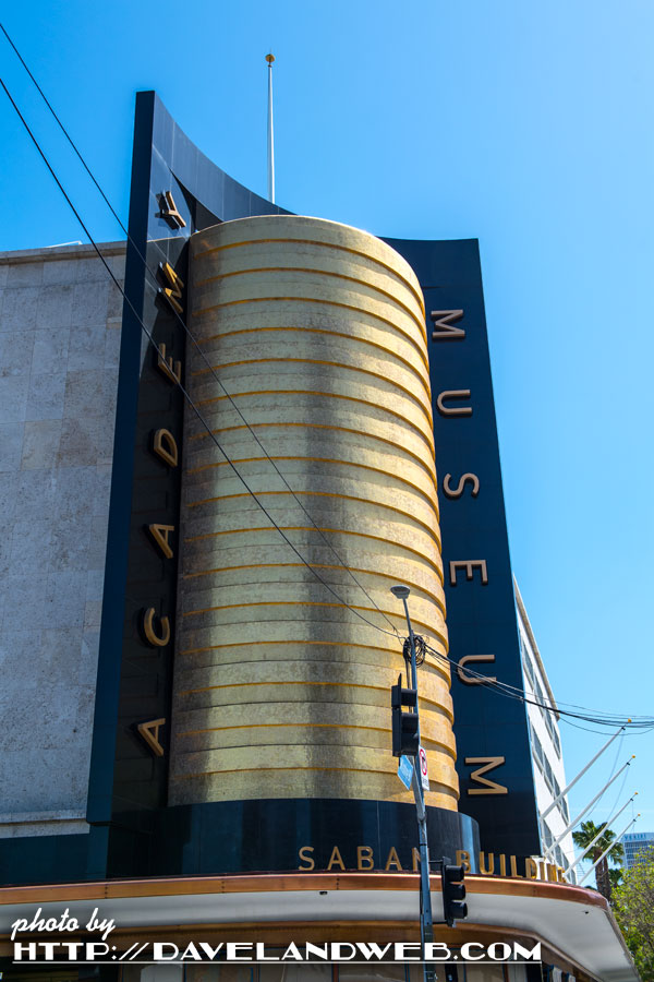
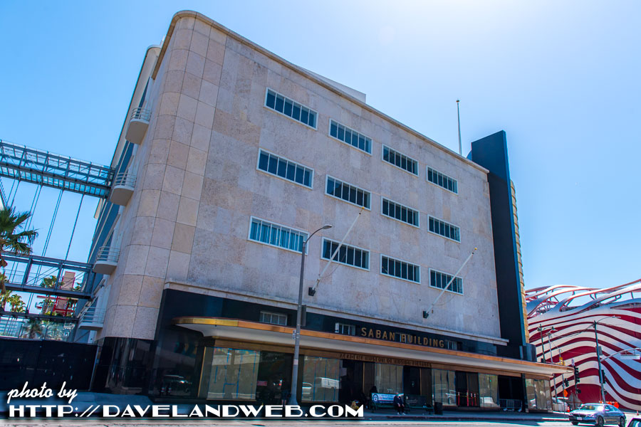
After a number of delays (some COVID related, some not), the Academy of Motion Pictures has announced an opening date of September 30, 2021 for their new museum located on Wilshire Boulevard, aka Museum Row, aka the Miracle Mile. The building it will inhabit was originally the historic May Company store, built in 1939 and designed by Albert C. Martin, Sr. (designer of the Million Dollar Theater and Los Angeles City Hall). Sadly, the Academy’s website ignores the history of this building, which has been renamed “The Saban Building,” because apparently the wealthy donors felt their name was more important than honoring the original legacy of this Streamline Moderne classic. An additional slap to Martin is that the only designer credited on the Academy website is Renzo Piano. Since he was born in 1937, he obviously had nothing to do with the original May Company.
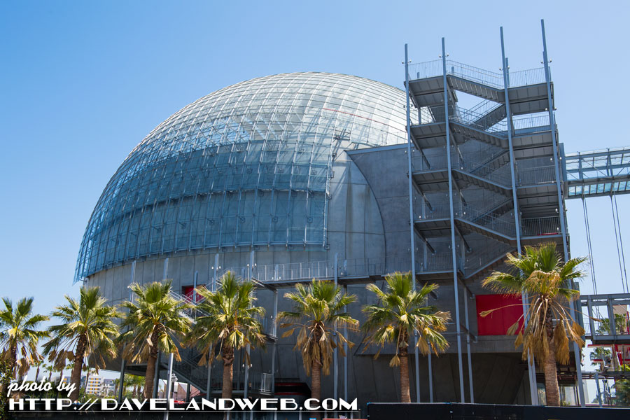
Maybe this funky little space-age pile at the back of the building is his?
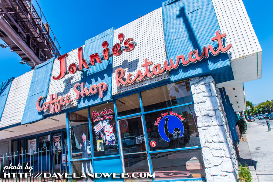
Just across the street is Johnie’s Coffee Shop (circa 1956), an example of Googie Architecture. Closed since 2000, it is only used as a film location and apparently, a campaign headquarters for good old Bernie Sanders.
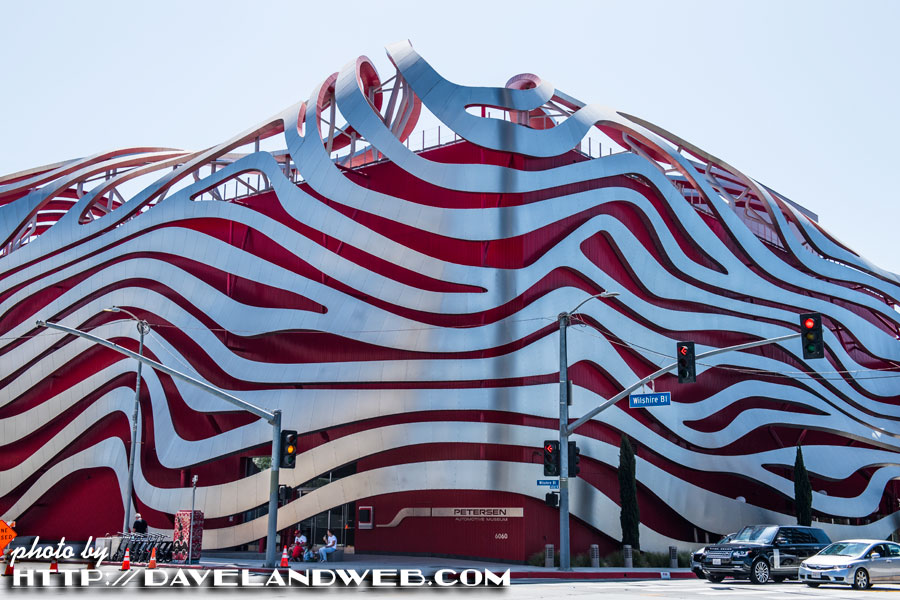
Also nearby is the Petersen Automotive museum, which was apparently redesigned with this “unique” façade in 2015 as part of a $125 million renovation. Huh.
If you want to get more information about the Academy Museum, you can visit the Academy website. Warning: it takes awhile to load, so if you don’t have a great internet connection, get ready for an exercise in frustration.
See more Los Angeles photos at my main website.

8 comments:
If Johnie's is rented out as a period movie set, maybe the presence of recent political stuff is to frustrate cheap filmmakers trying to use the exterior for free.
Recalling the old story of a Hollywood stunt man who'd wear a woman's hat while practicing. The idea was to make it impossible for a producer to film his rehearsal and use that instead of paying him for an actual shot.
Savannah Antiques dealer Jim Williams hung a Nazi flag in front of his home to prevent the team of “Glory” filming their movie with his house in the background.
You could be right about Bernie, but I think it's more just someone with a sense of humor.
Nice photos, Dave. With so many historical L.A. structures demolished, and so much ugly modern architecture, one can at least be grateful that the May Co. building and Johnie's are relatively intact. Also the EPCOTish space age pile is redeemed by holding a new 1,000 seat movie theatre, capable of showing glorious nitrate movie prints --- one of only 5 or 6 such theatres in the U.S.
The automotive museum looks like the girders of skyscraper melted by Godzilla. One day I was leaning against the metal, waiting for a bus, when a guard came out and told me not to do that.
Well I was about to say something nice about that 1930's MayCo architecture, and even compare it to the 1970's one in Fashion Valley ( while different, was still classy. ) ...but then we get to DBenson's hilarious story and that business about Jim Williams.
How cool that someone would still have a theater that can show nitrate movies. This is one of those pleasant cases where I learn more from the comments than the source intended.
I can't believe we live in a world where the security guard tells someone to stop leaning on the building. If it was so fragile, what'd they put it on the exterior for? I've only been to the Peterson once for a special event and doubt I'll ever return.
What is that even supposed to BE? A brain? Sometimes I really get the feeling modern designers are all making drunk bets "Oh yeah? Well I'll bet I can get someone to pay me $125 million to make a building that looks like my thumbprint!" (Other drunk architect): "You're on!"
All good points, Stefano! For nitrate prints, I can stomach the space age pile!
What a relief to see that building preserved.
I think I might have once gone inside with Mom and Dad on a visit to LA, it's pretty vague and almost 60 years ago.
No surprise to me that only the modern designer is credited in the current promotionals. Modern design for museums is partly ego-boo for the trustees and partly ego-boo for the designers, and for the most part, the more outrageous the design, the better. I've seen a number of recent renovation designs that seem purposely calculated to destroy the original experience of the old building.
That Petersen museum is such ghastly wreckage, it may even be worse than the Bilbao Guggenheim, which is going some for me. Computer-aided design has a lot to answer for in making these fever dreams feasible to construct.
Stefano, your experience is no surprise. We visited a building in Boston with a facade made of terra-cotta panels, and not the handsome molded glazed kind, more like planks made of flower pot material, which managed to be both ugly and incredibly fragile. Filled with cracks, spalls, chips etc. and staff to warn you away from it.
Buildings like these make me ashamed to be an architect.
JG
DBenson and Dave, those are very funny stories about preserving your rights to visual material. Smart thinking by those folks.
If you've seen the "Pick-tchah" (In Bette Davis voice) "The Star" this May Co. was the one where out-of-work actress Bette Davis goes to work when no one would hire her as an actress. In the scene, some customers start gossiping about her and she has a classic melt-down and storm-out. It was filmed outside and inside this building and from my memory I think they actually refer to it by name. I highly recommend this camp classic with Bette's on screen daughter portrayed by Natalie Wood.
Post a Comment