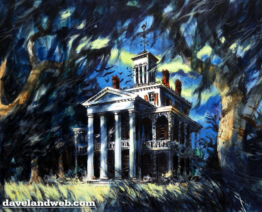
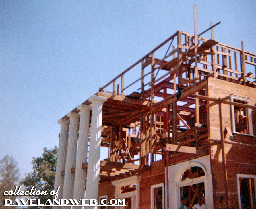
And in the beginning, there was the concept art, and then construction.
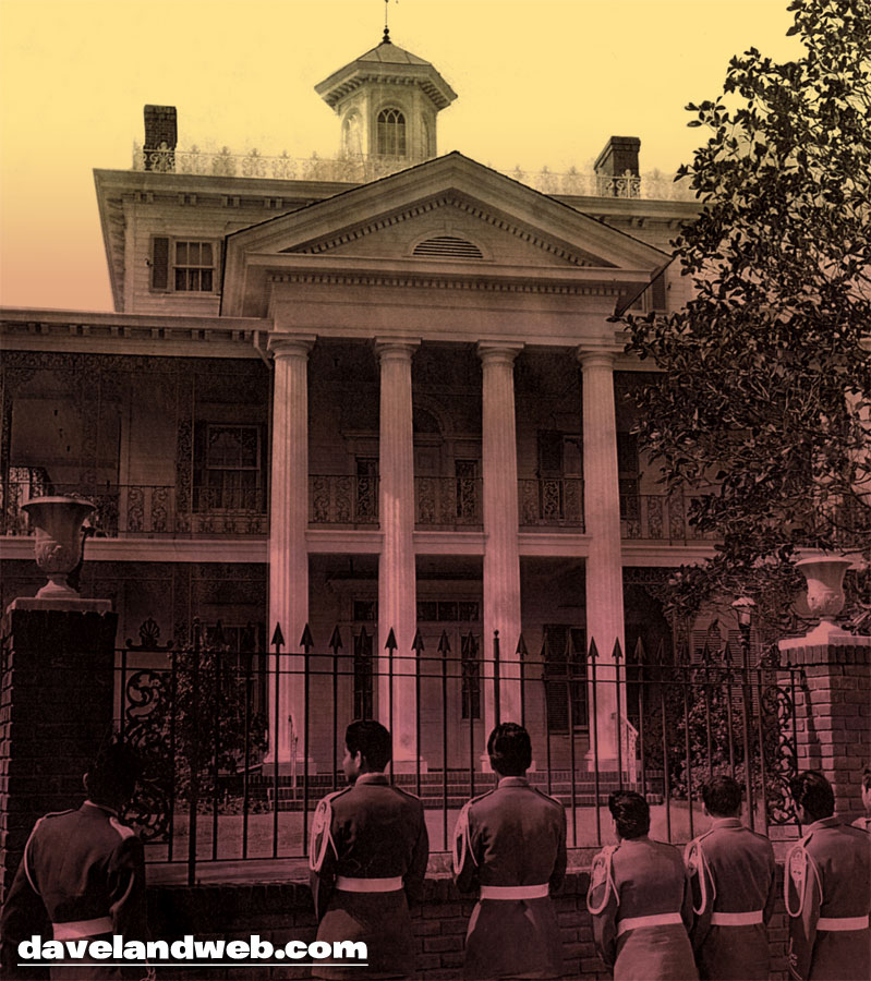
This rare still shows some young men in what appears to be either a military uniform or a marching band costume. Either way, they seem somewhat lost and curious about the yet-to-be opened Haunted Mansion in New Orleans Square.
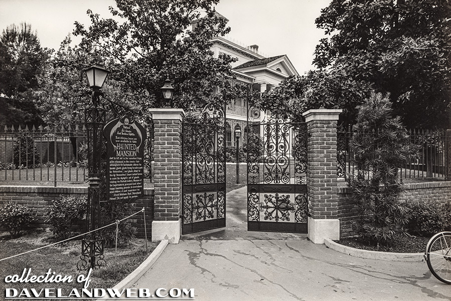
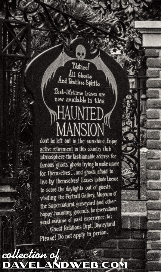
Although the gates are ajar, this publicity photo is only a teaser. The sign is up telling you...well, heck, you’re all (or mostly) adults, you can read it yourself. I also love the bike on the right, just barely visible, making you wonder what happened to the kid who dropped it off; probably rushed into the house for a peek and was probably never seen again!
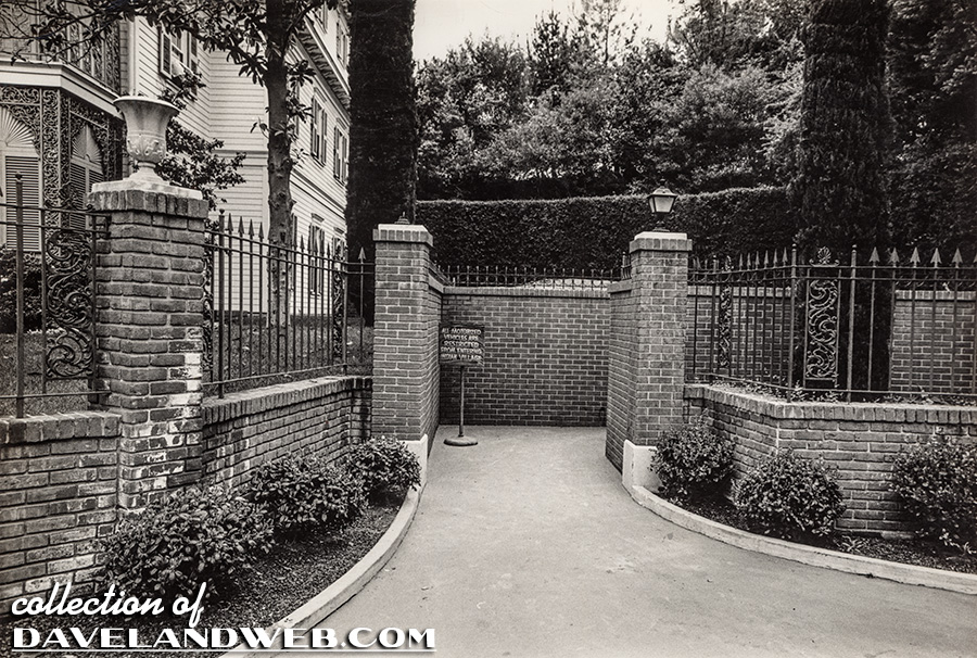
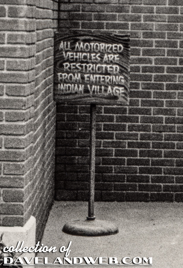
This photo of the right-hand side of the mansion is from the same time frame as the previous shot. I have included a closeup of the sign warning not to enter the Indian Village with motorized vehicles.
This pic looks pretty run of the mill on first glance, but if you zoom in on the left, you see the Haunted Mansion, circa 1963, way before it’s even open yet.
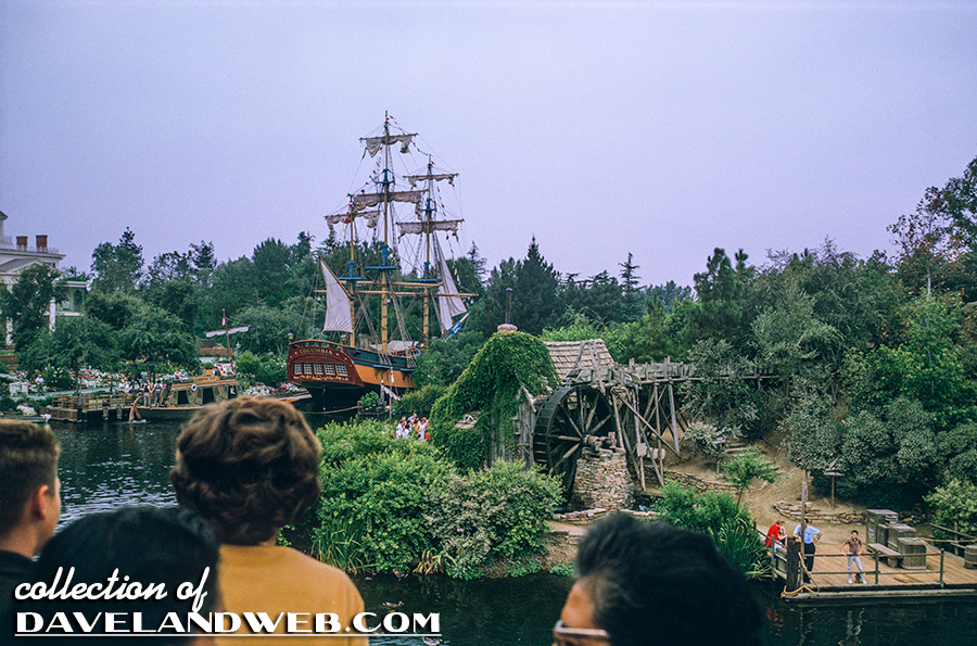
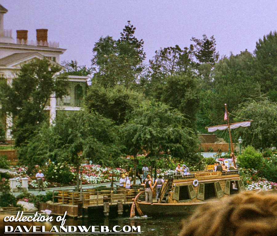
For almost 6 years, The Mansion sat vacant while guests walked by. This November 1963 shot shows the Mansion’s completed exterior but no attraction inside.
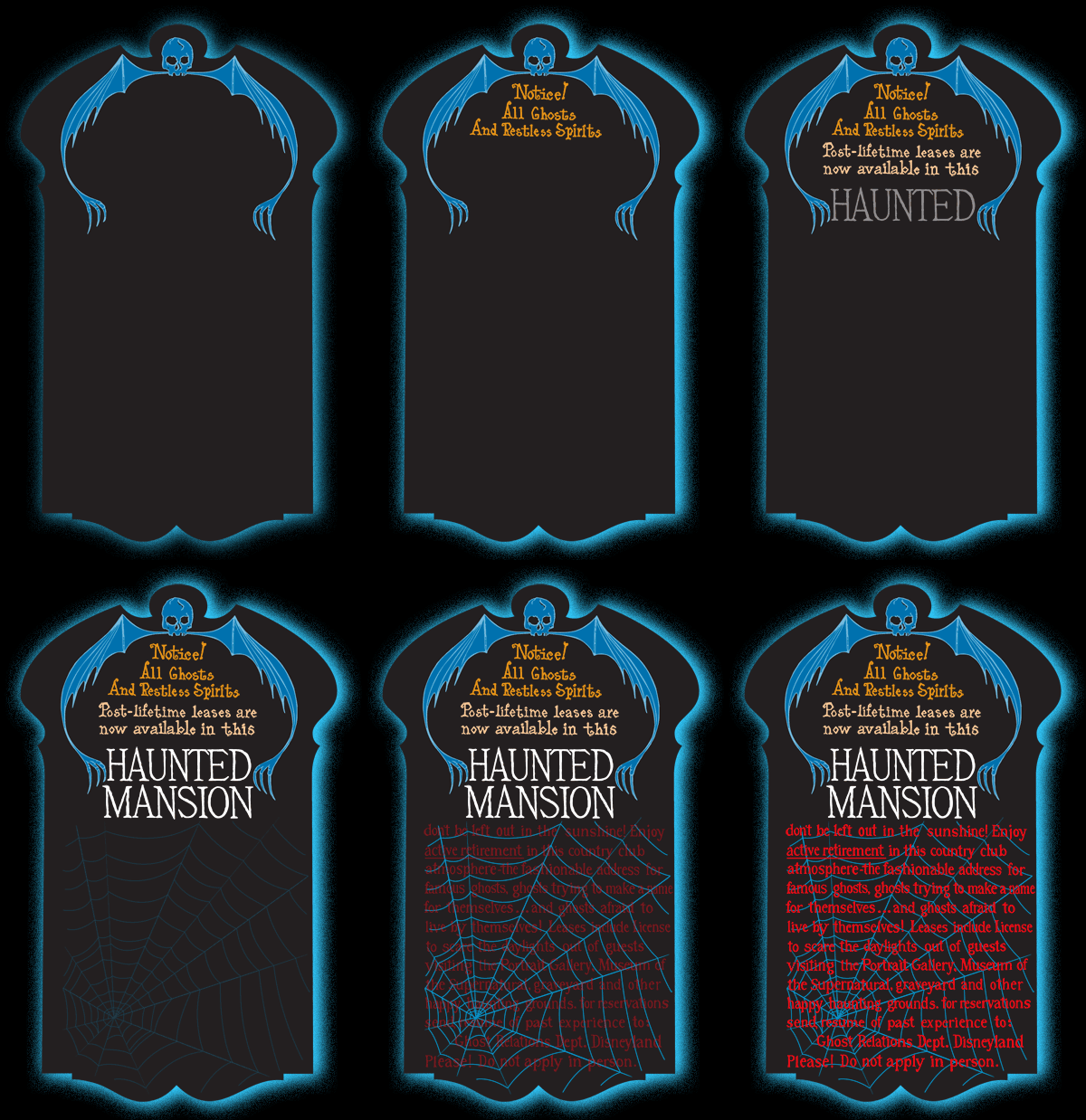
My “animated” version of the Marty Sklar Coming Soon signage:
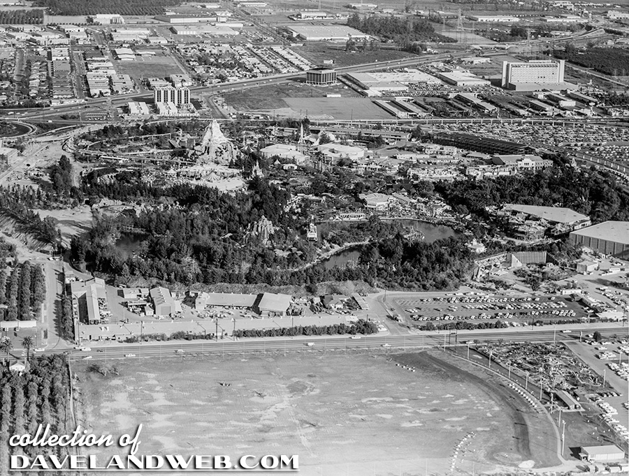
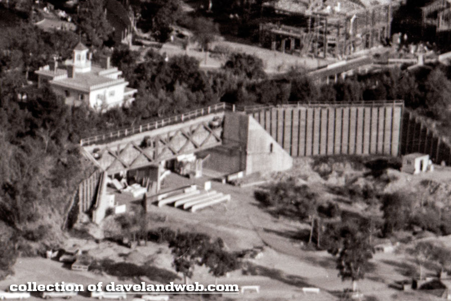
An aerial view of the park from February 2, 1966—I am also adding a close-up that is of particular interest to HM fans, showing the Haunted Mansion attraction under construction.
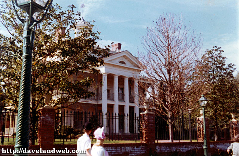
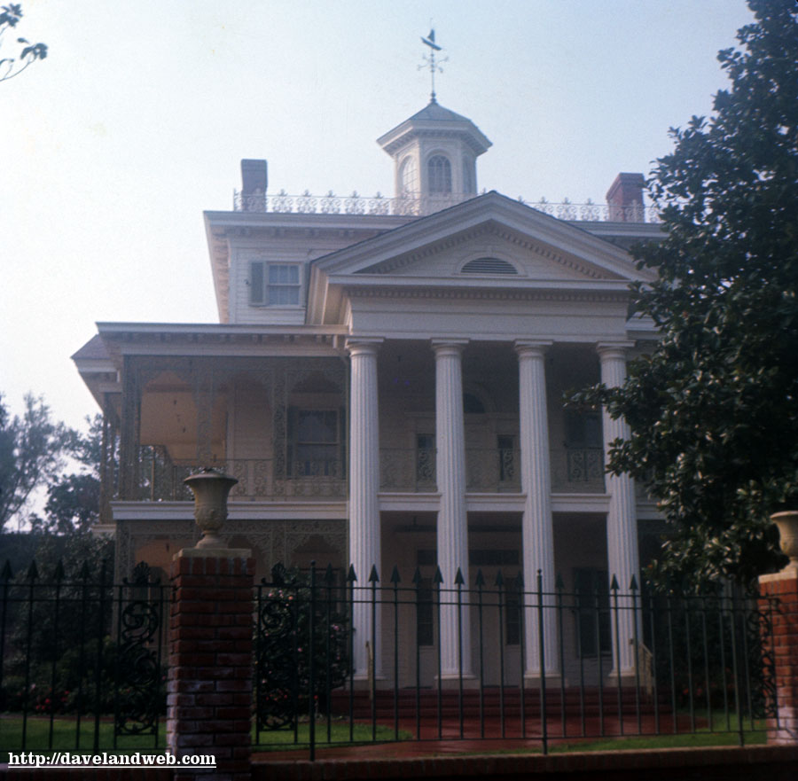
Based on a number of good clues, I would put this undated slide to December 1966/early 1967. The Mansion is not yet open, but the exterior is finished, and causing lots of people to stare through the fence to see if anything is going on.
From December 1968: if you look to the left, you can see some poor sap reading the sign announcing the imminent arrival of the attraction; hang on buddy, only about 8 more months to go!
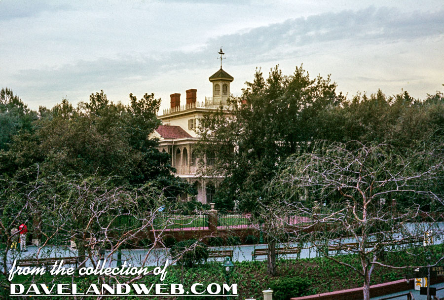
FINALLY! It’s open! Circa October 1970:
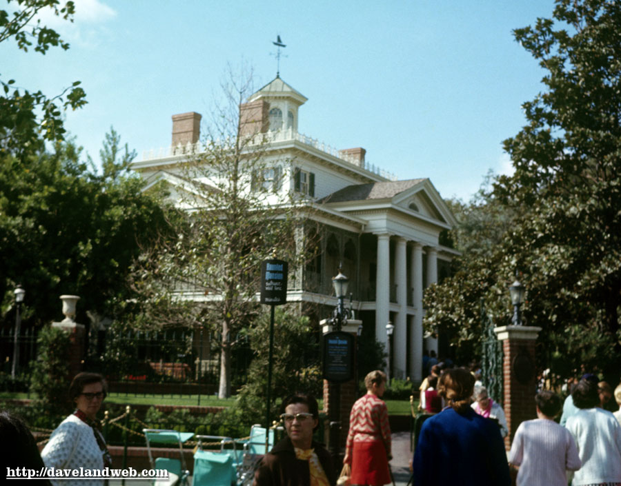
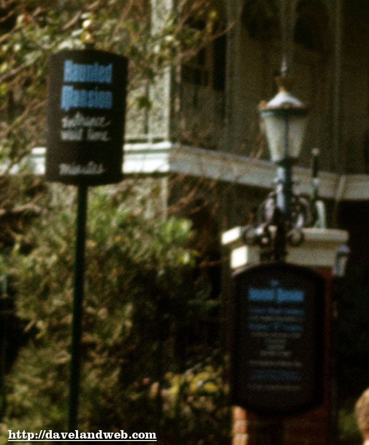
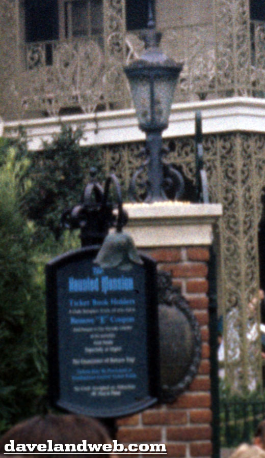
Here’s a vintage exterior view from August 1975. I have included a closeup (albeit grainy) of the ticket sign outside the gate.
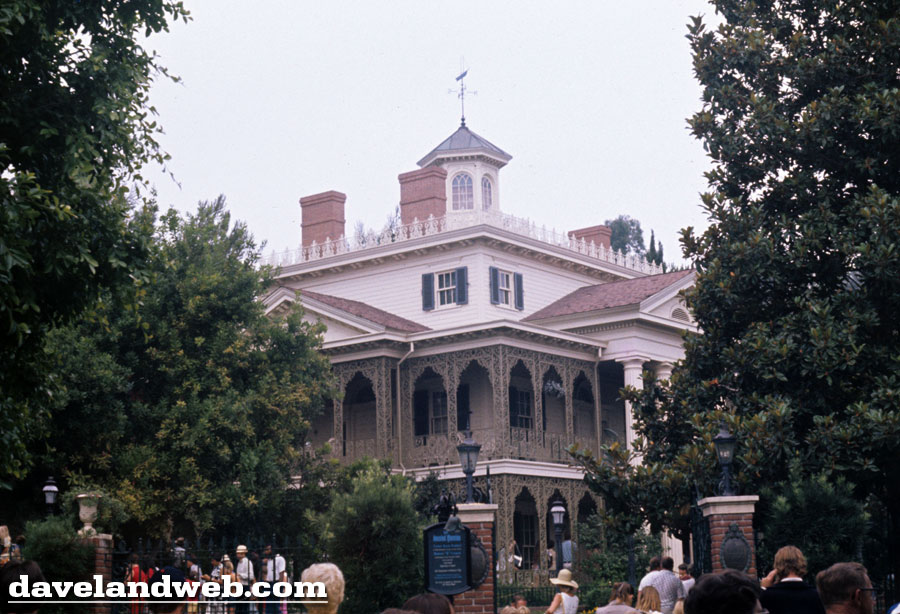
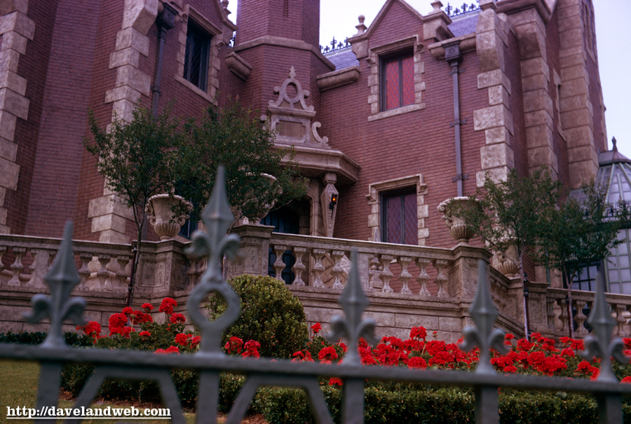
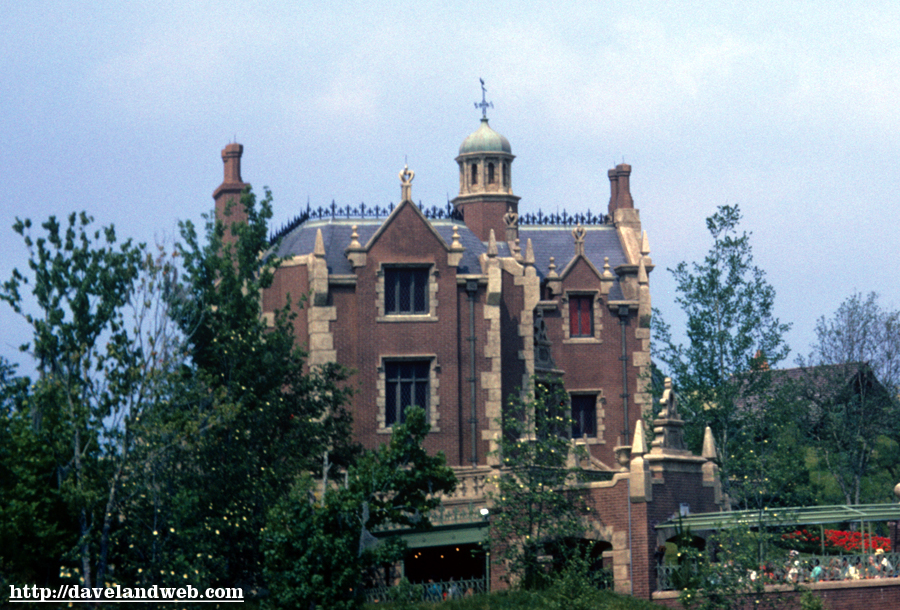
Although I have many, this is probably my favorite exterior shot of the Haunted Mansion. I definitely prefer the Disneyland architecture to its relations in Orlando and the other parks.
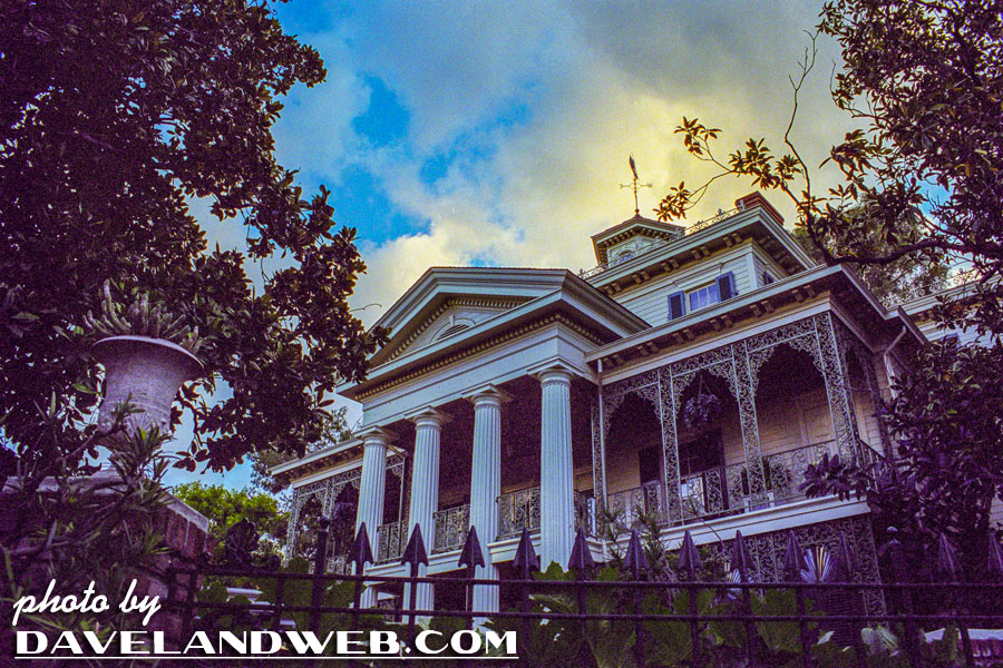
A few shots showing the outside of the Mansion, sans guests.
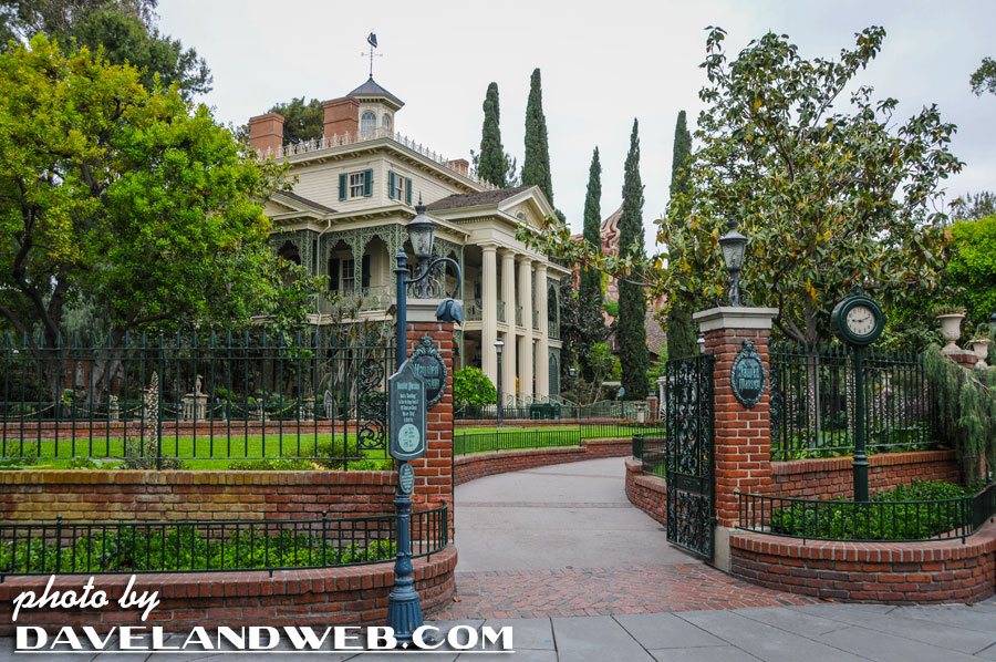
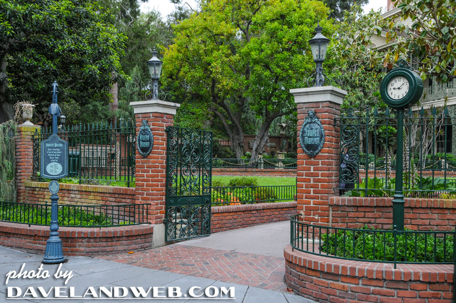
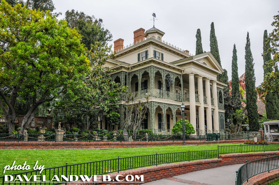
The WDW version of the Mansion for comparison, circa 1975.
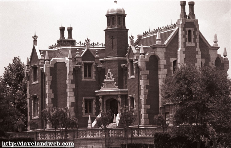
And two from 1972:
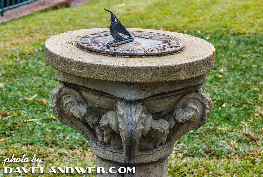
And a few of the sundial that sits in front of the mansion; no batteries for this piece of timekeeping—often this detail is missed as guests rush through the queue to enter the mansion as quickly as possible; there is something to be said for skipping the fast pass option at times.
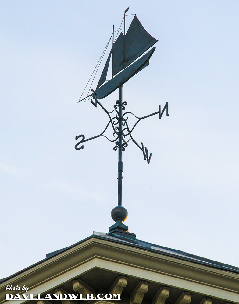
Can’t leave out the weathervane atop the Mansion, denoting the original concept that the owner of the Mansion was a sea captain:
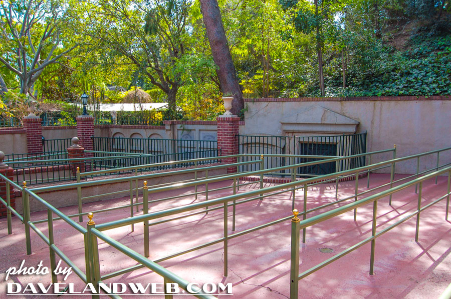
On a rare occasion you can get this shot without any guests, showing the outdoor crypt:
See more Disneyland Haunted Mansion photos at my website.

10 comments:
Once again...
Awesome!
an amazing look at a classic. thanks.
I love that house, if I ever build a house of my own I think it would be an exact replica of this one. Thanks for the pics!
Great post and I so agree with you Dave.
Some thoughts. First, the original is a stone cold classic, with a great element of surprise. One of the biggest surprises is that of subtlety. We expect it now, but really would anyone expect subtlety from a horror/haunted house theme at Disneyland? Subconsciously it continues to work on us. It's masterfully designed to have a pleasant yet slightly aloof, haunting presence. It's specific enough to be real and appears puzzlingly real. Yet it's vague enough that you really don't know what is in store - anything could be, and that helps everything work all the better.
They shouldn't touch the original. But in my humble, I'd suggest the remakes in the other parks could use some work. I've been to WDW and I expect the place to house Mr. Toads Wild Ride. It's strangely (very, very slightly) cartoonish, colorful, cute and quaint, as scary as its made to be.
Hadn't heard about the sea captain thing. That's an idea. The Ghost and Mrs. Muir is a (romantic) classic based on some broad elements that might be turned into a theme that could work. Why not add a "beyond the dead" romantic angle? The place as-is with really subtle tweaks could hit that angle pretty well. How to give that an edge "for today's audiences" would be the challenge. It'd be hasty to say "suggestions of a vampire" but I'm sure something could be worked out that would make the other haunted mansions as original as the, well, original.
Wow, great pictures! Imagine if they built a new attraction facade without an attraction this day and age and let it sit there for years. Somebody would spill the beans these days and there wouldn't be a surprise.
I cannot wait to see what happens with Mystic Manor in Hong Kong. It seems more like a Stephen King story-with-an-animal character adventure. I love monkeys and The Haunted Mansion, so I have got to see this.
Originally I started liking the WDW facade, because it looked more Gothic and imposing. But after time, I like the DL's Southern Gothic version more. 'Might just be the psychological effect of its being the original.
However, I do disagree with Walt Disney and agree with Jeff Burke that the exterior should look decrepit and spooky ^_^
Question. On the far left of that great arial pic, is that the construction of It's a Small World? And has the DLRR already been rerouted to make room for it?
Good eye, Ark - you appear to be correct on both counts.
Wonderful photos! Just this past March I finally noticed the sundial for the first time, and I've been on the Haunted Mansion many times. It surprised me that I could have missed something that was right there!
Anyway, I love the photos you share! Thanks a lot!
There's not enough photos in this post! WOW Dave, what a super look at the Mansion! I love that TICKET SIGN!! Thanks for all the hard work!
Post a Comment