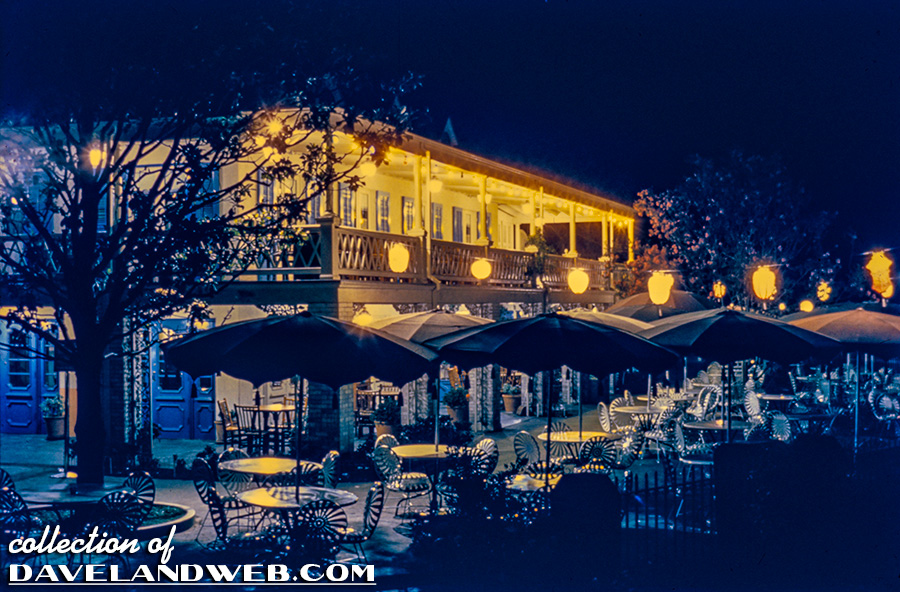
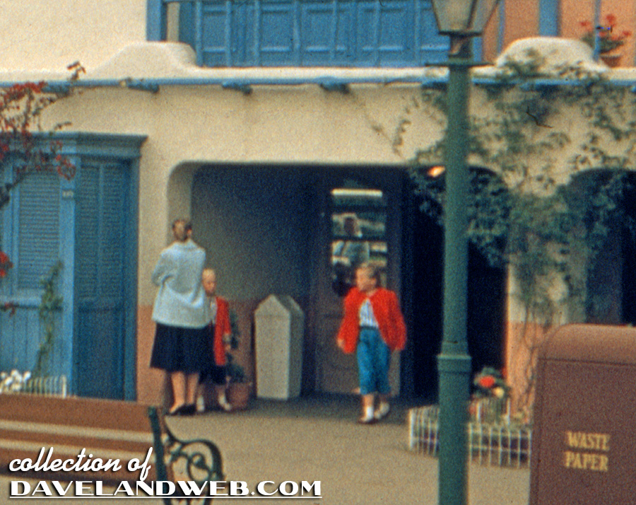
While the above image may look like the interior of the Blue Bayou Restaurant in Disneyland’s New Orleans Square (shown below), it’s actually the Chicken Plantation Restaurant EXTERIOR.

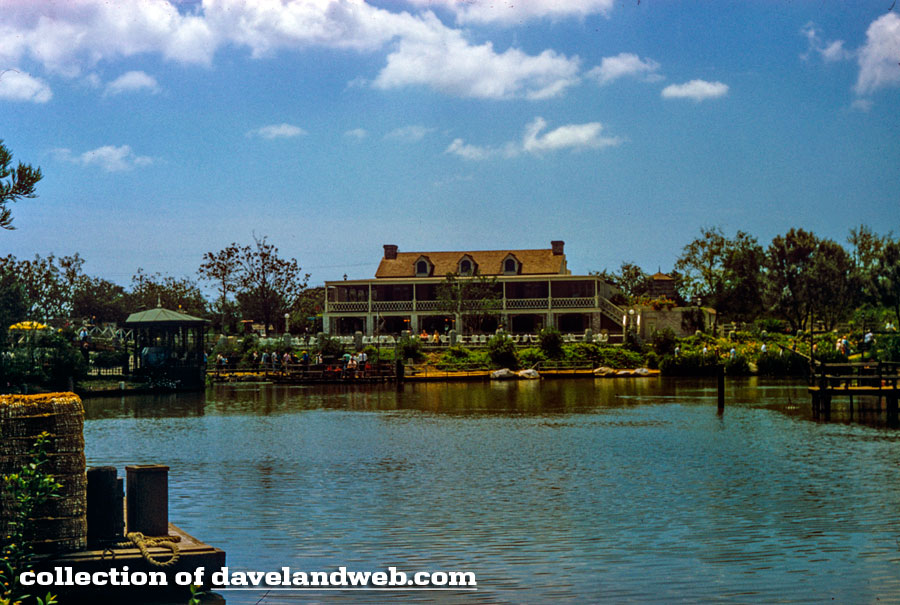
Here’s a daytime vintage image of the long-gone Chicken Plantation that once resided along the Rivers of America:
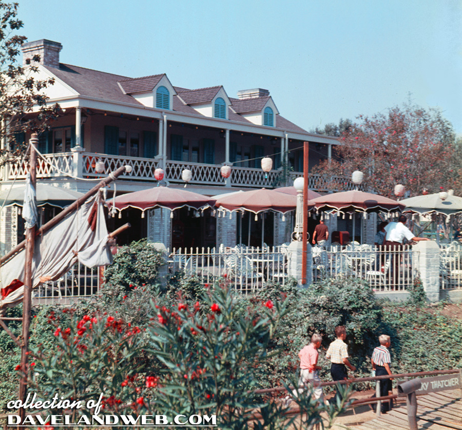
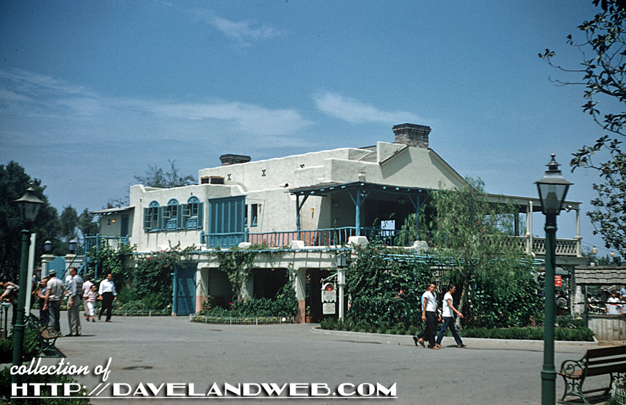
The front of this restaurant, which was removed in 1962 to make way for New Orleans Square, definitely inspired the Blue Bayou. The back…that’s an entirely different story! The corporate sponsor, Swift’s Premium Meats, did not give positive reviews for the Mexican Adobe styling of the backside. Swift Company reps thought it looked like a mud hovel and not very enticing to potential guests viewing it from the nearby Frontierland Depot. I can just hear this couple now, looking at the structure: “George, I wouldn’t eat at that dump if you paid me!”
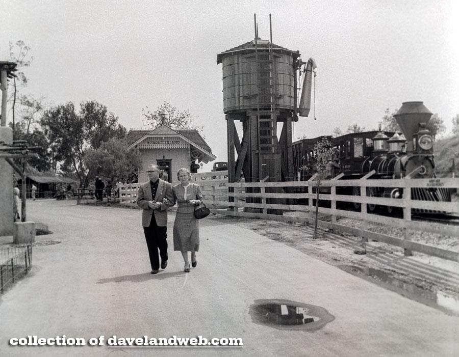
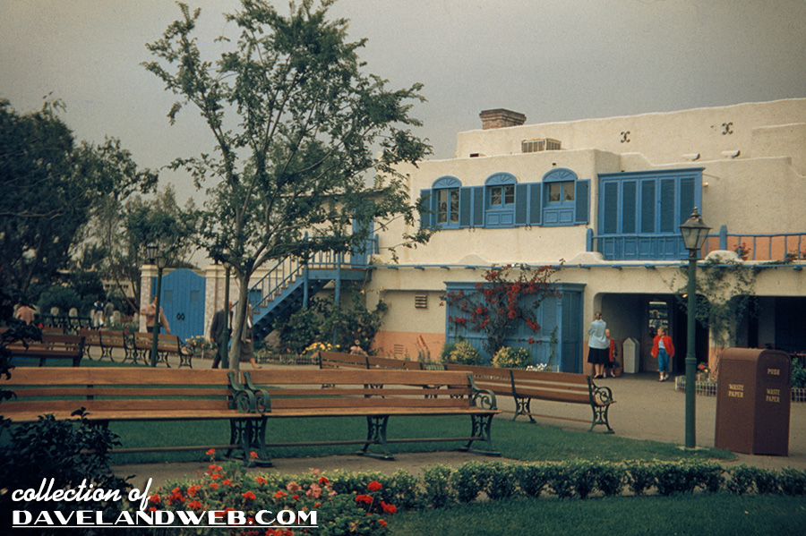
Shortly after opening, the shutters were added to make it seem a bit fancier.
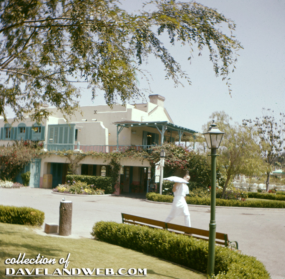
Another backside view with a cast member carrying a food tray. I love the rustic log fountain!
A previously posted shot of the backside of the restaurant:
…and a shot from the edge of the Rivers of America to give you an idea of where it was located:
See more Disneyland Chicken Plantation photos at my main website.

2 comments:
First, I'm floored to see so many color pictures of it. I just assume anything from 1955 to 1962 or thereabouts will always be B&W. Second, this may be one of the times I agree with the suits. I understand the Imagineers goal of making one building look different on both sides, but a Spanish villa doesn't make sense here. You get off the train, look north and see a Spanish villa then a river with a steamboat? If they really had to give the train facing side a different façade, maybe a log cabin or something from the old west that matches the river facing side, but slightly different materials. ( logs instead of boards ) Also, so weird to see a regular white trash can in shot #5. I don't think I've ever seen one that plain at any Disney park in any decade. Must have been a stand in until the one in shot # came along.
@ Fifthrider-
That white trash can is an oddity. It appears to be a 'swing top' style, and much smaller than the typical Disneyland trash can - no matter its theming.
That landscaped area behind the restaurant complete with ample benches is quite the grand esplanade, considering its relatively out-of-the-way location.
Post a Comment