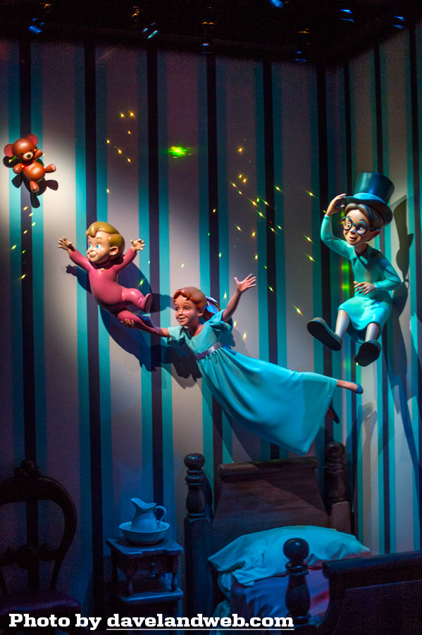
I know I am in the minority, but I was not as "wowed" as I thought I would be when I took a spin on the newly refurbished Peter Pan's Flight. I can't quite put my finger on it, but unlike the Alice dark ride, this one just doesn't seem to have integrated the new digital effects as well.
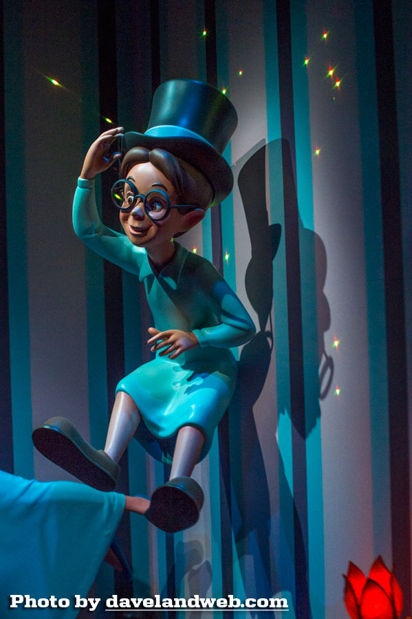
It's cool to see the pixie dust effect in the nursery, but it now makes the static nature of the children seem odd.
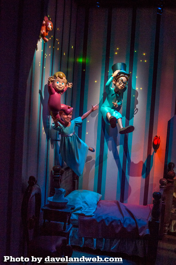
I did like how it now appears that you are following Tinker Bell's light as you soar over London.
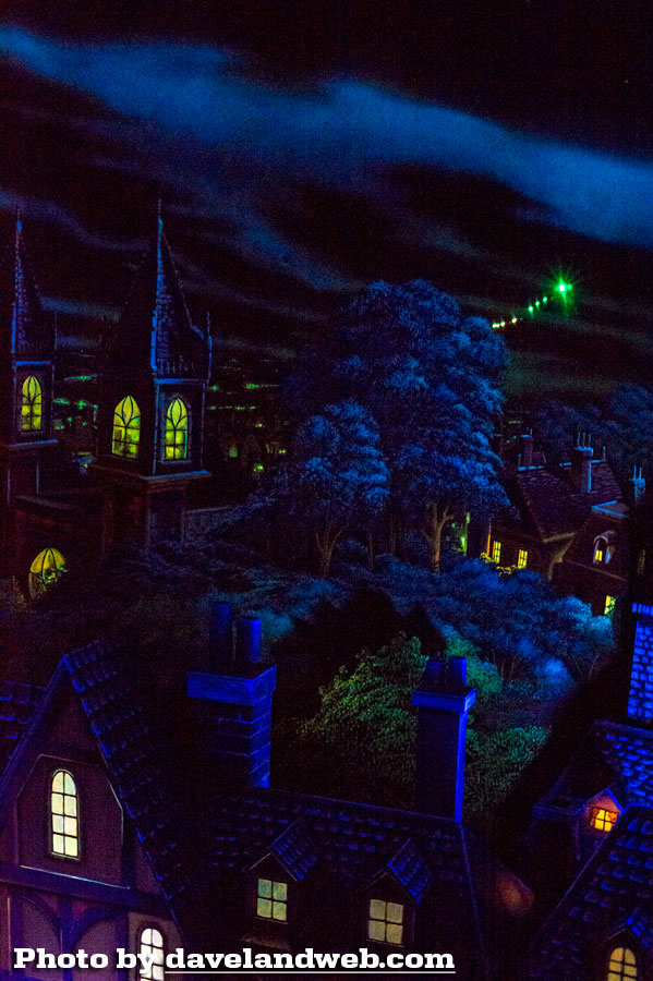
What I didn't like was how bright all of the tiny lights below seemed. For whatever reason, it killed the magic feeling I used to get as the ship sailed over London and Big Ben. The red lights seem much brighter; what the heck at that time would show up as a bright red light in the sky?
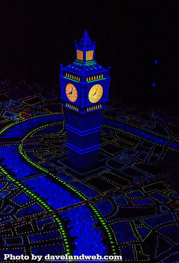
A closer look at Big Ben:
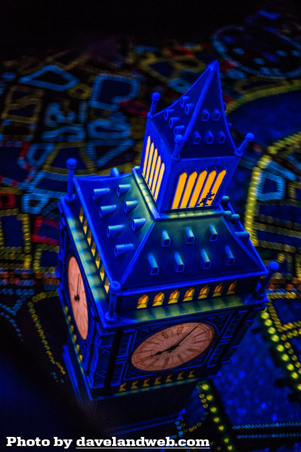
and a closer view of the Hidden Mickey:
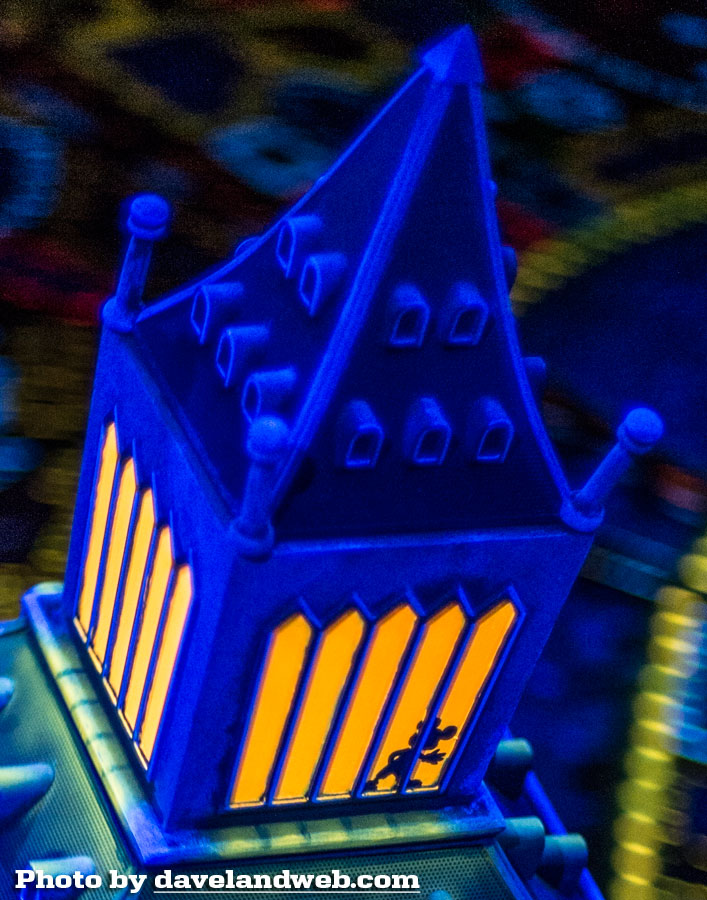
On all the lights below, it just seemed like a lot of noise. Too too much.
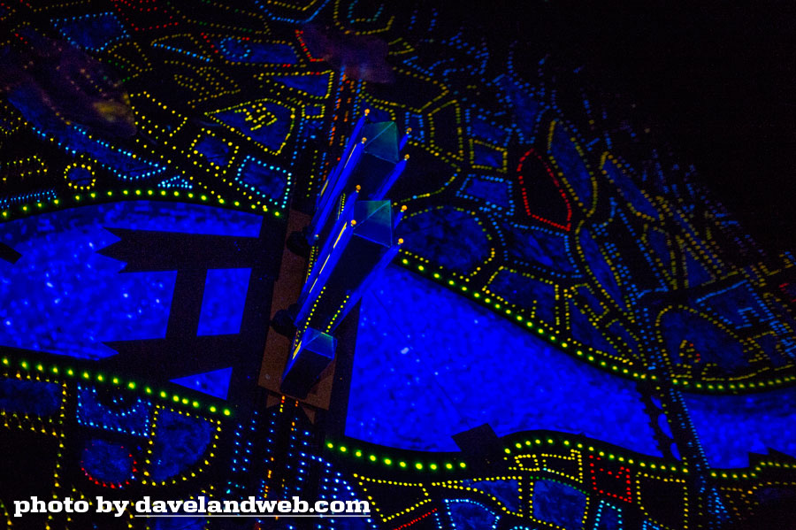
And then there was some kind of digital effect on the wall that looked like something from Star Trek; I didn't capture it this time, but whatever it was, it just did not seem to have any place on this attraction. Call me stupid…I just didn't understand the need for it. Flying over Neverland was fun though; the digital effects here are integrated in a way that is subtle and enhances the scene.
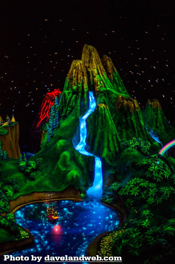
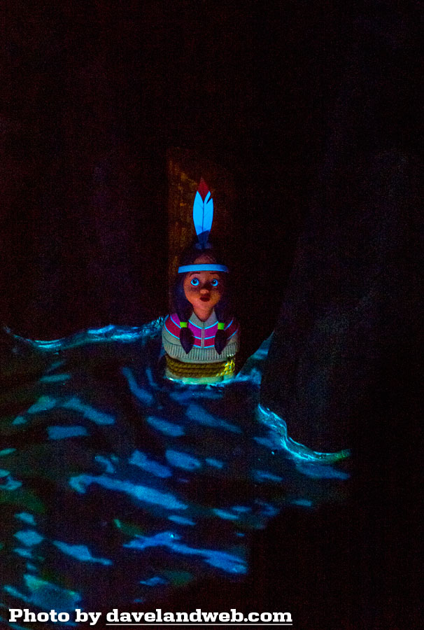
The new rippling water effects around Tiger Lily are also effective - yay!
I didn't notice much new in the Walk the Plank scene.
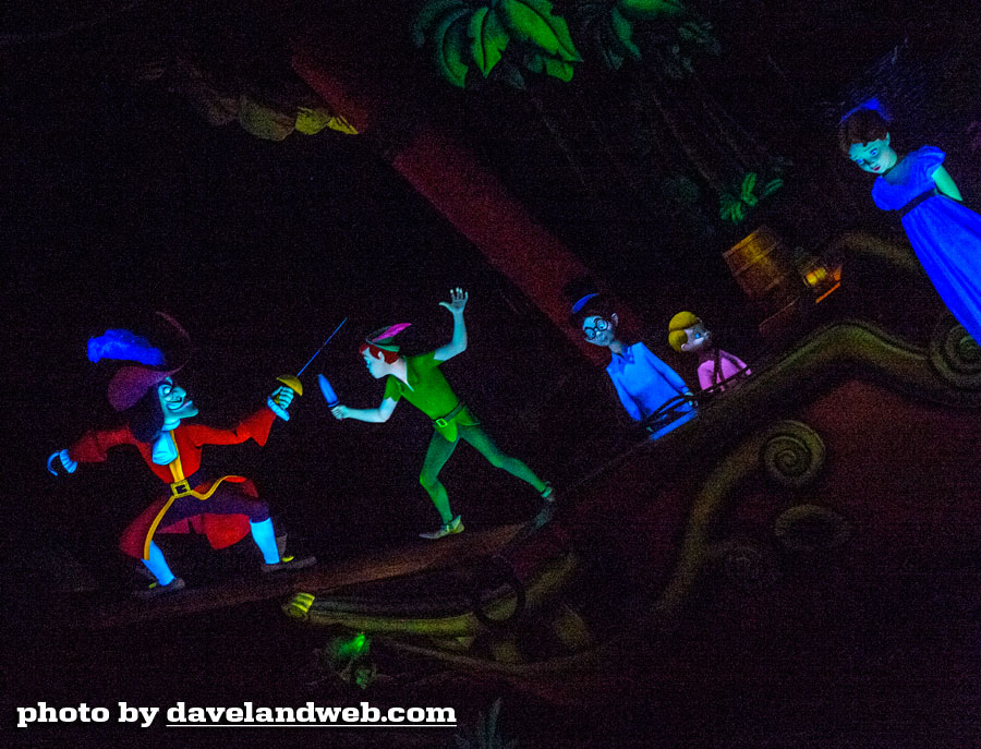
Still cool…still difficult to photograph!
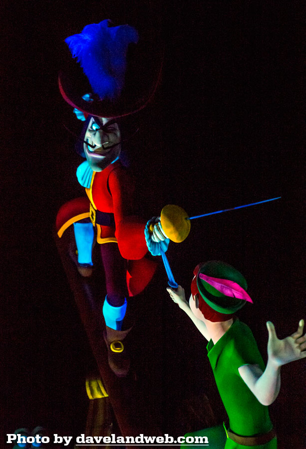
Poor little Wendy looks mighty scared.
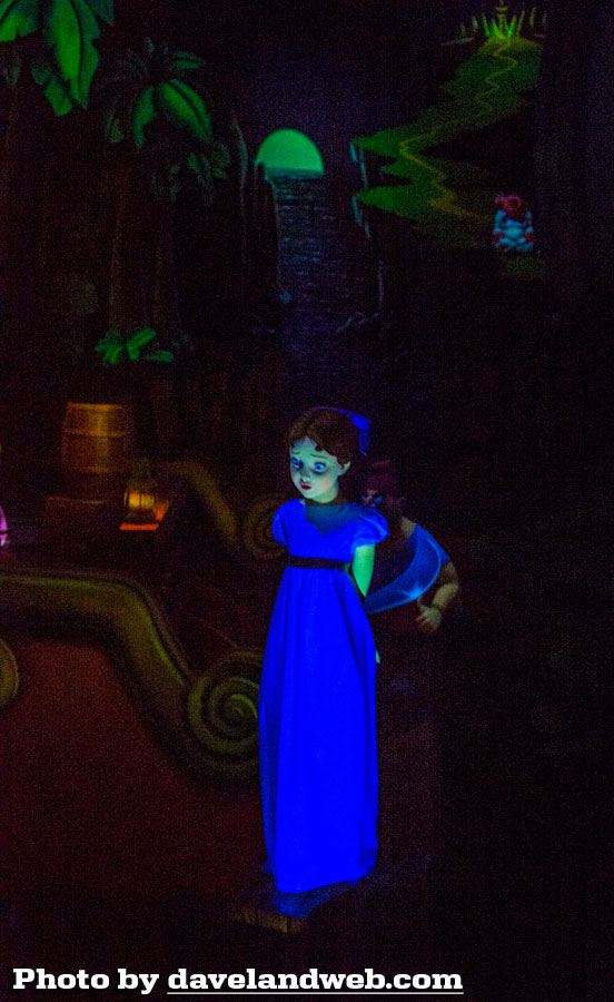
Have no fear; the gang is sailing home as soon as you round the next corner.
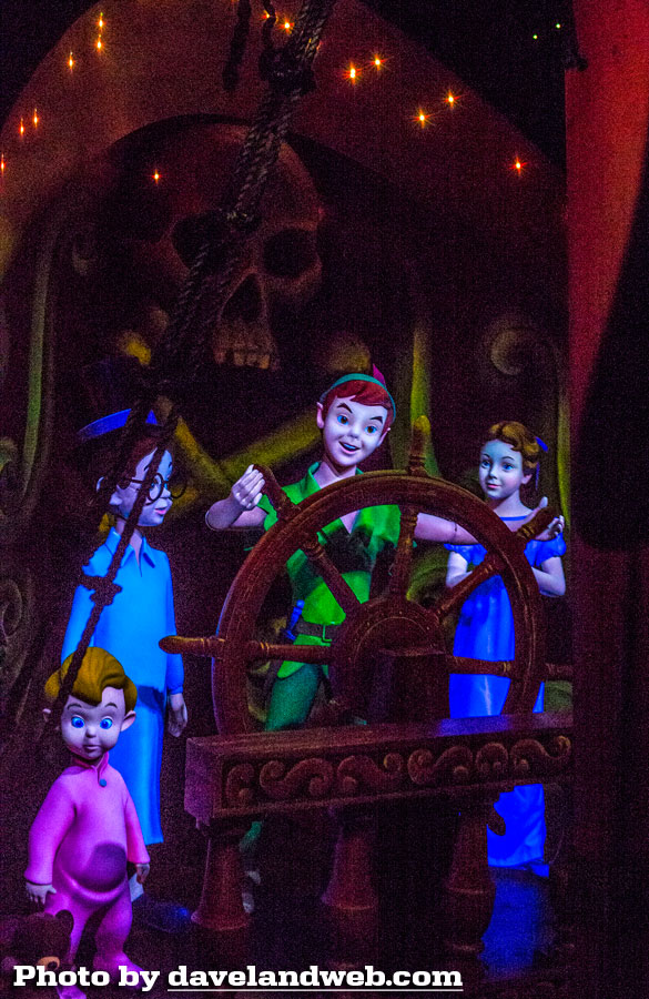
The digital effects are nice here, but the little fiber optics coming out of Tinker Bell's hand look cheap now.
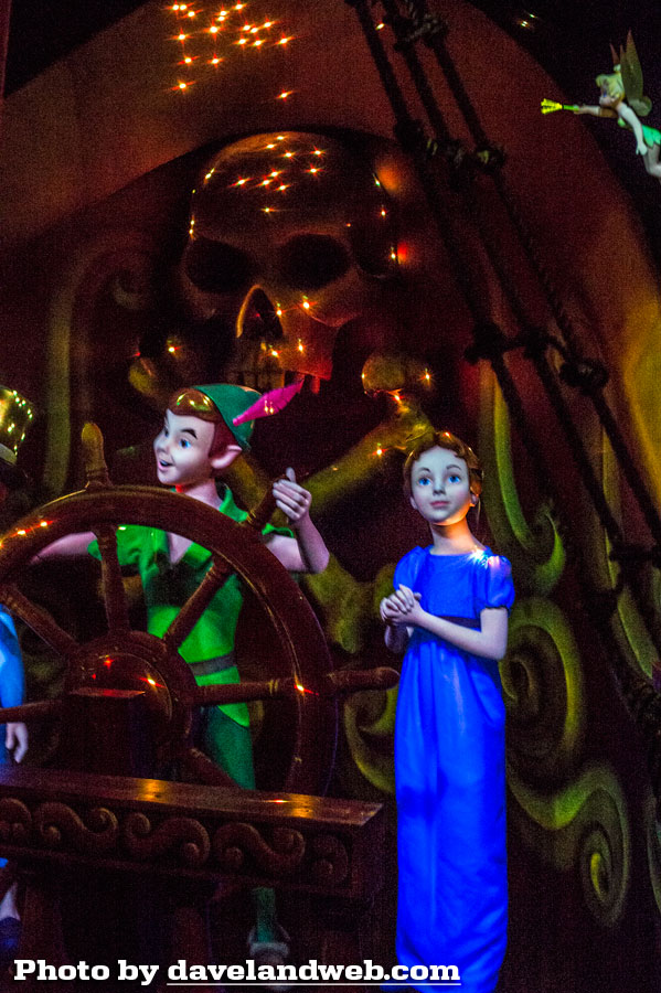
Another tough scene to catch as your ship zips by. Time to invest in a new lens!
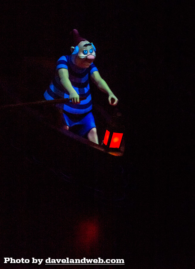
I did enjoy all the instances of the digital water.
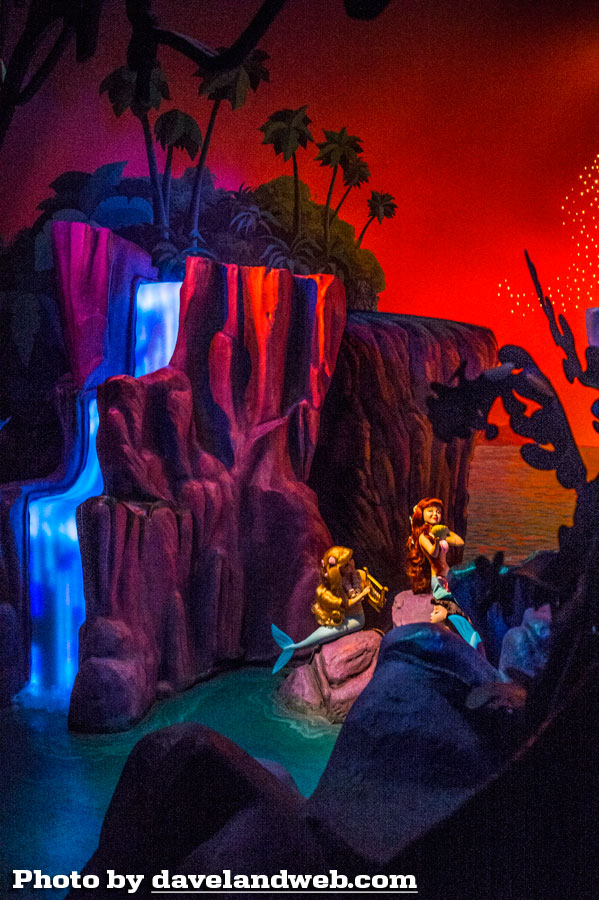
Again, I know I am in the minority. Overall it seems like most are very happy with this refurbishment. While I still rank this as one of the best Fantasyland dark rides, I would have to say that I now put it much closer to Alice and Snow White.
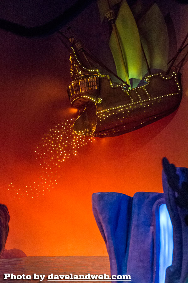
More photos of the refurbished Peter Pan's Flight at my main website.

6 comments:
I agree with your assessment. I am not wowed by the changes and the pixie dust looked cheap and out of place.
I haven't seen this in person yet. I realize that the children now move up and down "in the air", but I'm assuming that Wendy no longer turns her head back and forth like she used to when she was sitting in the bed. Too bad they couldn't have kept that head movement with the new figures so they wouldn't come across so static.
- TokyoMagic!
P.S. From the video footage I've seen and the comments I've heard from many others, you are not alone....the lights of London are now HIDEOUSLY bright. How is it that they can often be so close to getting something right, but then they go and miss perfection with something that obvious?
- TokyoMagic!
Based strictly on photography and reports (such as yours), I have to agree that London is now too . . . the word I think we're looking for is GARISH. The brightness ironically makes the 2D nature of the city more obvious and therefore less convincing. You're also right about the red. The limited palette of the original worked much better, with greenish yellows, blues, and some pale oranges. Looked dreamier. Blood red has no place on such a palette.
The effect I think you're referring to that is not pictured (the "Star Trek" looking thing) is the "second star to the right" which now appears to be simply an animation playing in a loop on a flat screen TV... problem is the stardust or whatever is coming off the star actually bleeds to the edge of the screen for some reason, clipping in a perfect rectangle around the star, revealing the trick. Can't believe it never occurred to them to keep the subject contained within the dimensions of the screen!
Great input from all above, thank you. So interesting to see how sometimes modern imagineering goes with "Oh well, close enough" on that rectangular screen instead of taking the time to dial in an effect or understand the final presentation of a color like red. I wonder what their motivation would have been for even using it? Was there any historical basis of London having red streetlights around an entire block?
Post a Comment