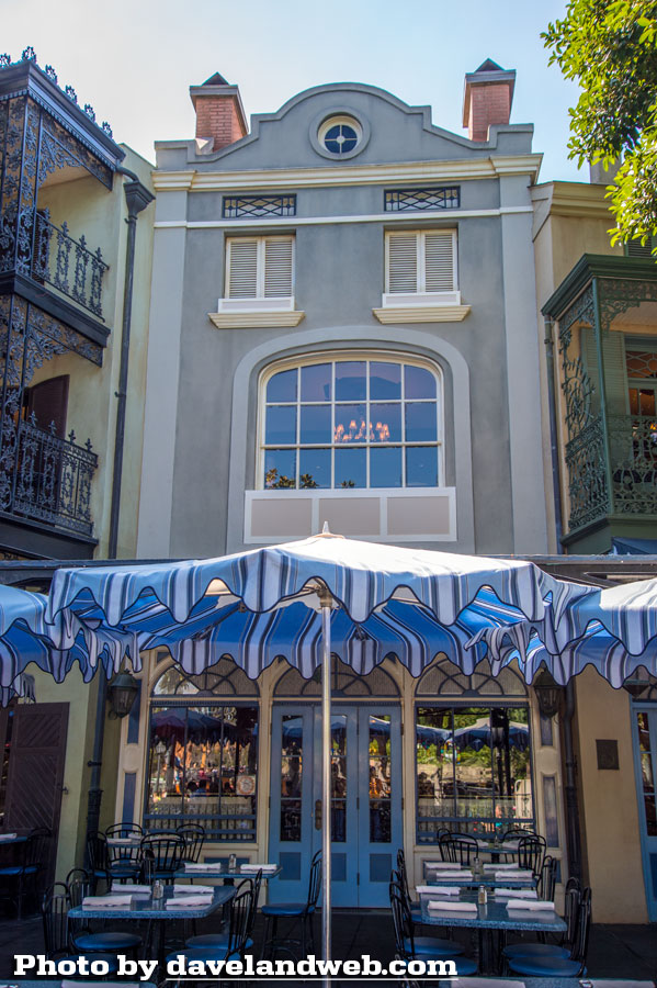
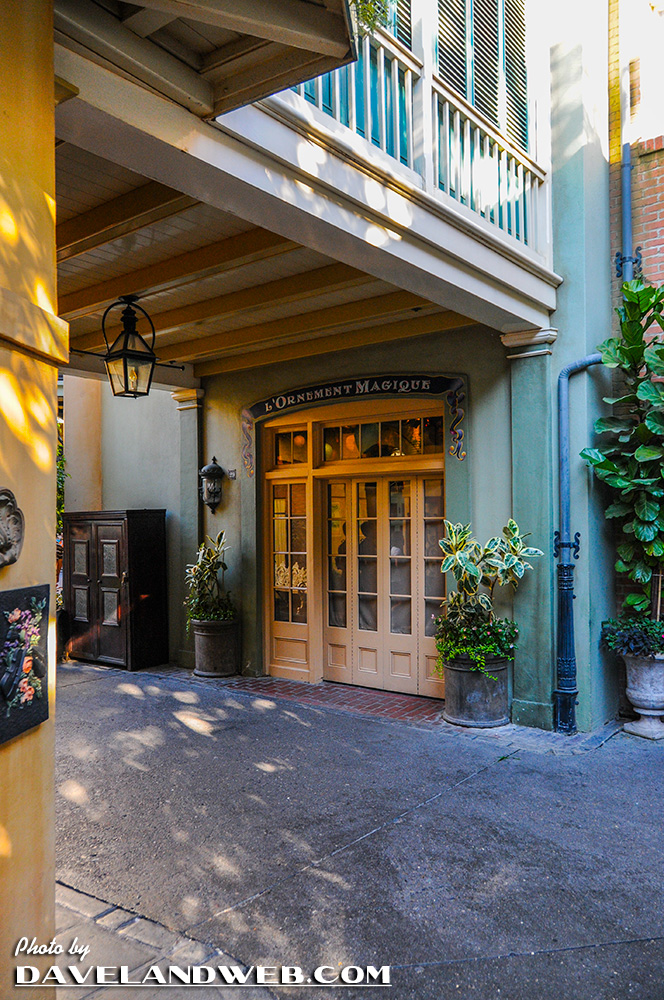
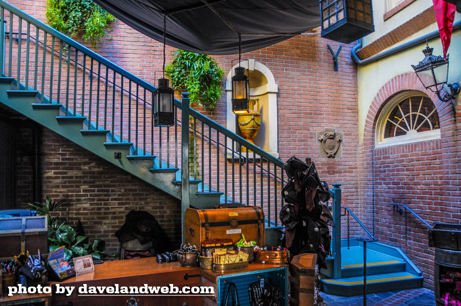
I finally got the chance to see the changes to New Orleans Square for myself. The current view (above) of Club 33 from Café Orleans vs. the previous view (below). While it's all a matter of personal taste, this particular blogger is really not crazy about this version.
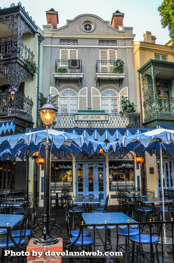
The original assortment of shops, restaurants, and façades seemed well executed and tastefully decorated. Due to space constraints, the additions to Club 33 have caused Imagineers to shoehorn a number of elements in that look…well, shoehorned in. This is what people often refer to as a "re-muddle."
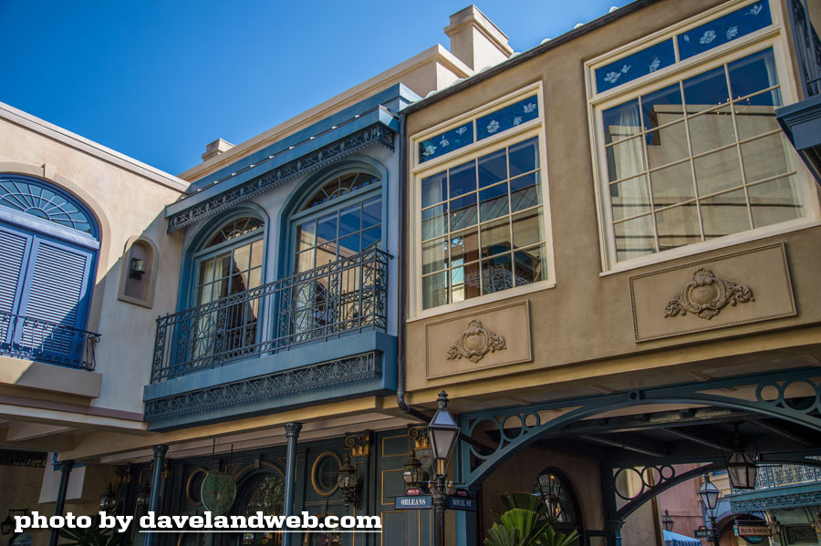
I can't help but think even with a lack of real estate that there couldn't have been a much more tasteful solution. One that still took you to a different place and time. Not one that looks like it had been decorated by a salesperson at Home Depot or Michael's Craft Store.
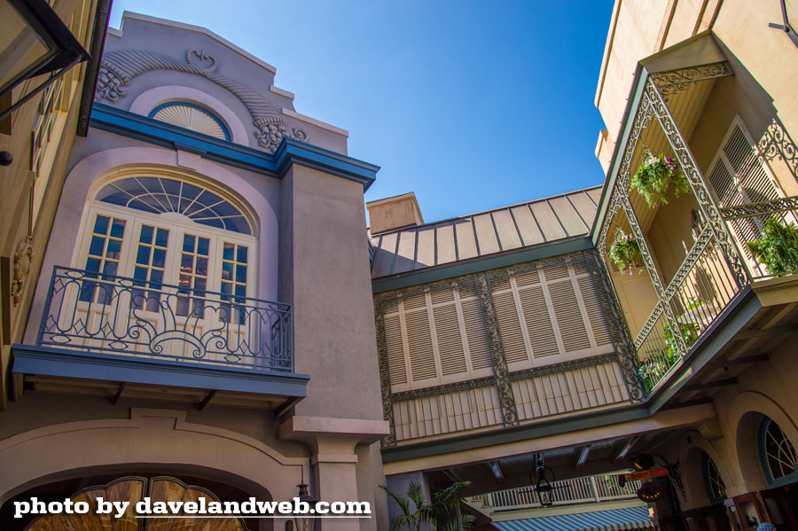
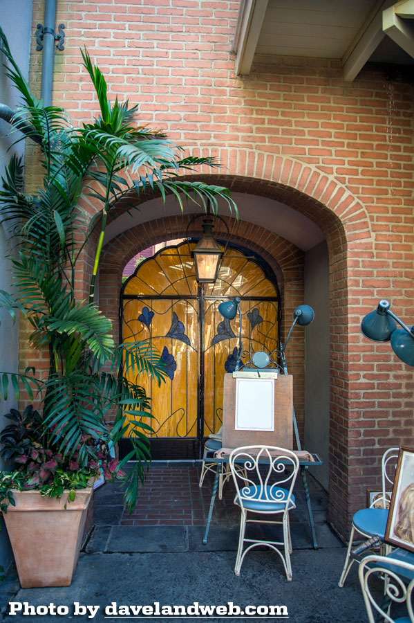
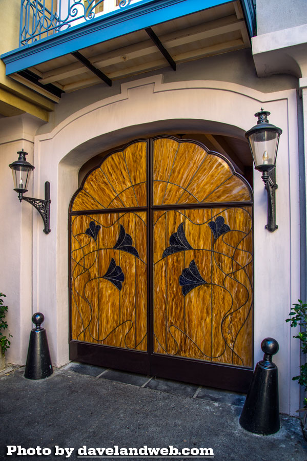
One of the worst offenses is this ostentatious entrance to Club 33.
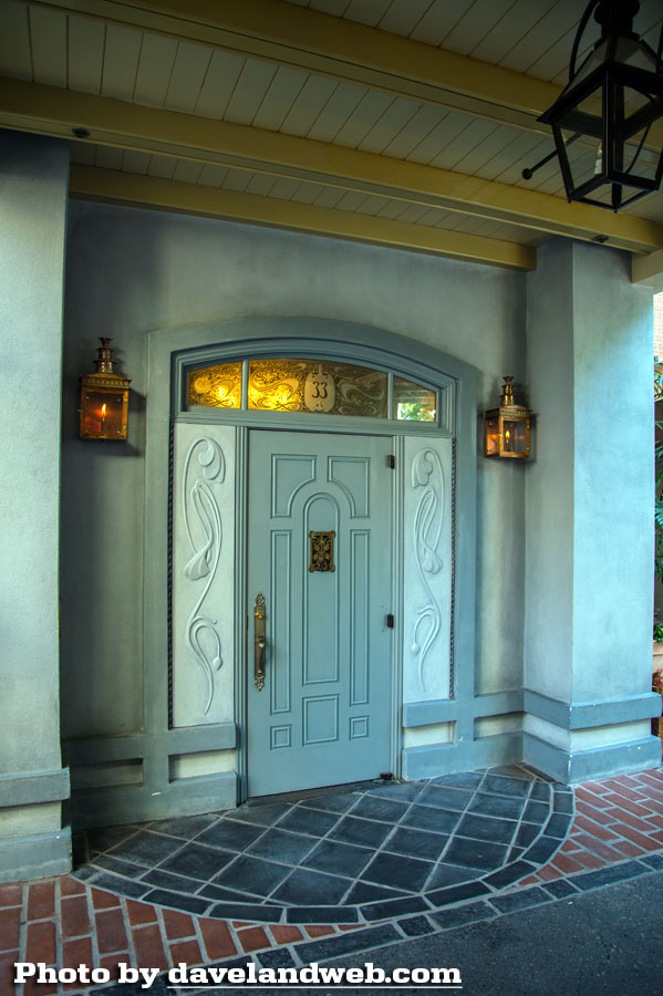
What was once a not-so-secret secret that casually blended into the background is now visible to all who walk by.
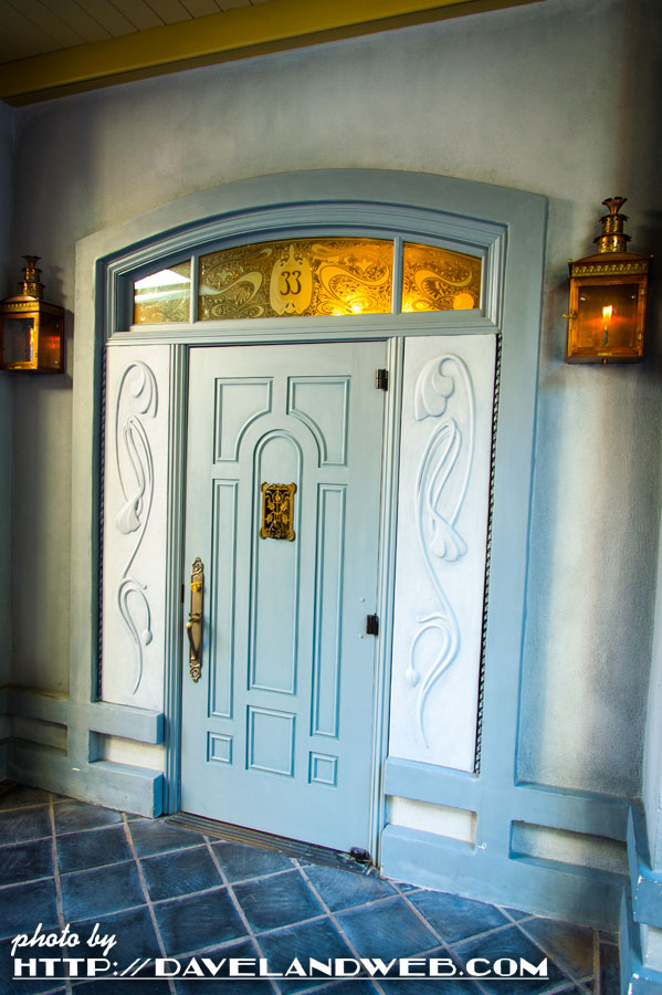
Here's what was there previously:
I believe this little grate on the door is an actual antique or a recasting of one, as I own one myself.
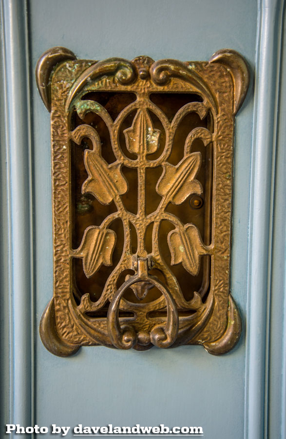
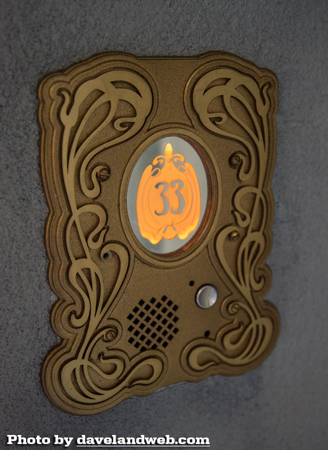
The doorbell doesn't quite mesh with the antique grate. It is a somewhat modern take on Art Nouveau:
These poorly executed stained "glass" (aka acrylic) doors also hurt. Nothing vintage or charming about them. Again…I am expressing a matter of taste. I am sure there are those out there who love these (BESIDES the people who designed them).
Meanwhile, changes to the Royal Court are occurring. Not enough progress to know what the Imagineers have in mind here.
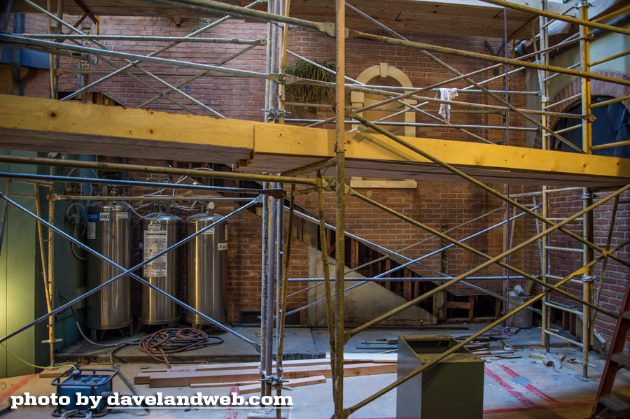
What it formerly looked like:
What do you think of the "new" New Orleans Square?
See more Daveland vintage & current Disneyland New Orleans Square photos at my main website.

6 comments:
I think it sucks!
Ken - I could not agree more with your eloquence!
What a mess!
the facade can at least be painted
"Not one that looks like it had been decorated by a salesperson at Home Depot or Michael's Craft Store."
I never tire of how you put things. Dead on. Each of the exterior walls of the add-ons remind me of the videogame Roller Coaster Tycoon where you can just drag and drop pre-fab wall textures with generic textures. Those all look like "generic New Orleans texture #31" to me.
I've been booted from Disney fan forums for offering my 2 cents about this and am flabergasted at how many people choose ignorance over knowledge. They've openly said they don't care about whatever was there when Walt was building the club, they think it all looks nice. Ha, like a Disney cruise ship only it's not!
I've been there since the re-open and while I'll admit it's brighter, I'm 100% positive that Imagineers could make it brighter AND keep it well themed and hidden from the outside if that were their goal. The wide open exteriors here serve only one purpose and that's to showcase what ( and who ) is inside for the purpose of drumming up new members.
Why new? Because the cost to join is 3x what it used to be and TDA perceives the rightfully disgruntled previous members as a bunch of grumps. TDA would like to replace those members ( who were rich in the knowledge of Disney history and their love for what Walt did ) with newer members who don't care about knowledge and just open pocketbooks to write big checks. ( Read: richer and unconcerned with history )
Post a Comment