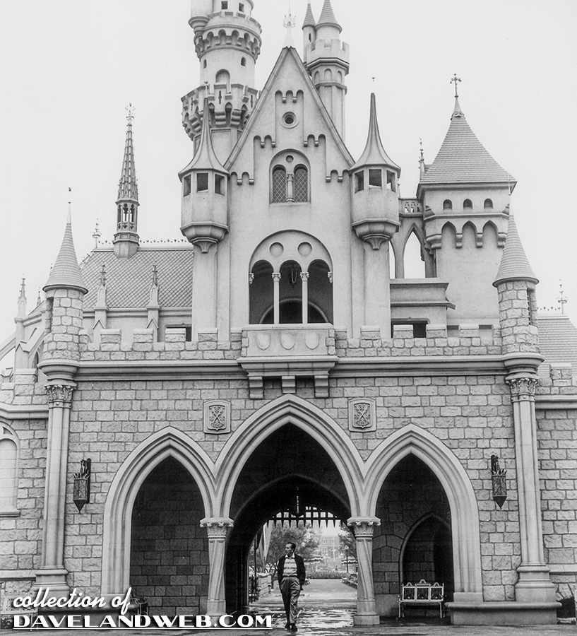
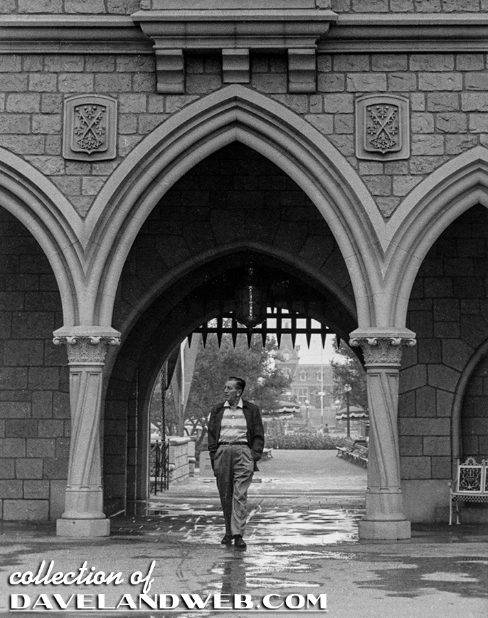
When it comes to collecting vintage Disneyland images, shots of the Castle are pretty much a dime a dozen. Almost EVERY visitor of the park has taken a shot of the Castle with (or without) their entourage. Still, there are certain angles of this Anaheim icon that will generate a moderate amount of interest for me. Most have seen this image of Walt by photographer Renie Bardeau; what makes it cool is that it shows the BACK side of the Castle.
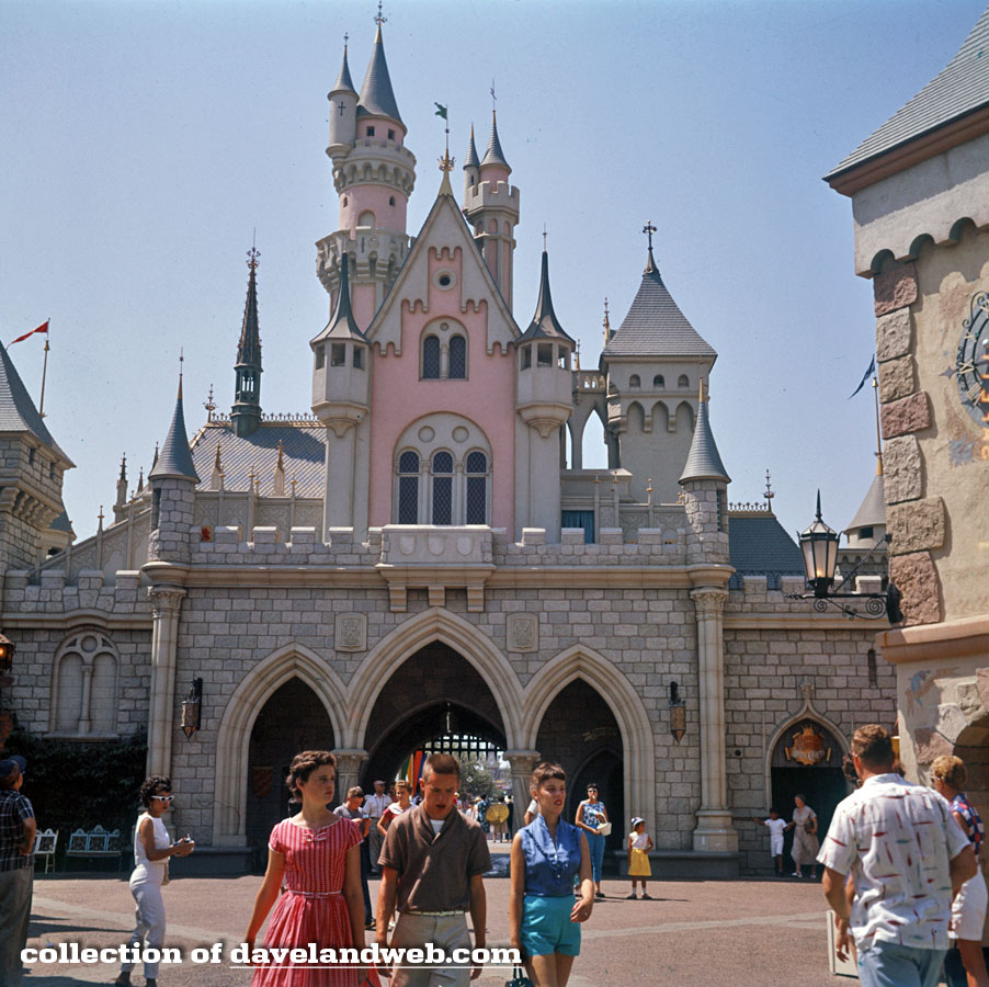
This recently acquired image also shows the back side of the Castle...IN FULL COLOR! And from the 1950's, to boot!
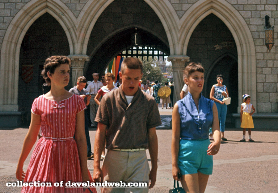
Zooming in gives us a better look at the vintage outfits, as well as the reprobate mother on the right with the cigarette hanging out of her mouth. Shameful!
Just in time for the 50th, the Castle was painted a Pepto Bismol shade of pink.
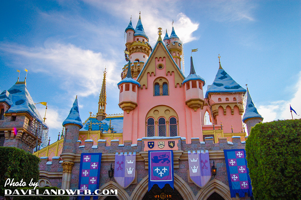
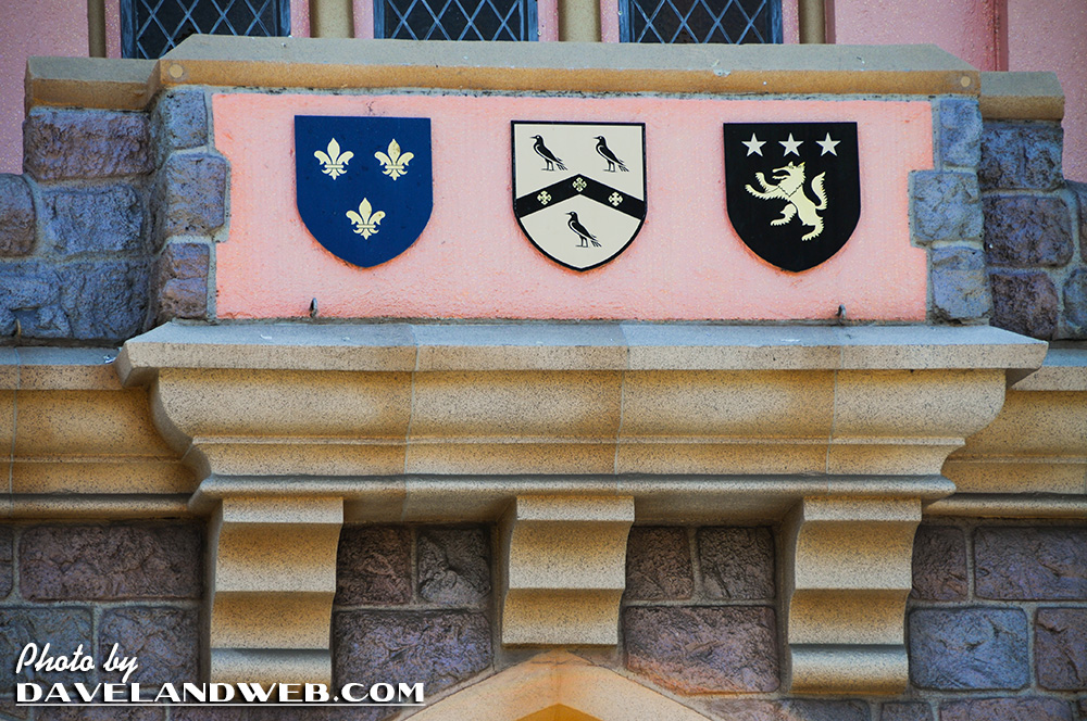
Although they were blank in the early years of the park, the 3 medallions now have a design on them.
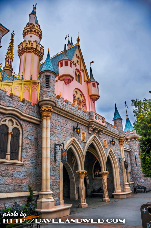
A 2011 side view:
And one of my famous FauxD© images of the Castle from 2012:
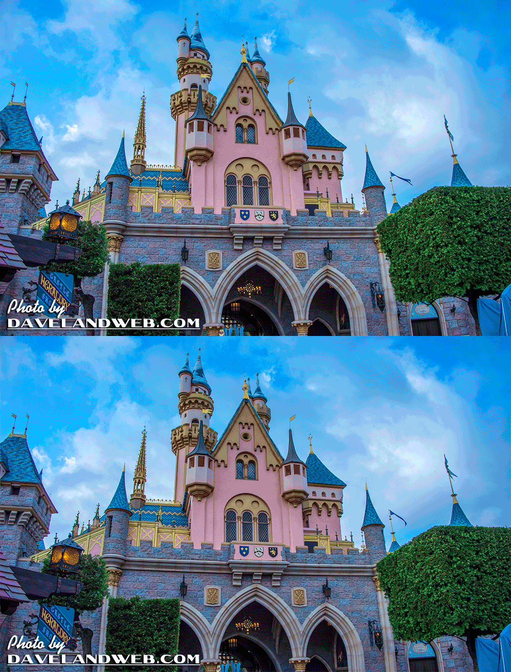
Next time you're at the park, make sure you look at BOTH sides of the Castle!
See more vintage & current Sleeping Beauty Castle at Disneyland photos on my Castle web pages.

Love that vintage picture! But oh, that pink on the castle today - yeesh.
ReplyDeleteI read somewhere that the back (north side) as featured here was originally intended to be the entry (south) side, and was switched around in a design meeting.
ReplyDeleteBut that might only have been the upper parts of the towers (pink), since the rockwork and the drawbridge seem well-suited as they are.
I really object to the current lurid colors, even though Mad King Ludwig's example and other Bavarian architecture did use some bright colors.
This building is really a superior design, it's quaint without being too cute (looking at Fantasy Faire here) and authentically detailed without being quotational. I hope it is maintained forever since it could no longer be replaced with the design talent currently aboard (Fantasy Faire anyone, anyone?).
JG
The third image is perfection. Beautiful subtle colors and not overly decorated. I think somewhere down the line Disney has forgotten the beauty of simplicity.
ReplyDeleteAccording to Herb Ryman, he flipped the model around right before Walt came into the meeting. The other imagineers freaked out saying Walt would hate it. When Walt said "I like it better that way" everyone suddenly loved the idea...
ReplyDelete