
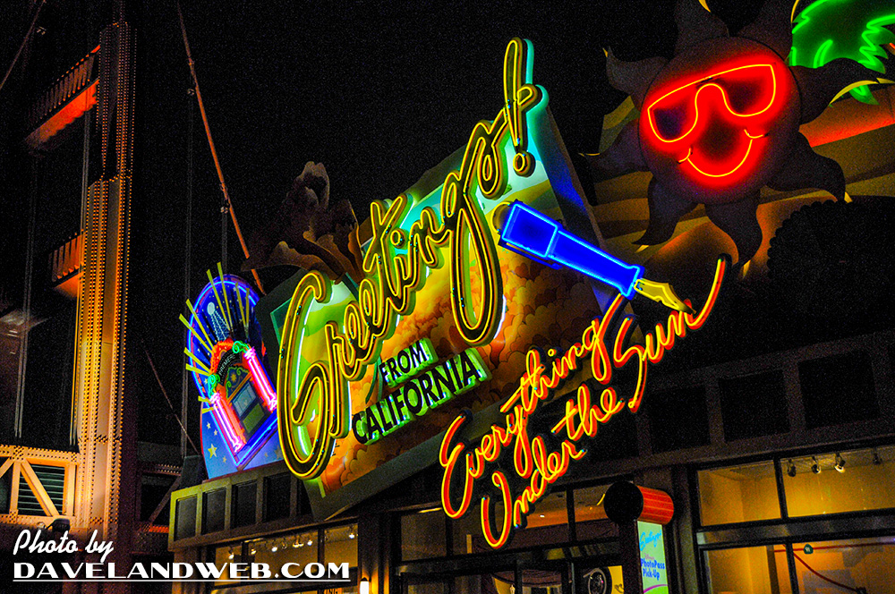
When Disney California Adventure opened in 2001, the entrance area was known as the Sunshine Plaza. Gigantic letters spelled out the name of the state for the guests walking towards the turnstiles of Disneyland’s neighbor. Excitement ran high when the 55-acre theme park was added to the Disney portfolio in Anaheim. It didn’t take long for guests to figure out that this place was not created with the thought, care, and creativity that made Disneyland such an enduring favorite. The letters out front should have been C-H-E-A-P.

I drove two hours for this? I could have gone to the nearby mall.

Ooh…neon vomit. So charming!
The one appealing portion to me was the California Zephyr car which was repurposed as retail and (very basic) dining opportunities. Along with the retro styling of the info booth (patterned after the Union Stations of yore), there was a slight (VERY slight) feeling that you’d entered the past.
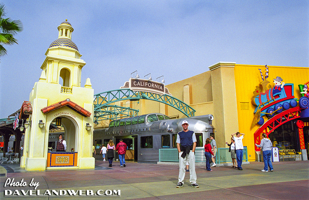
Once you saw the retail/food offerings, any illusion you might have experienced was quickly shattered.
The city of Anaheim was not happy about the underperforming Park, which did not meet the tourism revenue projections that Disney had promised. In order to repair potential repercussions (and yes, some nasty ones were on the horizon for Disney), DCA went under a major overhaul less than ten years after its initial opening. This September 2011 photo shows a very happy site: the destruction of the Sunshine Plaza.

The new entrance, modeled after the long-gone Los Angeles Pan Pacific Auditorium gave an indication that Disney was going with a retro theme for their entry area, versus the Tacky Tourist one that had been initially adopted.
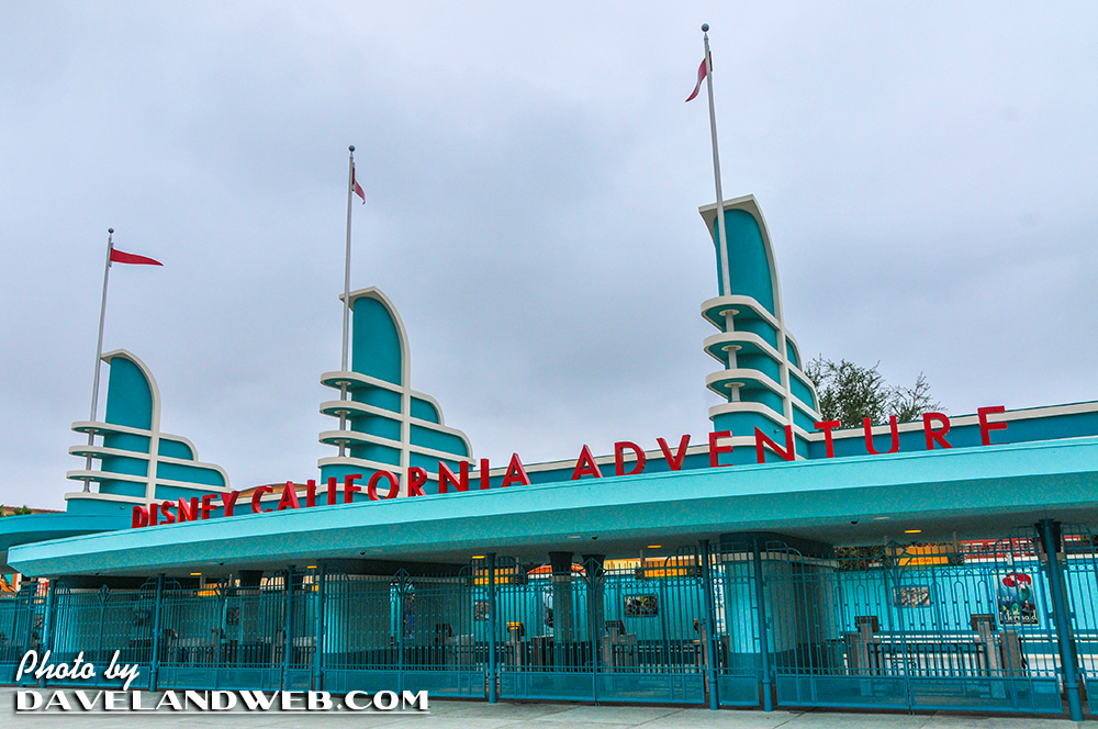
The reason this retro theme is so appealing is that it offers guests something they cannot experience: the past. DCA’s initial bomb can be chalked up to this: who would want to pay to see a cheaply done version of California when for the same amount of money, you could visit any one of the cities poorly represented all within driving distance? EPCOT succeeded because a plane trip across the ocean is not attainable for all; thus, being able to sample flavors and shopping from those countries within walking distance is appealing, even if they have been Disney-fied and boiled down to their lowest common denominators.
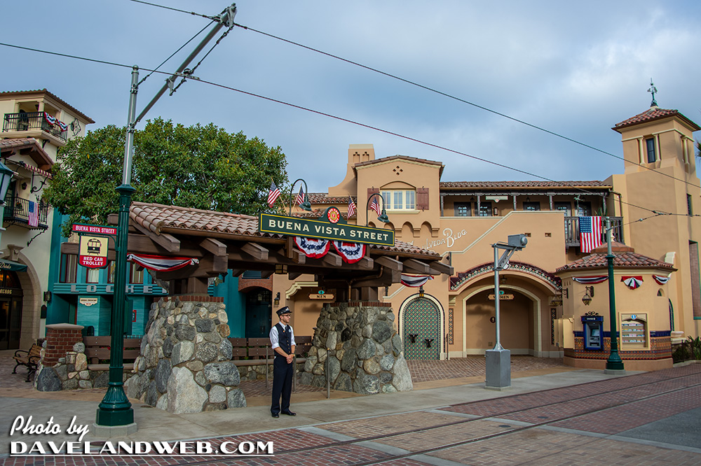
I was immediately captivated walking down the newly opened Buena Vista Street (named after the road in Burbank to which Disney moved the Company in 1937) at DCA when it was unveiled in June 15, 2012. Yes, I was there!
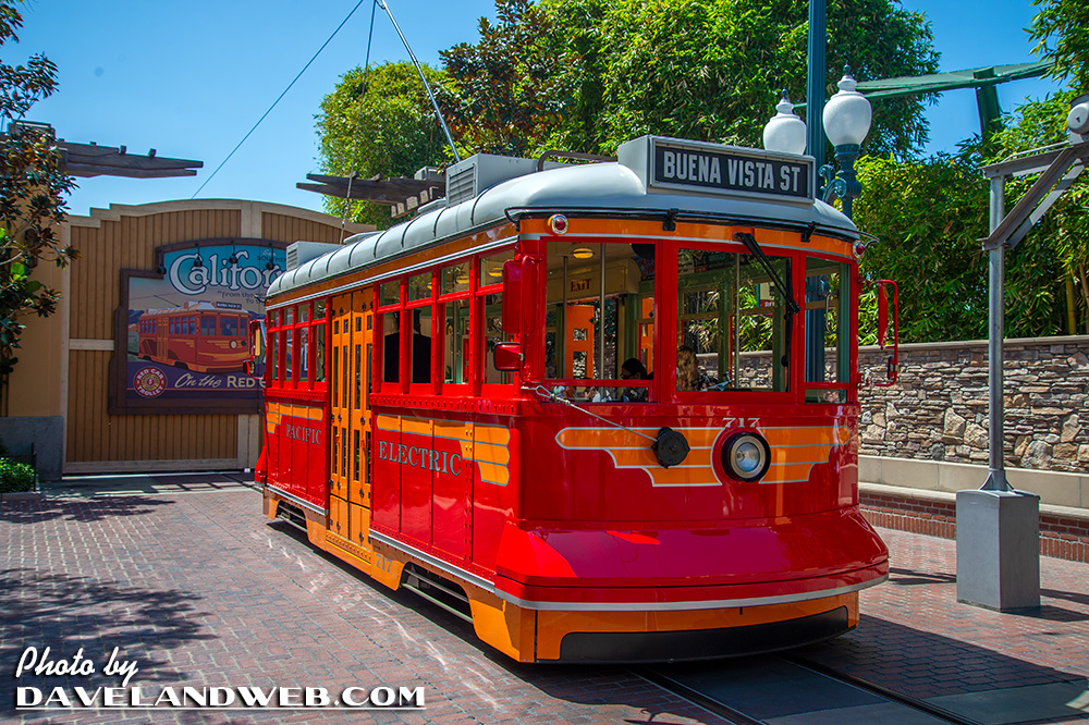
The trolley at the entrance added an element of movement that was missing before. It shuttled guests from the entrance to the Hollywood Tower of Terror Hotel (remember that attraction?).
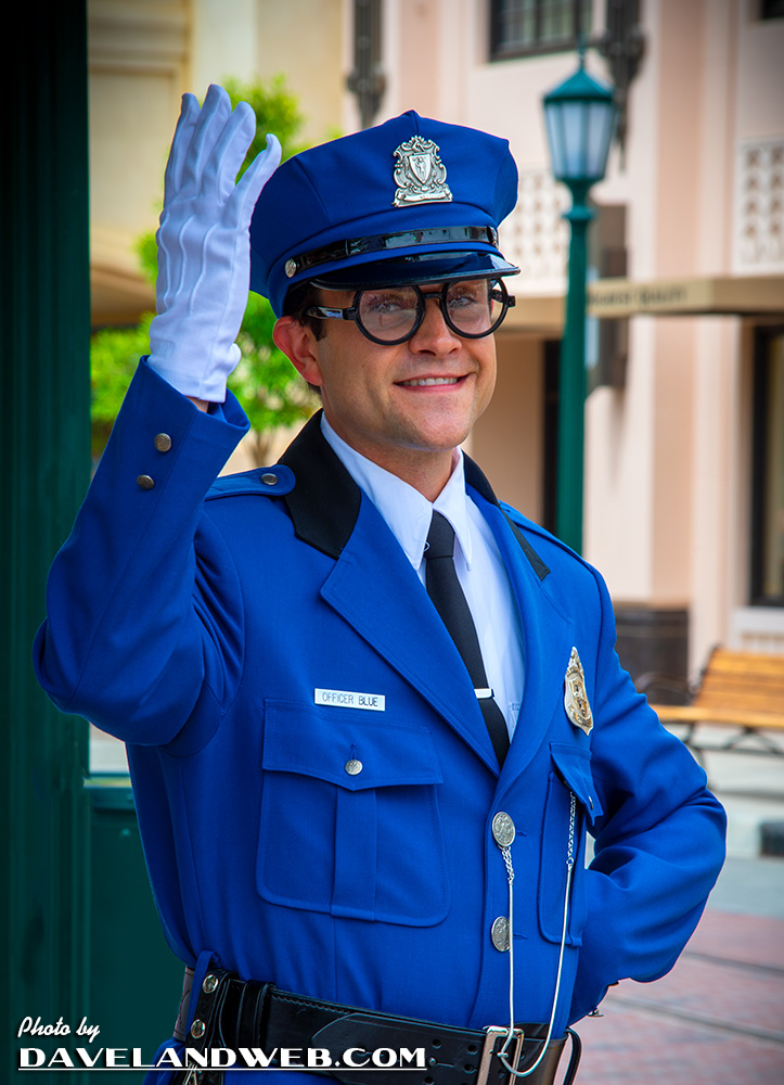
Appropriately themed 1930’s characters like Officer Blue were found here.
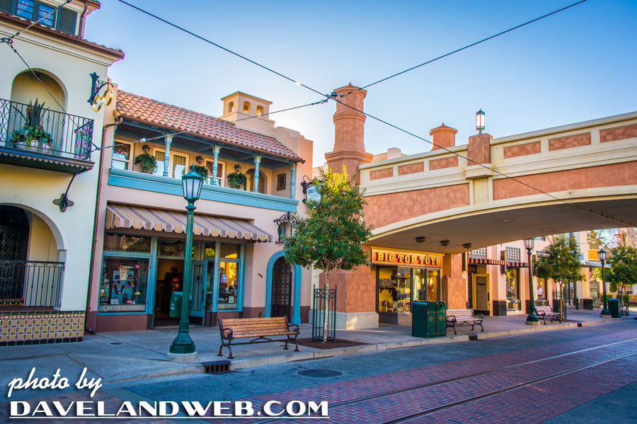
The architecture of Buena Vista Street was inspired by the Los Angeles/Hollywood area of the 1920’s/1930’s. You know, the buildings that get torn down to be replaced by mixed use high rises and parking lots.
The main retail store, Elias & Company looked like the Department Stores of yore:

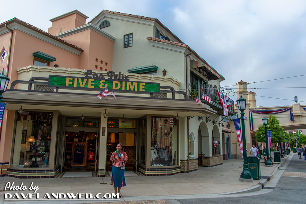
Other retail stores mimicked the shops one would have found back in the day with appropriately themed retro window displays.
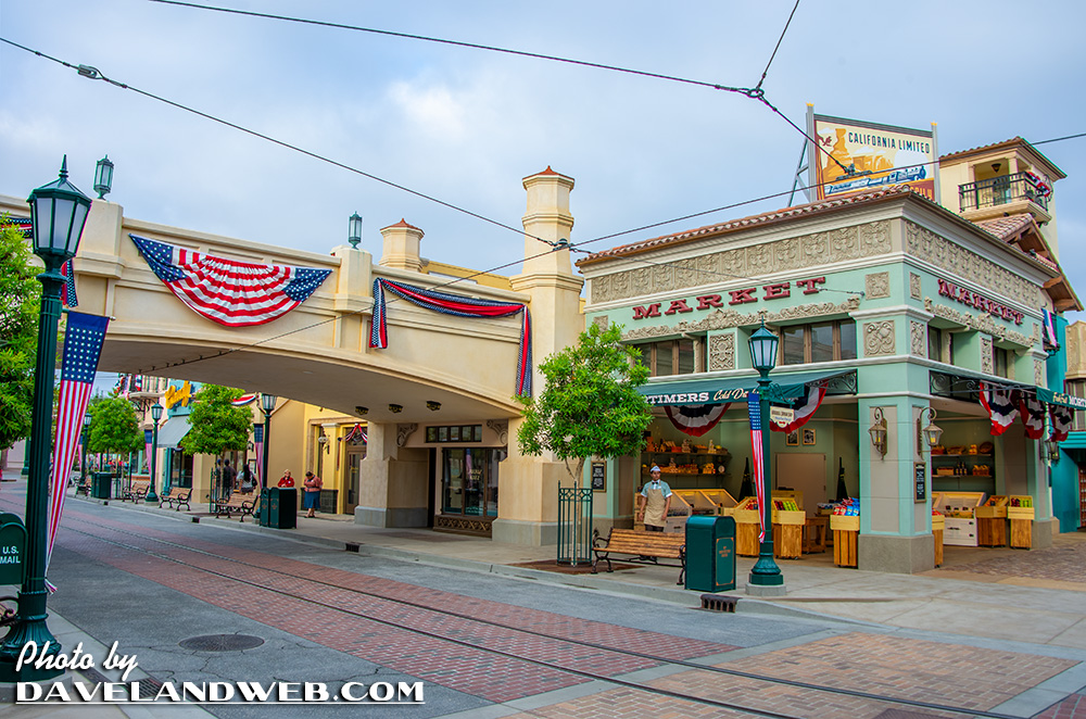
A cool vintage car at a gas station…oh wait, it’s actually a place to buy plush.

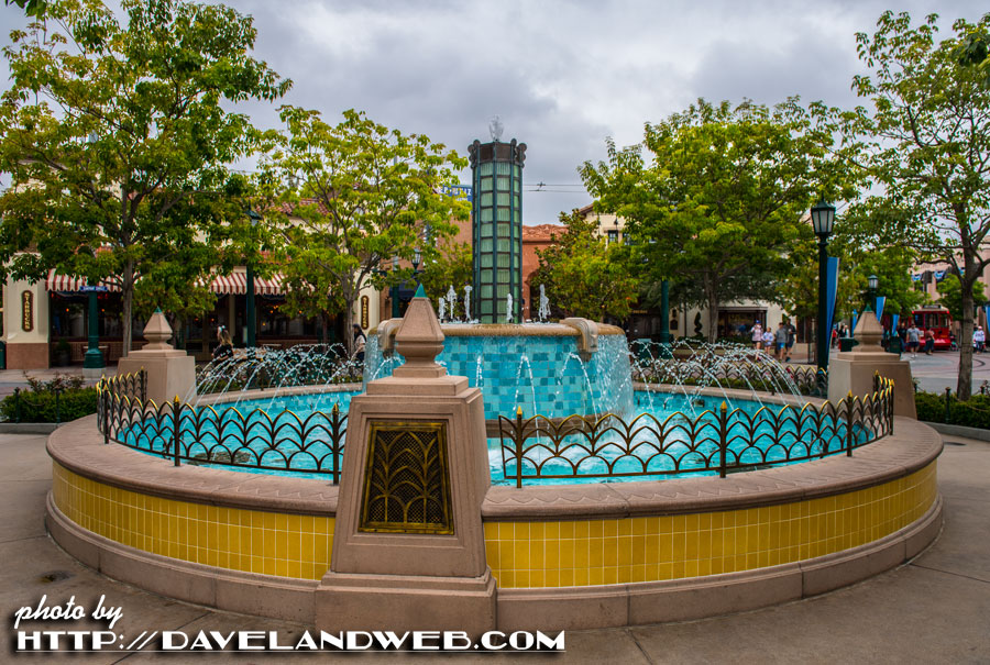
The center hub has this beautiful fountain; a great place for meeting the friends/family…
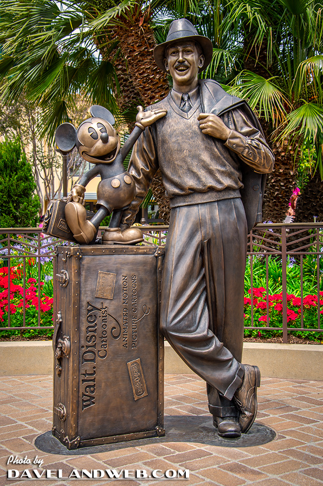
and a statue of Walt and Mickey, as they might have looked when they first arrived in California. A nice play on the Partners Statue at Disneyland’s Central Plaza.
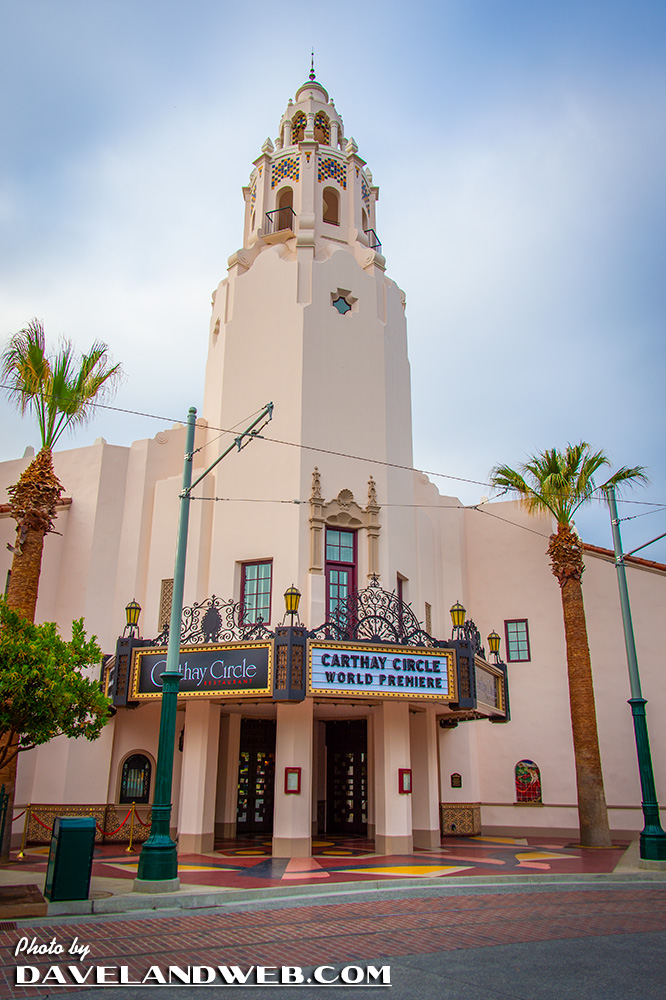
The showstopper of the new area was the scaled recreation of the Carthay Circle Theatre (yup, demolished years ago for a parking lot) that once held the premiere of “Snow White” in 1937. For DCA, it was a restaurant and lounge.

The interior was lavish:
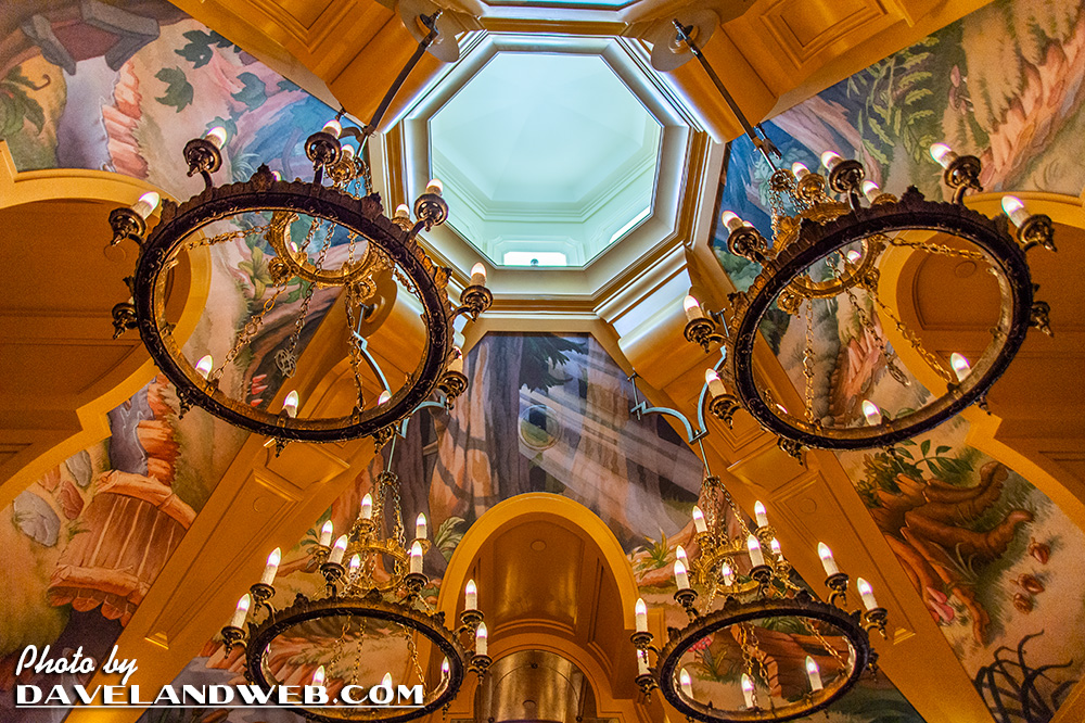
…and the food delish!

For the report card, was it an improvement? Definitely! And yet, a large portion of the remodel seemed just as hollow as its predecessor. Once you walked through the doors of these impressively detailed historic façades, the same bland food, beverage, and retail opportunities that you found elsewhere awaited your wallet here. Would it have been that much extra work to create an old fashioned ice cream soda shop with a counter, vs. the standard winding queue where you can get…wow, a Dreyers cone/sundae? Or a department store that perhaps offered a section with vintage clothing in addition to the cheap t-shirts and other crap that’s normally sold onsite?

C’mon, Disney…go the extra step or two and show off the creativity that used to be your hallmark!
See more DSC Buena Vista Street photos at my main website.

It's concerning that Disney Parks' Golden Age seems to only exist in hindsight. They've lost their "Top Theme Park in America" spot to Dollywood (which is a quaint little park, but nothing like Disney used to be). I personally think they became over extended with all the overseas ventures and new IPs (which they feel obligated to cram down guests' throats).
ReplyDeleteI wish they would focus on their core and hire and promote truely creative people. Unfortunately, I've seen little of that lately.
Rant over.
Agreed with Stu. Dollywood has the reputation of being on point. Recent Disney have really endeared me to Knott's Berry Farm in Universal Studios much more. The California Zephyr was pretty cool but I never felt it was executed properly. It ended up being used as a facade for what's in the building. It would have been better if they had one or two rail cars next to each other producing one room out of them. Just my opinion. The corrugated metal of the buildings on either side could not be dismissed as theming no matter how much Disney would claim that was their intent all along. No, it was just cheap. You could argue that the Grizzly Flats Airfield or whatever it was called back then would use corrugated metal but not the rest of Main street. Terribly ironic that Real historic structures are torn down so that faux representations of them can exist instead. At least you can enjoy the Brown Derby in a Disney park I guess. I loved their wisdom of putting a small fence around the fountain after 2011. We don't live in responsible times anymore. Frankly I'm surprised nobody's scaled that thing and jumped in the fountain anyways. Check the news next week for an update. The most important thing about that project was some acknowledgment that the past is where people would rather see. Brilliant.
ReplyDeleteStu - spot-on assessment. Roy was the $$ guy and Walt was the creative; the two balanced each other perfectly. Today, there is no checks and balances system at that high level. Instead, the $$ win out.
ReplyDeleteBryan - The Brown Derby was one of the joys of my 2010 WDW trip. As close as one can get to that now.