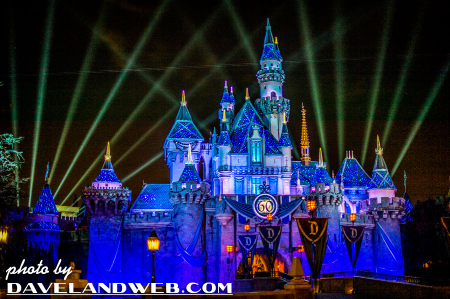
Through one of those serendipitous twists of the Universe, I virtually met Jason Petros from EarzUp Podcast. I have been a guest on their show twice, and had a blast both times. The first episode was a lot of loose chat about the Disneyland resort and my vintage collection of shots. My second visit centered around the vintage attraction The House of the Future. After my portion of the podcast, the rest of the show was a discussion about “5 Disneyland Details We Love (and 5 we hate!).” It’s always interesting to me to hear the opinion of others about the Park. I thought it would be fun to illustrate the EarzUp quartet’s comments with photos from my collection. I will begin with the areas that they hated need some help (trying to put a positive spin on it!), and follow up with those that elicited feelings of love. There were a total of 17 areas that the EarzUp team thought needed help, and I have to say I agree with every one of them.
1. Defunct attractions that are never funct! Carousel of Progress became America Sings which became…nothing...then Innoventions...then Star Wars Launch Bay... The Disney Corporation keeps putting something in the Carousel building just to fill the space, but not something people actually want to go to. Something of substance should be put there instead!
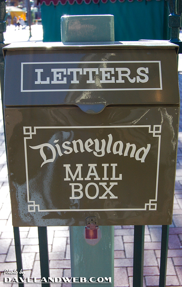
2. U.S. Mail Boxes: Love that they have them, but hate dislike that they don't sell stamps at the Park or postmark the letters from Disneyland anymore. What's the point of having them? Without the Disneyland postmark, they have lost their magic.
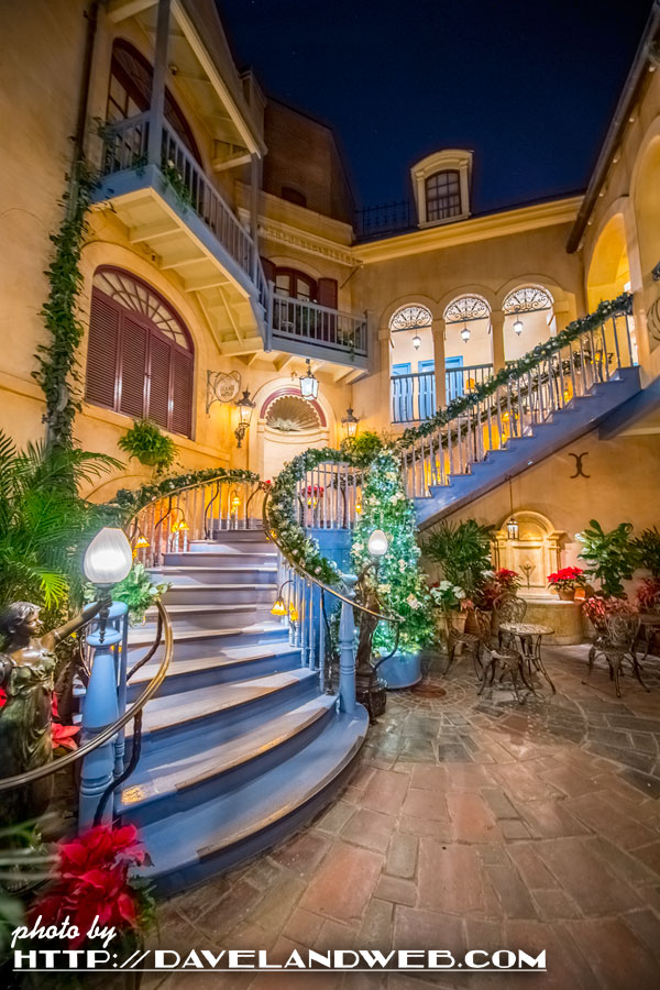
3. The blocked off Court of Angels in New Orleans Square: which is now the waiting room for Club 33, proving once again that the wealthy will always take from the common folk! A class warfare kind of thing. But… it is fun when you're on the other side!
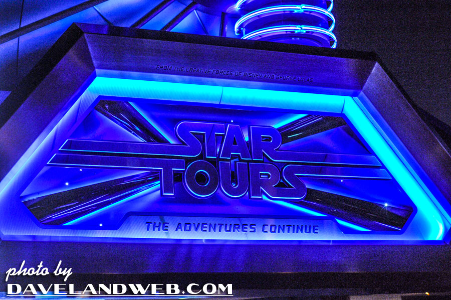
4. Star Wars in multiple places. Star Wars has an entire area, but still has overflow in other lands. “The joy of Star Wars is the unknown of Star Wars. We don’t want it rubbed in our faces.”
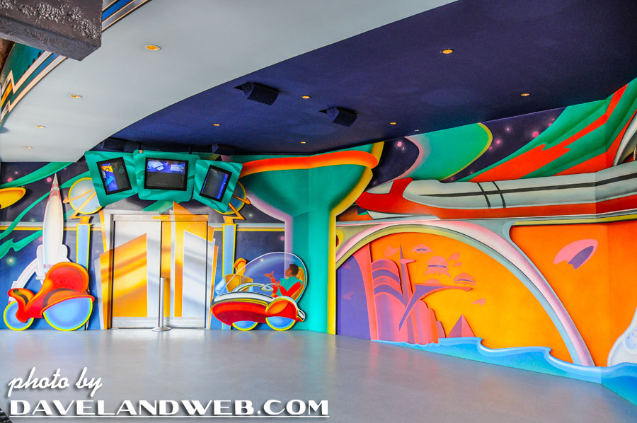
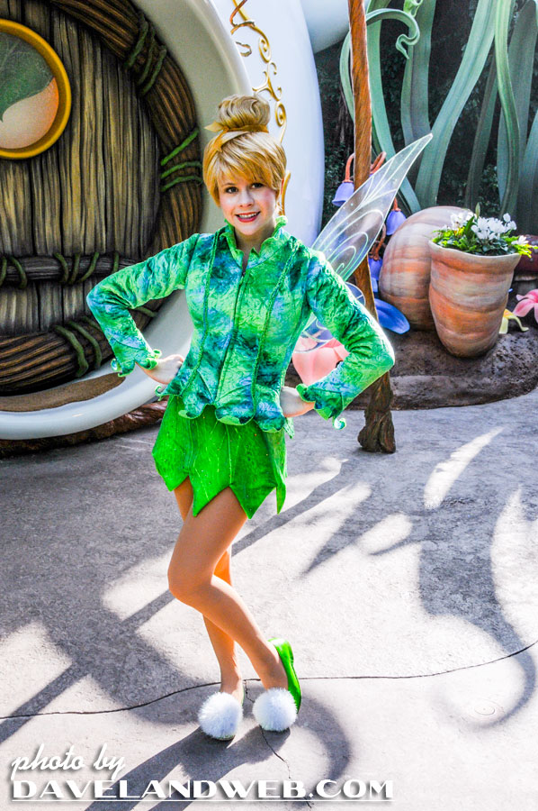
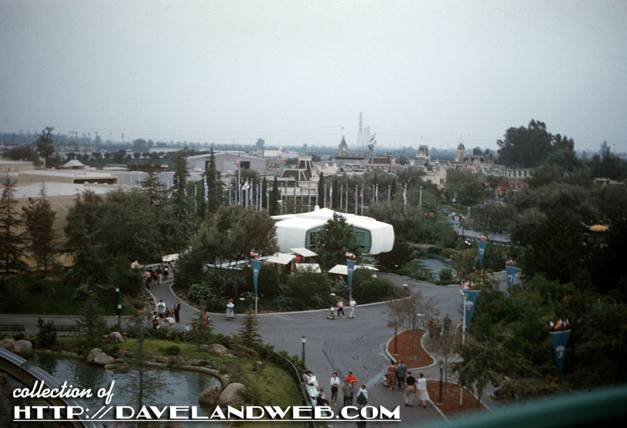
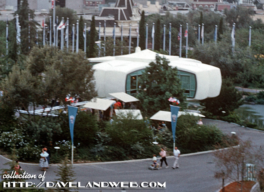
5. Pixie Hollow: For us vintage Disneyland geeks, this one is extremely painful, since the House of the Future was once located here (seen below in this November 1959 image):
Pixie Hollow is the worst…you stand in line, go to different sections, and take photos with the “fairies”; it’s shady, but still sunny, and it’s just plain dumb.
6. The small world attraction ceiling: it’s just painted black and you can see the air vents, HVAC tubing...why not put up a false ceiling or a drapery to hide and help the immersion?
Want to “see” the unedited podcast and get a sneak peek of the rest of the show? Here you go…

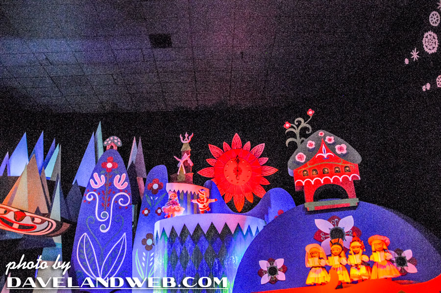
Wow, I didn't know that this had happened a week ago and I feel bad about it but I'm grateful you posted it now. The way my work goes it'll take me all day to listen to two hours of this intermittently between other things, but 12 minutes into it I love what I've heard. I'd have to agree with the ceiling tiles. That's always been my number one. Sure there's plenty of other things to take issue with when it comes to a Disney attraction you expect the highest standard and here we are with ceiling tiles that look like they're from a high school cafeteria. It's the most on Disney like thing at Disney.
ReplyDeleteI'm still laughing at detergent next to sugar. That was a similar plot element in 9-to-5.
ReplyDeleteBryan - You really need to be careful with that Skinny and Sweet product!! Funny…I just watched that movie again yesterday. Still a classic.
ReplyDelete