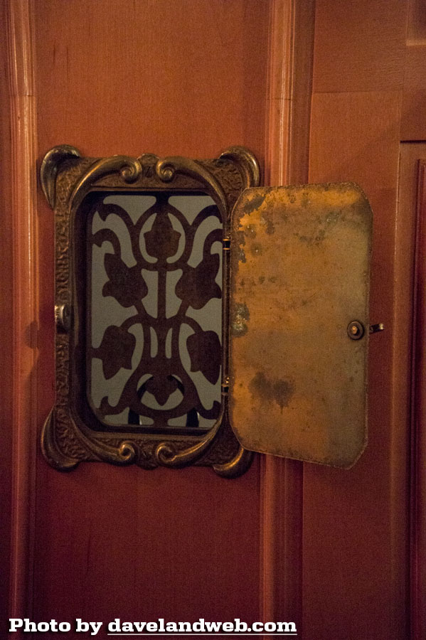
Sorry to split the Club 33 visit into multiple posts, but there is just too much to cover in one entry. Note the antique speakeasy door on the new entrance; strangely enough, I bought one of these years ago at a San Diego antique salvage store. It must have been a popular design. It's a small thing, but I like having this somewhat rusty little door here. Overall, New Orleans Square looks too squeaky clean. It has little of the antique charm and decadence that its namesake is known for.
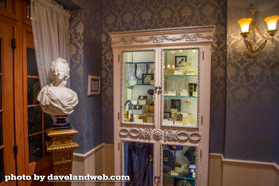
The new lobby has a cabinet with Club 33 merchandise for sale.
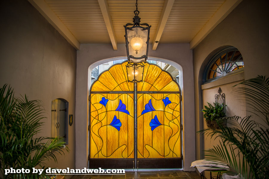
This is a view of the backside of the faux stained glass that separates the regular guests from the Club 33 guests when it comes to the Court of Angels. This still smarts a bit when I think about what a beautiful place of rest, quiet, and photographic opportunity this area once was for all who discovered it.
The irony is that now that it has been closed off and "jazzed up," it has lost its appeal for me. Like so much of the semi-recent Disneyland Park design, the Court of Angels suffers from the mantra of "It ain't done til it's overdone."
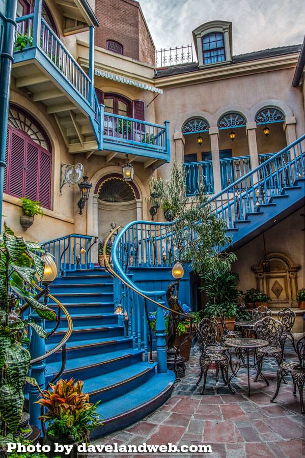
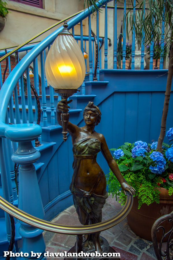
The wooden balustrade looks odd with the addition of the brass one. The woman holding the light fixture is nice enough, but she seems out of place. JUST TOO MUCH.
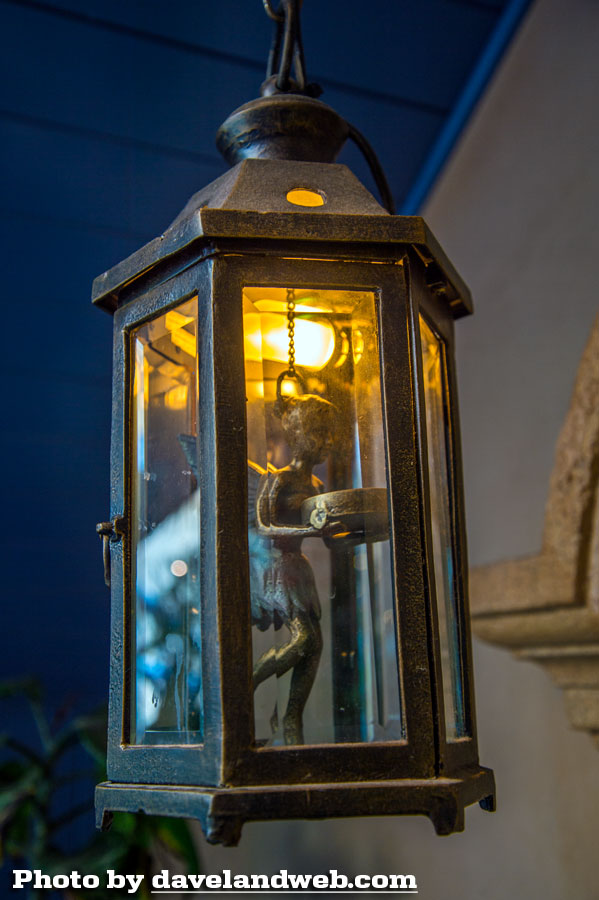
I like the idea of Tinker Bell in the lantern but it would have been more effective if she had been created in a smaller scale.
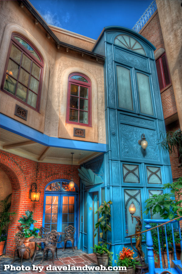
Here's the new elevator that takes you up to the Club. Note how it has been sandwiched into the existing space; why keep the window on the upper-right? It just makes everything look crammed in. Makes me think of sardines.
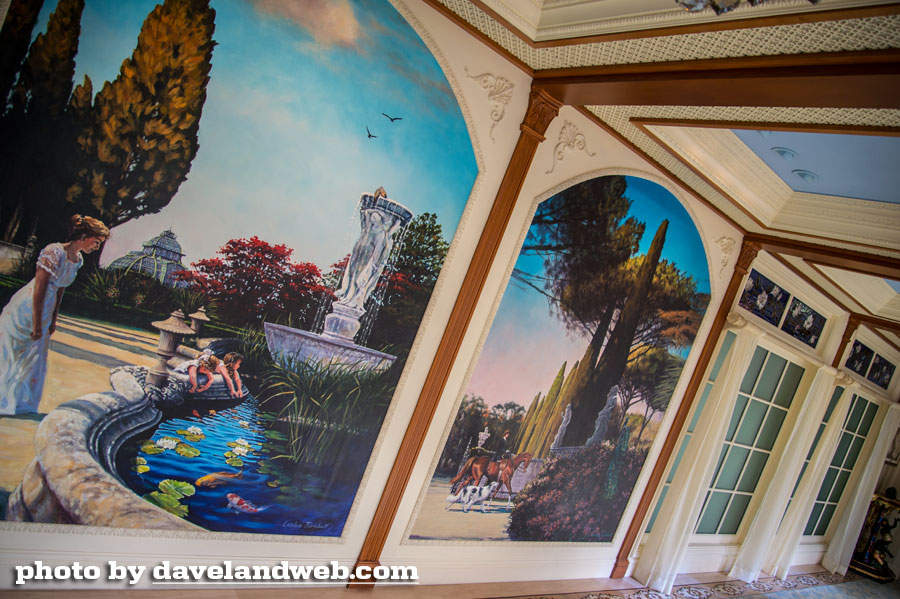
The upstairs hallway features murals that look like they had been freshly minted from a large format color printer.
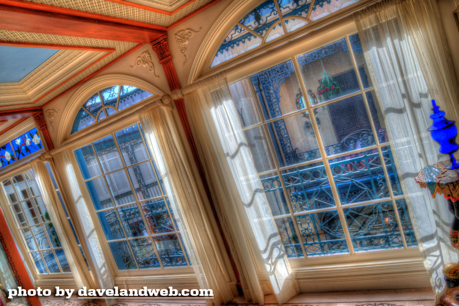
Every ounce of this space has been jam-packed with mass-manufactured ornamentations and scrollwork.
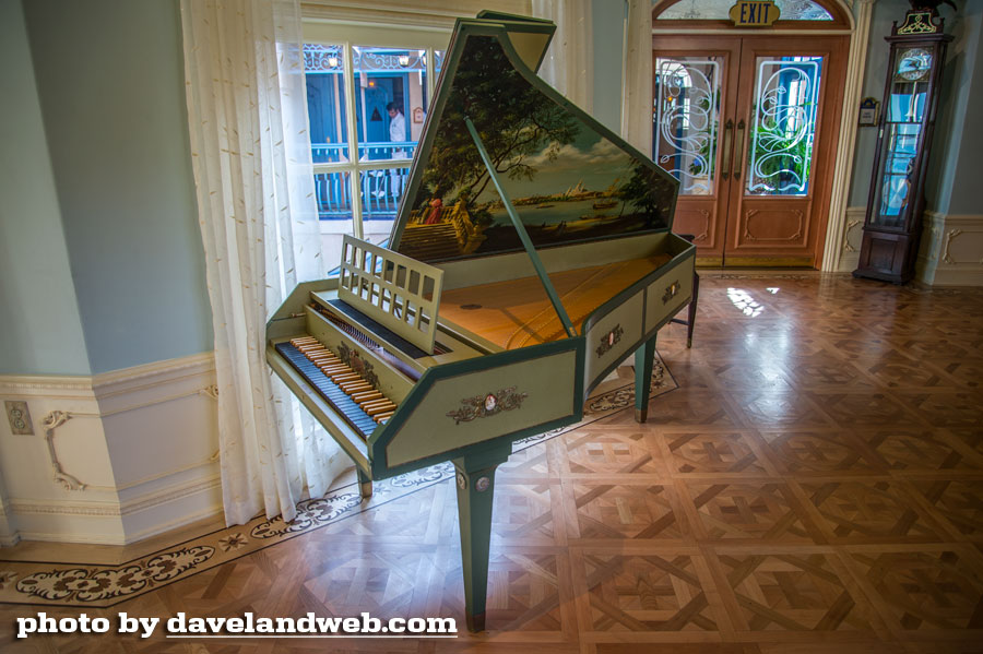
The harpsichord survived the transition, but the accompanying seat did not. In other words...just look, don't touch. The parquet floor is beautiful, but with all of the other details my eyes were exploding from the sensory overload.
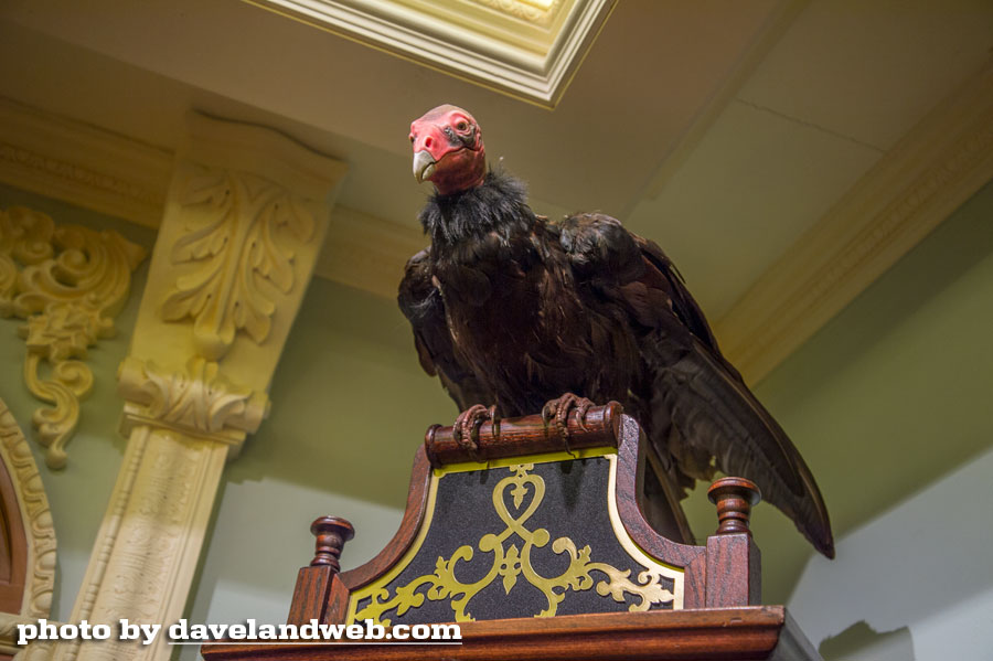
With the Trophy Room demolished to make room for a new kitchen, the vulture was homeless.
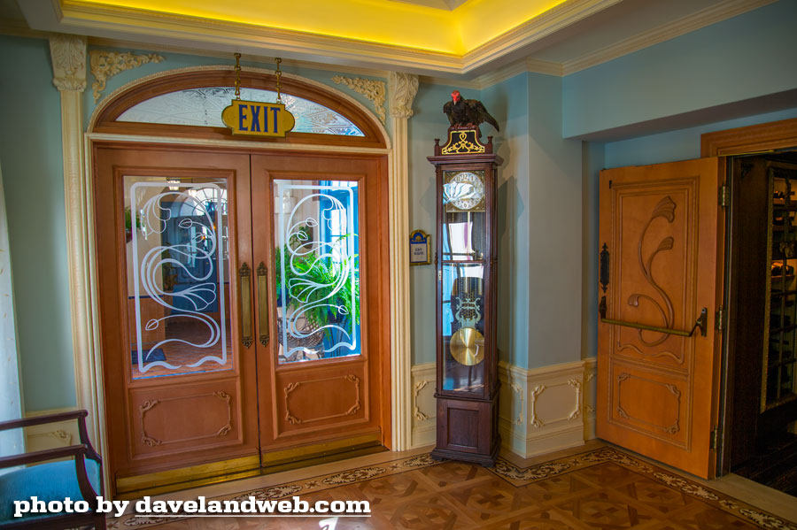
He found a new landing spot on top of this grandfather clock. In a trophy room with dark paneled walls, a stuffed vulture makes sense. In a brightly lit entry way where Art Nouveau meets Home Depot styling, a vulture just makes you go, "Huh?"
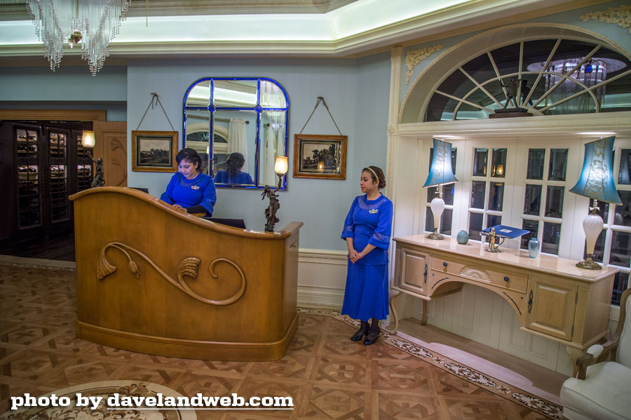
These poor girls in the ill-fitting bright blue dresses must be dying a thousand deaths. Frumpy is bad. Bright and frumpy is even worse.
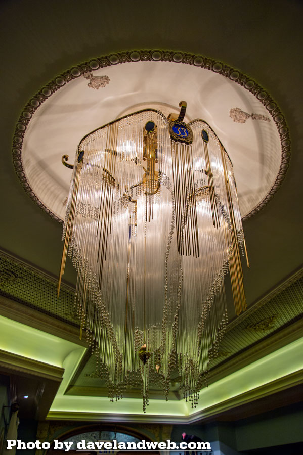
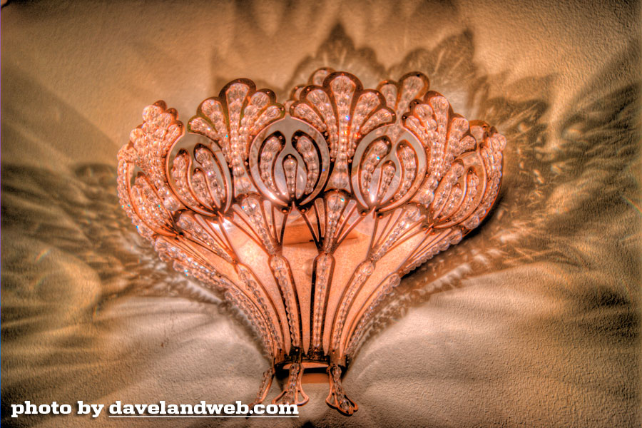
Don't ask me why, but I LOVE these two light fixtures:
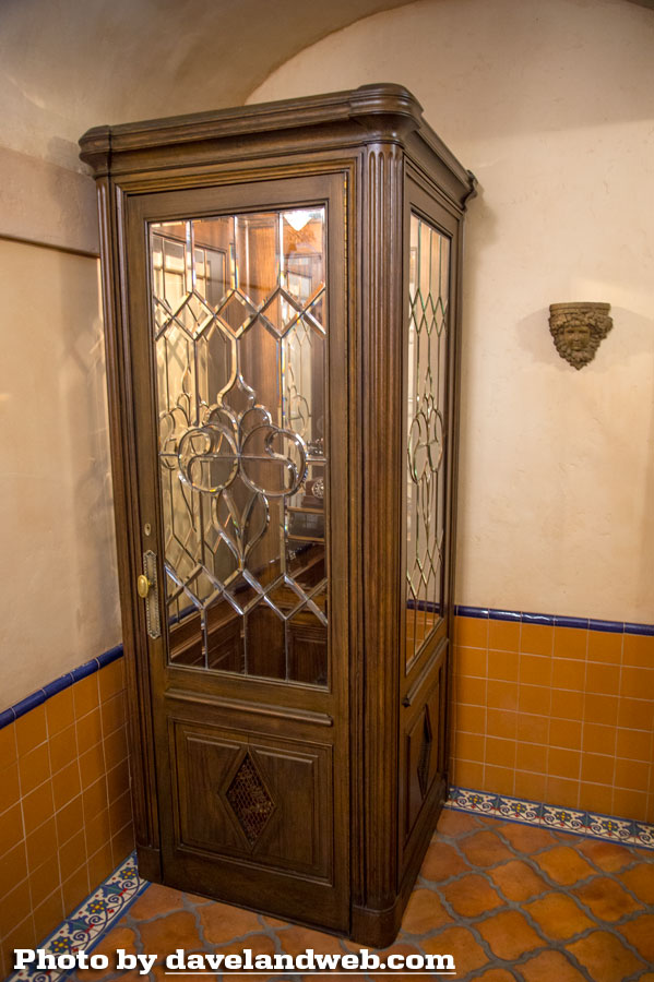
On the way to the men's restroom you'll find this phone booth that was modeled after the one used in the 1967 Disney movie "The Happiest Millionaire."
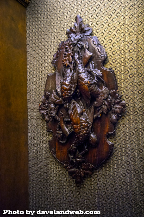
I actually liked the men's room. Go figure. It had the same warm inviting feeling that the old Trophy Room had.
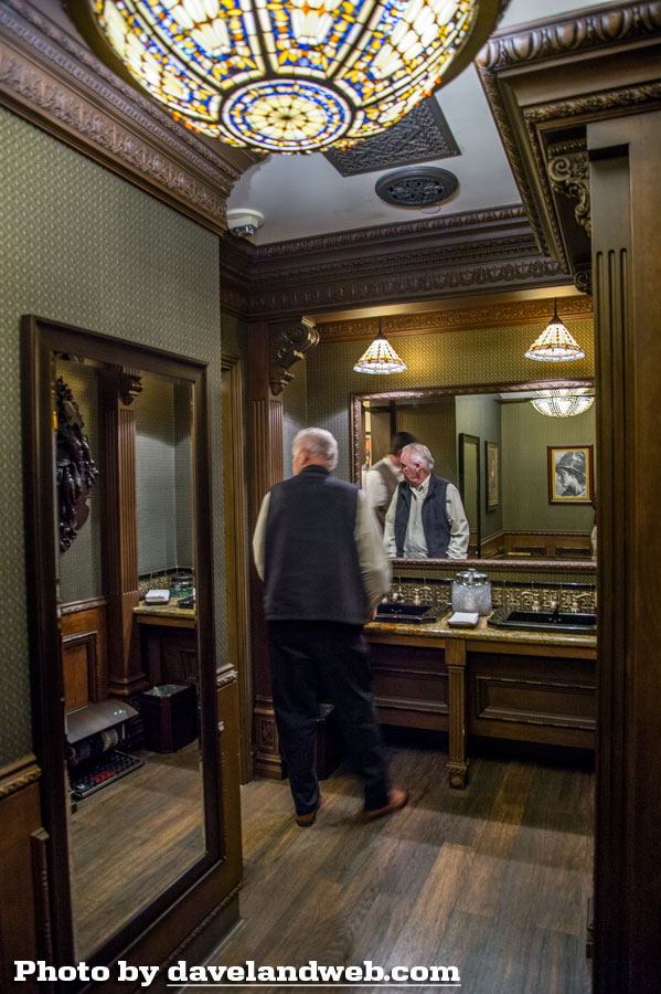
Another survivor from the previous Club 33.
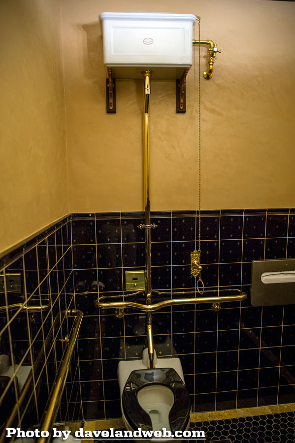
Check out this old fashioned toilet.
Finally, a sense of humor and light-heartedness is displayed.
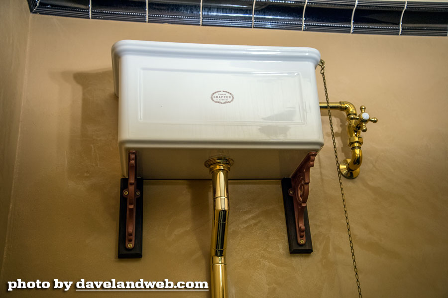
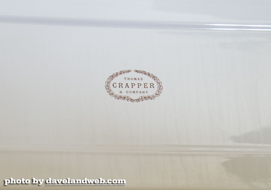
But you have to go to the crapper to find it.
Tomorrow: The Jazz Club!
More vintage and current Club 33 photos at my main website.

Up next from Disney....an HGTV contest to see which amateur team can remodel Walt's apartment best! Extra points for sleek modern design and open concept! I'd better shut up, those Disney design hacks might actually do it!
ReplyDeleteI've never been, but from looking at the photos, it's like they sucked the soul out of Club 33.
ReplyDeleteRandom thoughts.
ReplyDeleteThe bust of Marie Antoinette in the first pic of the foyer was actually made during Marie Antoinette's time and may likely have been seen by her. It was brought back from France by Walt's initial effort to build Club 33 around '65-66 and was on display in the old Club 33's red elevator room.
Agreed about the Court of Angels being overdone. One can hope that in another couple of decades there will be a movement by new management to restore and return things to original color palettes, as the public tires of things having gone too far and societal tastes change.
If you wait long enough the vulture does speak, but the voice is poorly matched to the character. One would expect a Wally-Boag-ish bird voice or perhaps something more fitting to a geographical region where one would find vultures. Instead it sounded more like George Sanders as Shere Khan. I guess London is infested by vultures. Who knew?
yuk.
ReplyDeleteUgh! How dreadful. I still don't understand why they used the ornament shop for the new foyer when instead, they could have used that shop that is next to the elevator. That way they could have had an interior entrance to the elevator and they could have kept the Court of Angels virtually intact...except of course, for the elevator crammed into the corner, but at least the general public could have still had access to this space. They ruin everything, don't they?
ReplyDeleteMy god! I didn't think it was THIS bad!? But, gosh, it truly is! So much charm has been lost, and you are right about the level of overdone-ness with the whole place! The double railing and statue of the woman in the Court of Angels and the flower lights make feel woozy! And you are right, there is a lot of texture and major sensory overload!
ReplyDelete-Janey