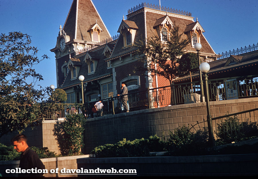
Walking through the underpass and entering Town Square, guests should take the time to turn around and view the other side of the Main Street Train Station.
This is a poster that I am not familiar with; love it though. Wish I could see it unencumbered by the fence.
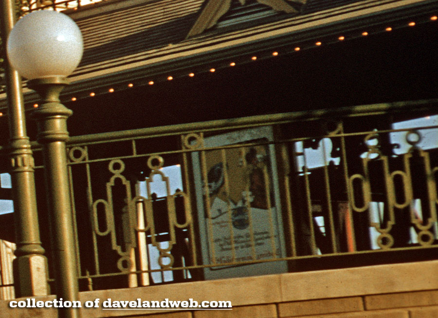
This view is from August 1956.
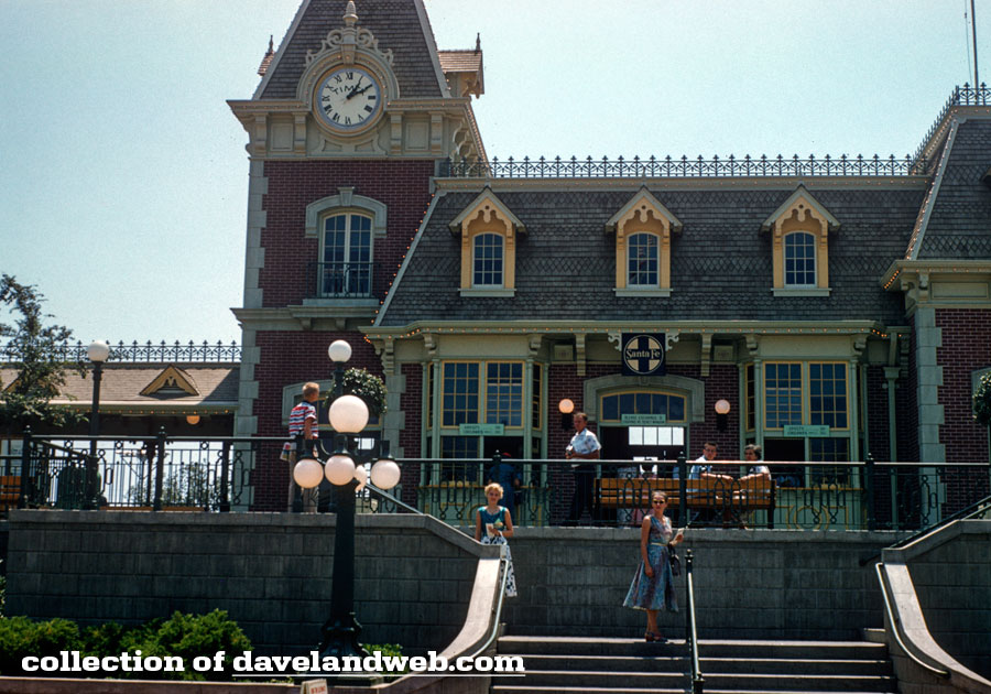
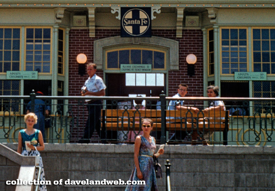
This was back when the building had the Santa Fe logo and signage designating ticket prices.
And the station today. In a rush this morning, so not a great job of matching angles.
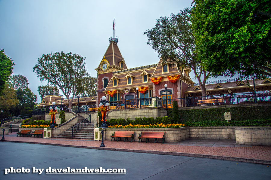
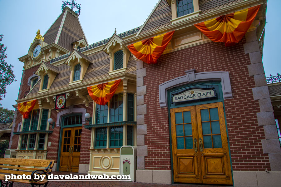
From yesterday's post, I am honoring Ken's request for an identical crop comparison shot:
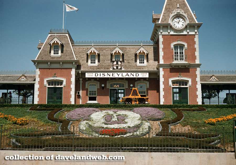
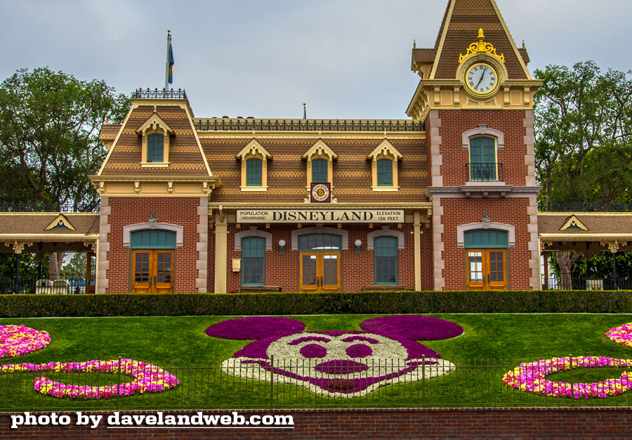
See more Daveland Disneyland Railroad photos at my main website.

The back view of Main Street Station is my favorite because of the way it's situated within the setting of Town Square. Walt Disney and his imagineers really knew what they were doing. Of course all views of the train station are great.
ReplyDeleteI could sit in Town Square all afternoon and be happy just people watching and listening to the arrival and departure of the trains.
Much appreciation for providing the cropped comparison, Dave. I toggled back and forth and notice many subtle differences pretty quickly. The windows are tinted dark and a lot of gold trim has been added. There's also the solid strip at the top of the roofline behind the ironwork that seems be covering up something in the newer version. Perhaps it's covering some sort of stadium style lights. Anyone know?
Thanks again for providing the comparison shots, Dave.
Great comparison shots. I never noticed the more recent gold leaf and 2-toned roof tiles. I can't say I care for it. It makes sense on the castle but not on a turn-of-the-century train station.
ReplyDeleteI like the modern changes to the train station. It's fancier and more Victorian-looking. I also think the trim and banded color roof tiles project a happier and more idealic setting, better preparing the guest for the wonders that await them on the other side.
ReplyDeleteThanks for posting.