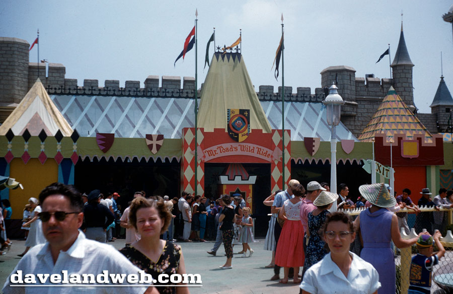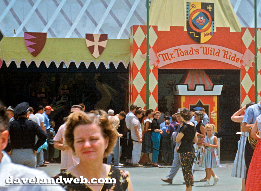
The last slide from this 1955 batch shows the façade of Mr. Toad's Wild Ride attraction.
Zooming in for a rare glance of the Ken Anderson mural that graced the entryway:

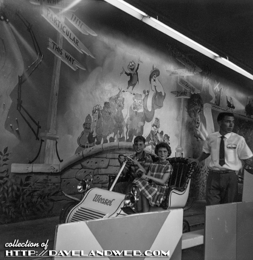
Using this as a transition to the next batch of images, this 1960's BW negative yielded this clear view of young guests awaiting their next trip to Hell!

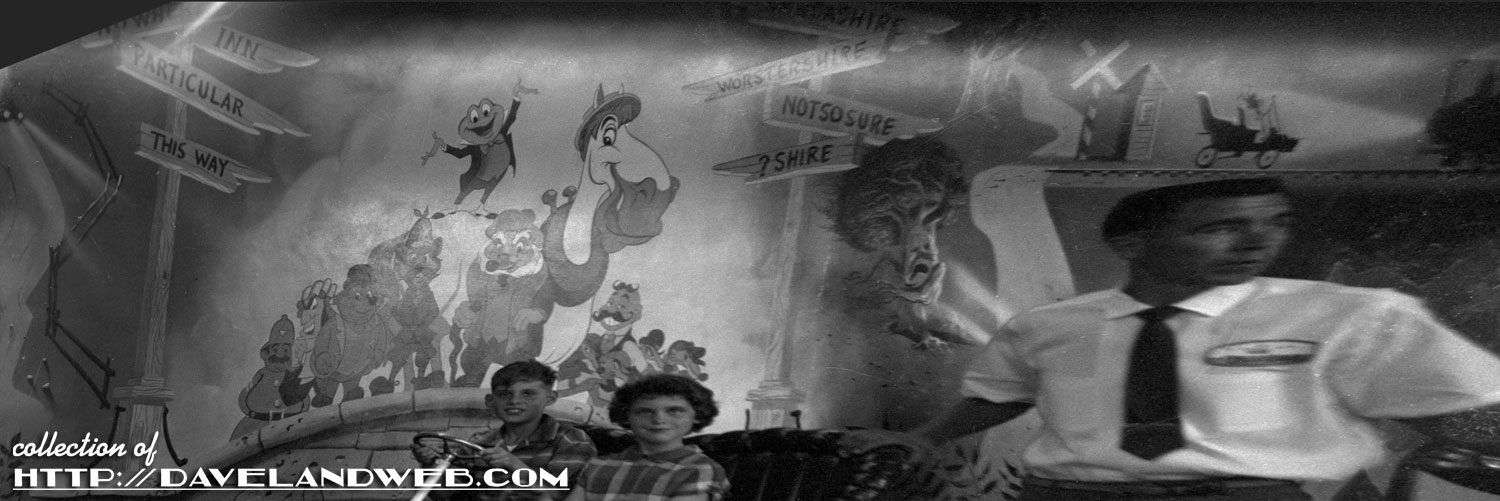
With a little Photoshop stretching and pulling, you can see a fair approximation of how the mural would look straight-on:

Follow my Daveland updates on Twitter. See more vintage & current Disneyland Mr. Toad photos at my regular website.

Amazing color for such old slides . . . or did you adjust them? It doesn't matter, they really capture the feeling of the time. Most people today are used to everything CLEAN. Back then, most everything was rather dirty and dusty. Especially places of family "entertainment". Streets were rather trashy, cars were seldom clean unless you did it yourself, and everywhere you went there were papers and cans and cigarette buts. Gag! Disney changed all that and set the standard which we seem to take for granted today.
ReplyDeleteLee - Those slides have their original color; they are really in great shape!
ReplyDeleteGorgeous! Love that first photo.
ReplyDelete