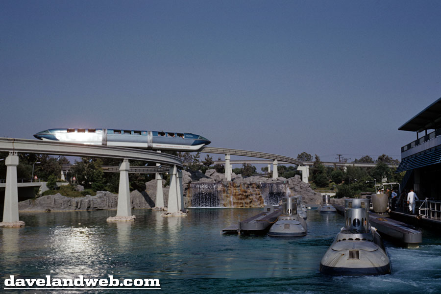
I'd like to pay tribute to the Blue Monorail. The Red Monorail is the one that gets all the publicity; the attraction poster, the ribbon cutting...what a show-off! However, in my personal opinion (which is what this blog is all about), I think the Blue Monorail is definitely the cooler of the two. Literally. It's ice blue color makes it look even sleeker as it makes the journey through Tomorrowland and the edges of Fantasyland. Don't you agree? (This is where you can nod your head "yes").
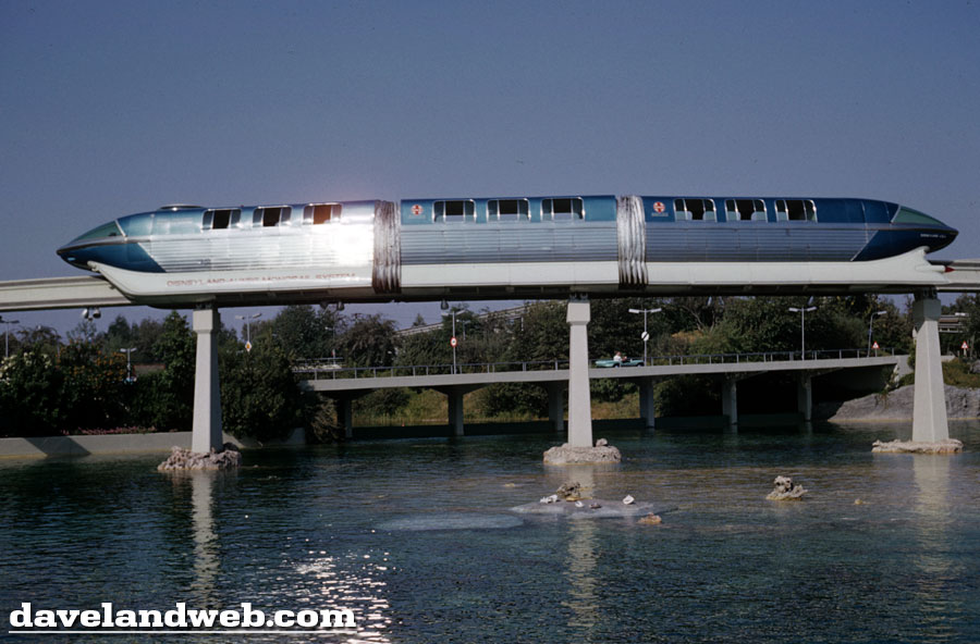
And pardon me while I repeat myself, but the Tomorrowland in these October 1960 photos is so full of energy. In one photo, you have The Skyway, The Monorail, and The Submarine Voyage, with The Matterhorn looming high in the background.
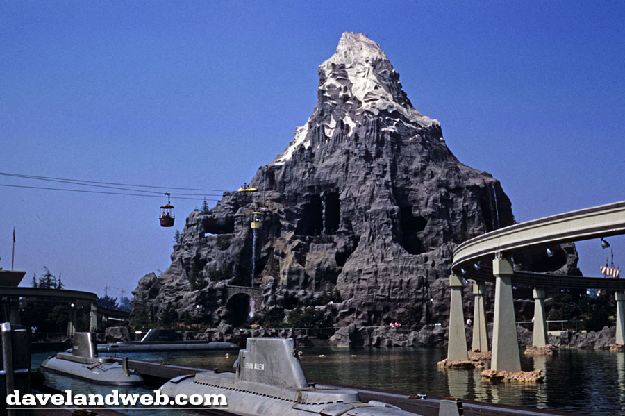
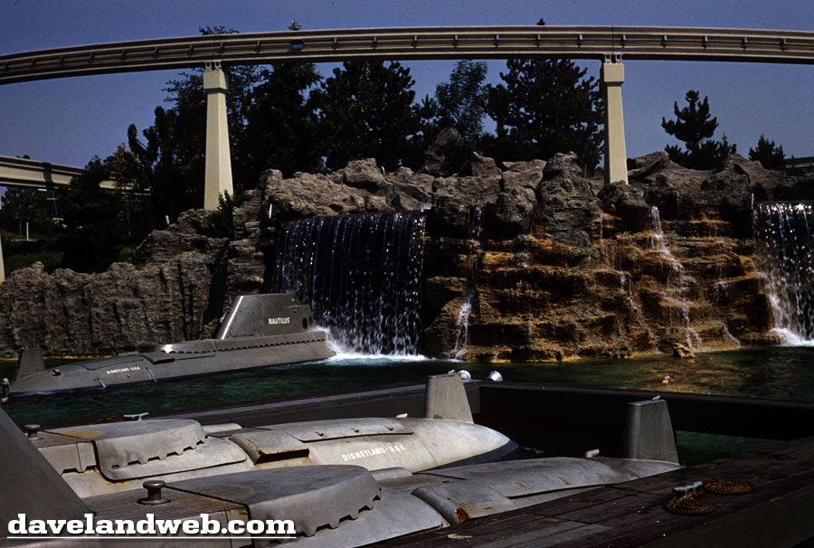
I am divided on the subs; although the gray color is definitely more authentic, the cheerfulness of the current yellow subs is a nice touch that catches your eye and doesn't make the ride seem so drab. Still...there's no division for me as to which version I prefer. The original was a fun blend of kitsch and adventure, whereas the current one just seems like a loud cacophony blaring while video images whiz by.
Enough of my opinions...it's time to leave Tomorrowland and head to other areas of the park, circa October 1960. Stay tuned!
See more vintage and contemporary Disneyland Tomorrowland photos at my main website.

The blue monorail definitely looks future-er.
ReplyDeleteNemo " a loud cacophony blaring while video images whiz by" could not have said it better myself.
ReplyDeleteMonorail blue with the sun reflecting off of it looks amazing!
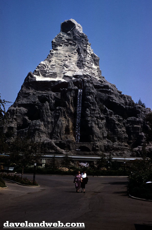
Nice Matterhorn shot with just two guests!
Looking forward to more of this series. THANKS!
Blue is the new pink :)
ReplyDeleteThat sheer icy blue speaks of speed and slices the air with a majesty all its own. The sleek silence bemoans nothing but excitement and promise and comfort for a better tomorrow.
ReplyDeleteWhile below the 'highway' reality has no greater calling than the starkness of GRAY. Somehow, they made me feel safe.
..Yet another beautiful set of pictures; thank you.
It's just that the red Monorail was the first one built! Plus I think that the red made more of an impace on the poster with the silver packground. The blue one is pretty cool too.
ReplyDeleteYay, I love Monorail Blue!! Even the current one!
ReplyDeleteI agree with MP that the red one would have more of a contrast, but people do love the blues.
ReplyDeleteNodding...yes!
ReplyDeleteGoing for the blue, sorry. It looks so good with the sky and water.
ReplyDeleteAgree with kinetic Tomorrowland. Disneyland has lost much of that sense of layered 3D motion and is frozen in place, along with the rest of the state.