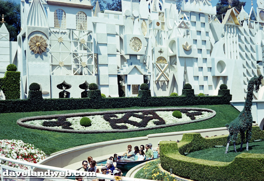
For all you small world fanatics, this posting will be the equivalent of a shot of heroin. For the rest of you...my deepest apologies. Enjoy this glimpse of "it's a small world" with this series of 16 photos presented in the order that they were taken back in August 1971.
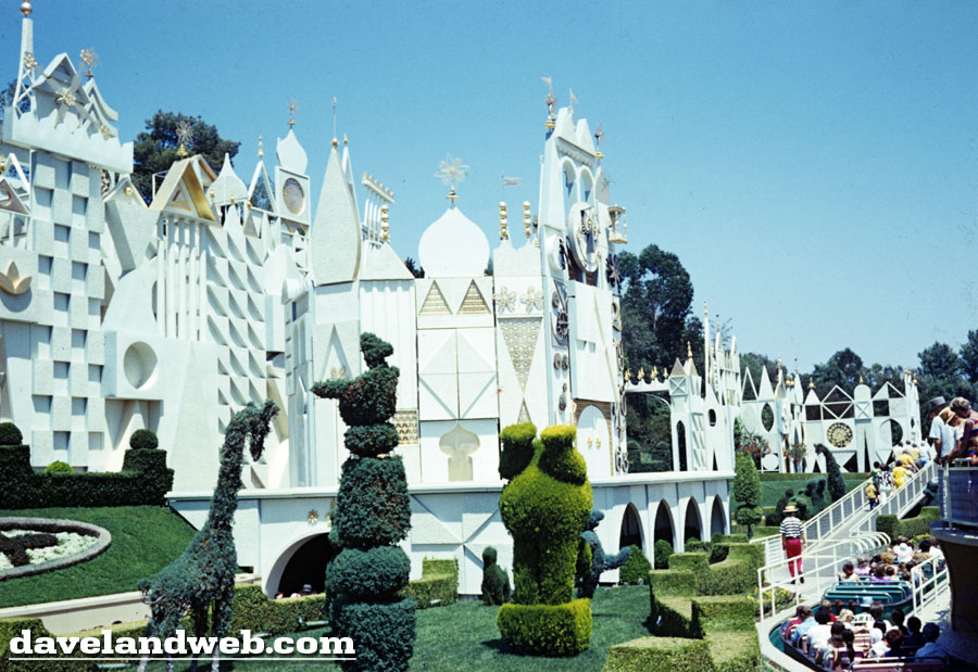
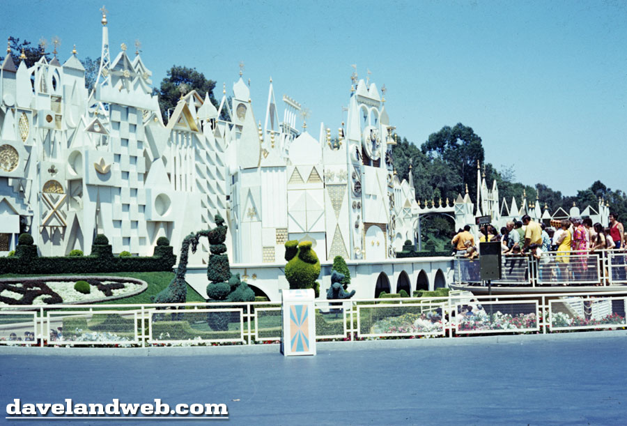
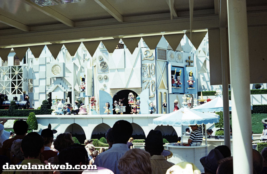
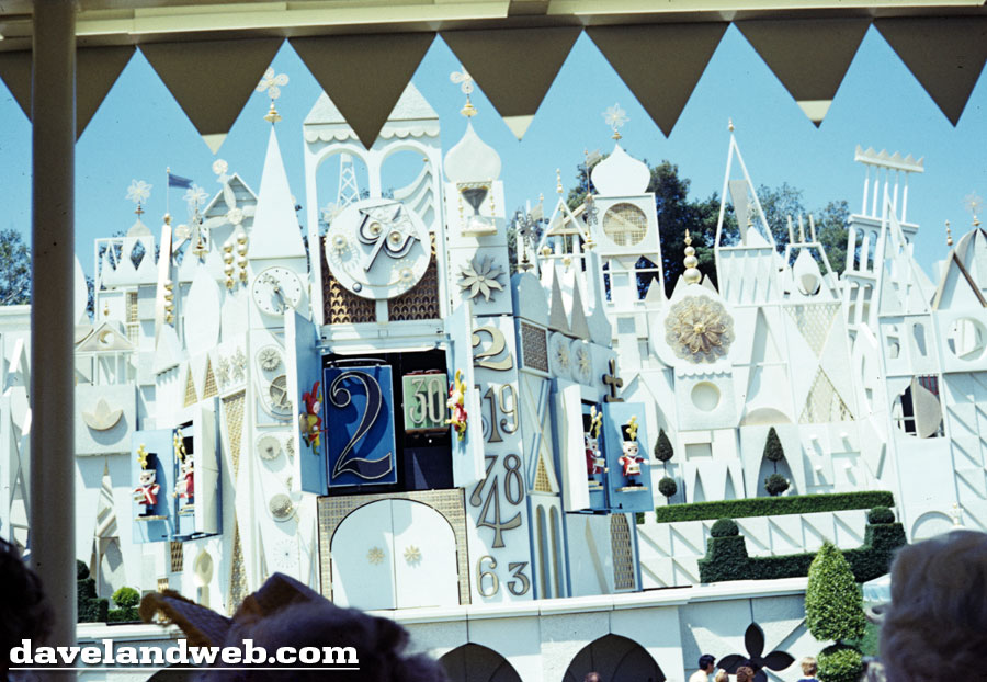
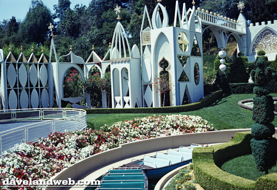
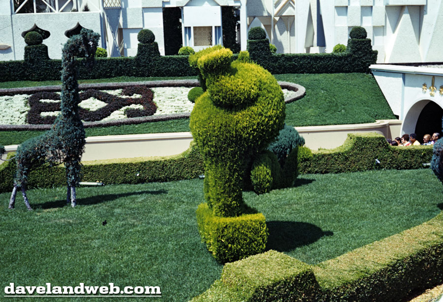
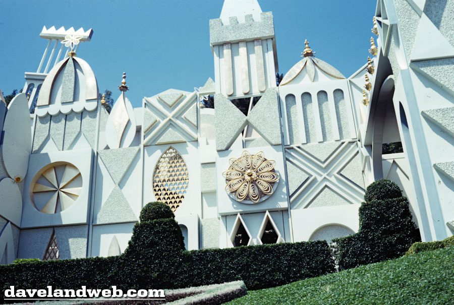
I'm not quite sure what happened...possibly the guest was so bowled over by the sites of this attraction, but for whatever reason, there is a large gap in the continuity of their documentation of this attraction.
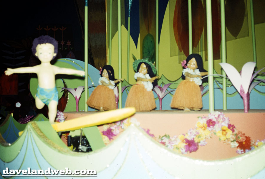
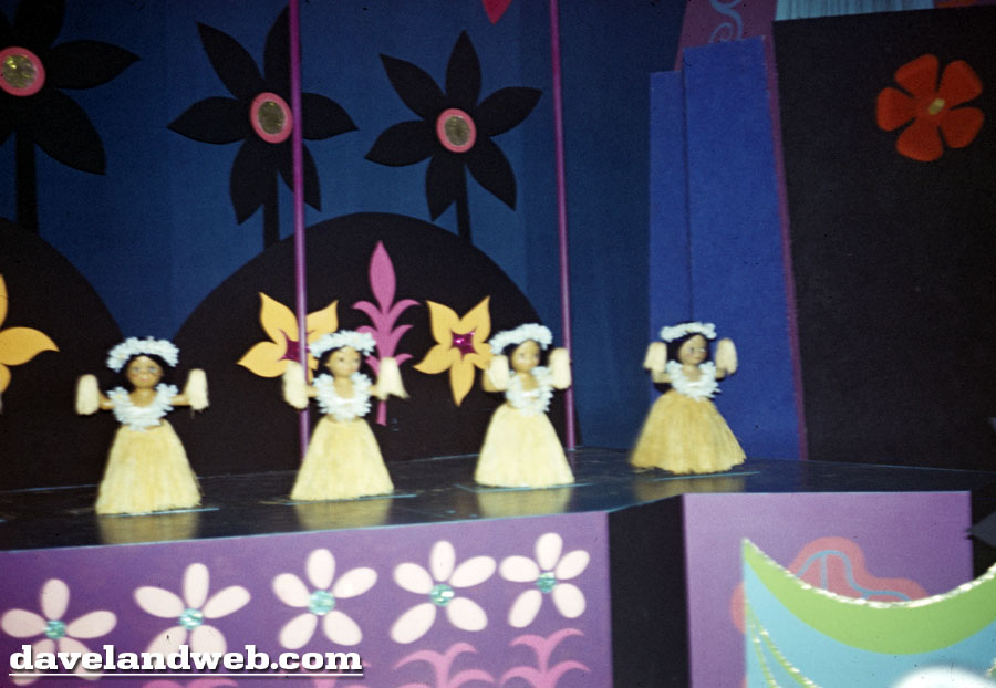
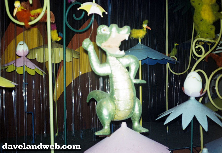
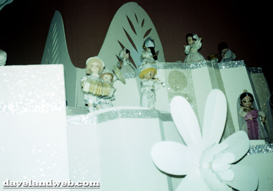
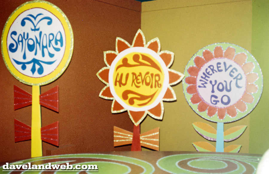
Based upon this shot, it would almost appear that the photographer was a glutton for punishment, returning to the attraction for a second pass-through:
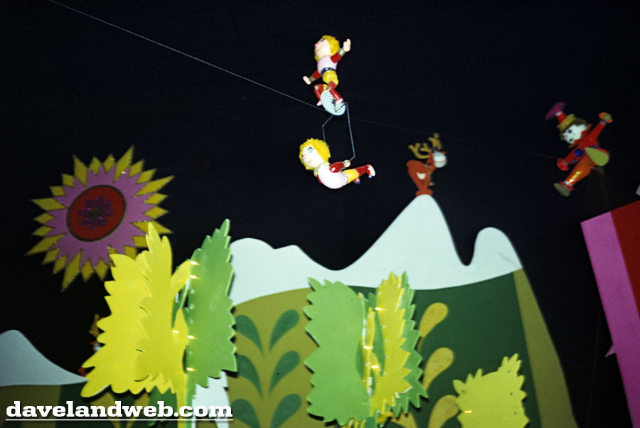
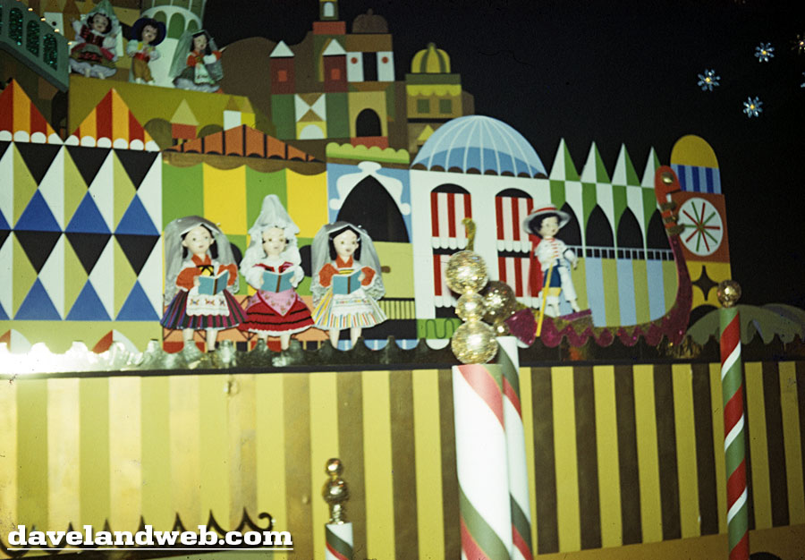
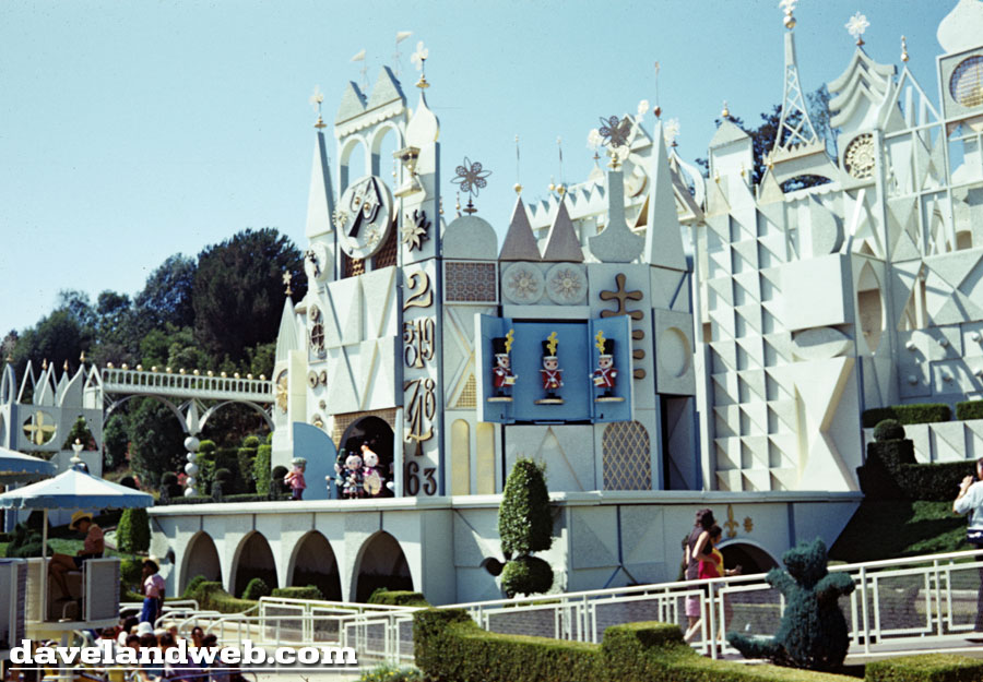
See more Disneyland it's a small world photos at my main website.

I'd don't think I could go thru it again just cause I missed a few shots!
ReplyDeleteThese are plenty vintage enough for me to enjoy them - thanks Dave!
That fourth pic is an unusual shot taken from the covered part of the old queue (the part that had the huge Bank of America sign attached to it). And I love the shot of the original "goodbye" signs!
ReplyDeleteBy the way, does anyone else remember what the rest of those exit signs said? After that one that reads, "Wherever you go", there were a few more and then the last one said something like "Bank of America is there for you!"
ReplyDeleteBoy oh boy, that person was all about IASW! I am one of the people who actually really likes the attraction, but seriously... 16 photos of it??
ReplyDeleteI always loved those B of A exit signs... They were faithfully done in the Mary Blair style, something that isn't currently being executed...
ReplyDeleteI was and am a big fan of the exterior look, especially the clock aspect, which made the pre-show wait more tolerable.
ReplyDeleteClassic Disney layering, with the train passing through, the curving overhead queue ramps and the bleach-smelling boat route underneath. And the topiary, a stroke of genius for landscaping.
The classic white and gold scheme is best, but we can tolerate changes back and forth over time, eventually the old look will come back.
The interior and relentless "earworm" music is, I think, less successful, since it goes on too long, but you can't argue with the sentiment.
Great post, thank you.
JG
I love this ride but I noticed that the dolls have been changing over the years. Can't they duplicate the originals?/
ReplyDeleteI do love the topiaries here and throughout the park.
ReplyDeleteI always thought that the ceiling in this attraction needed to be a wee bit less visible, though.
This had been in my head for five days now, thought I'd share - thanks Dave :-)
ReplyDeleteIt's a world of laughter,
a world of tears
It's a world of hopes,
and a world of fears
There's so much that we share,
That it's time we're aware,
It's a small world after all....