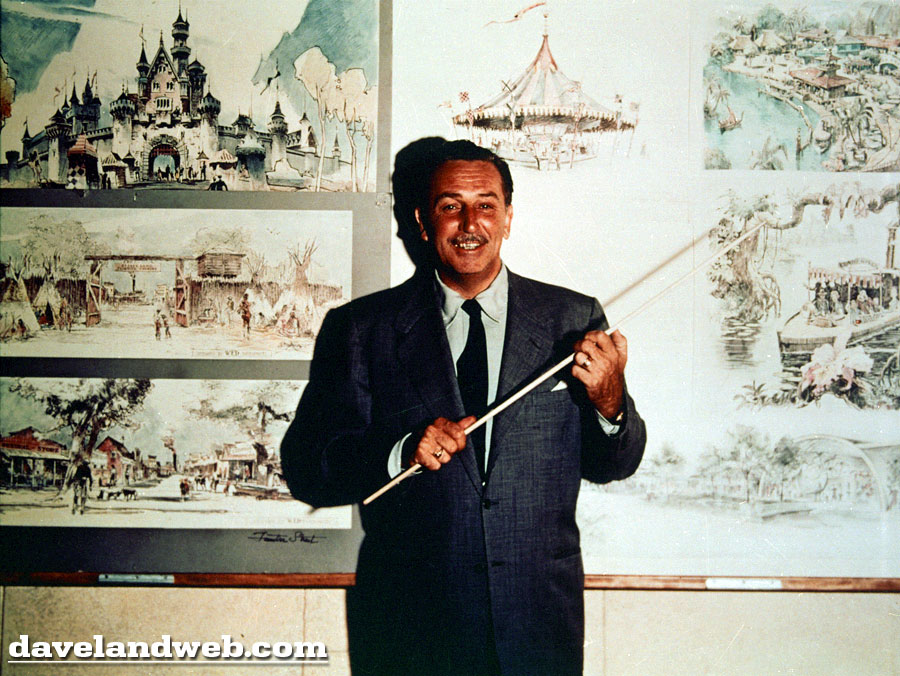
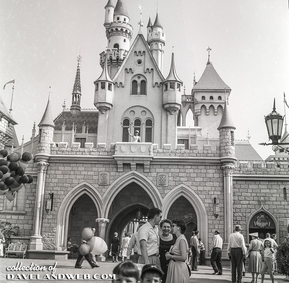
This first image kind of cracks me up. Walt has somewhat of a pasted on smile, holding a teacher’s pointing stick. You can almost hear Ben Stein’s “Bueller....Bueller...Bueller...”. Walt obviously wants to make sure everyone is paying attention before he describes the concept art located on the wall behind him. The Herb Ryman painting of the castle in the upper left hand corner shows the back of the castle, which was intially intended to be the front. Compare with this shot from 1957 and you’ll see what I mean.
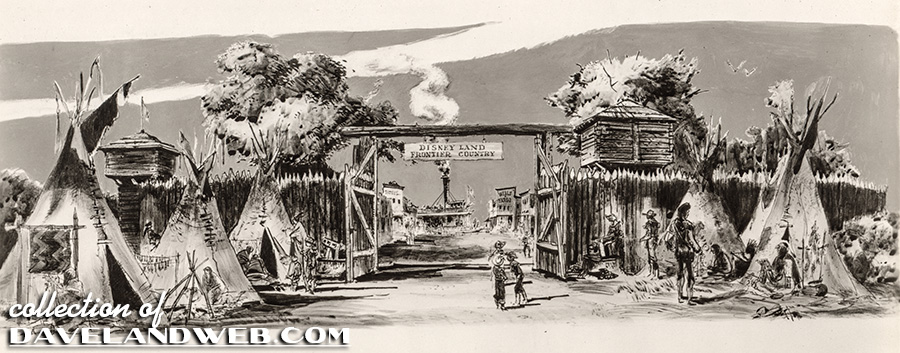
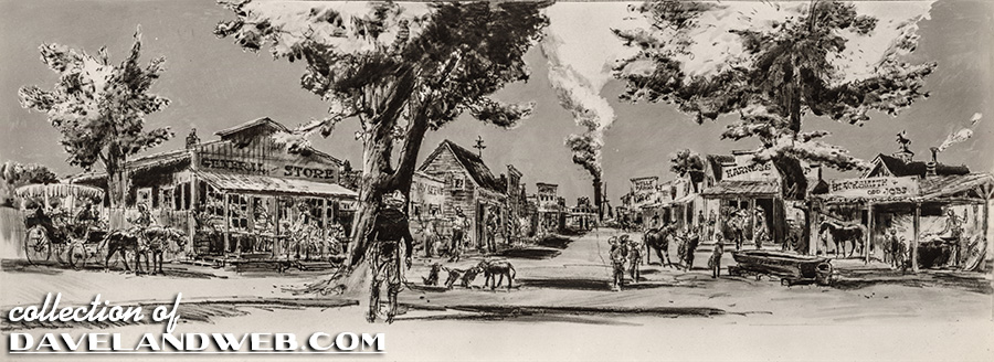
Although I don’t have color versions, I do have bw of the 2 Frontierland concept art pieces shown on the left of the first photo:
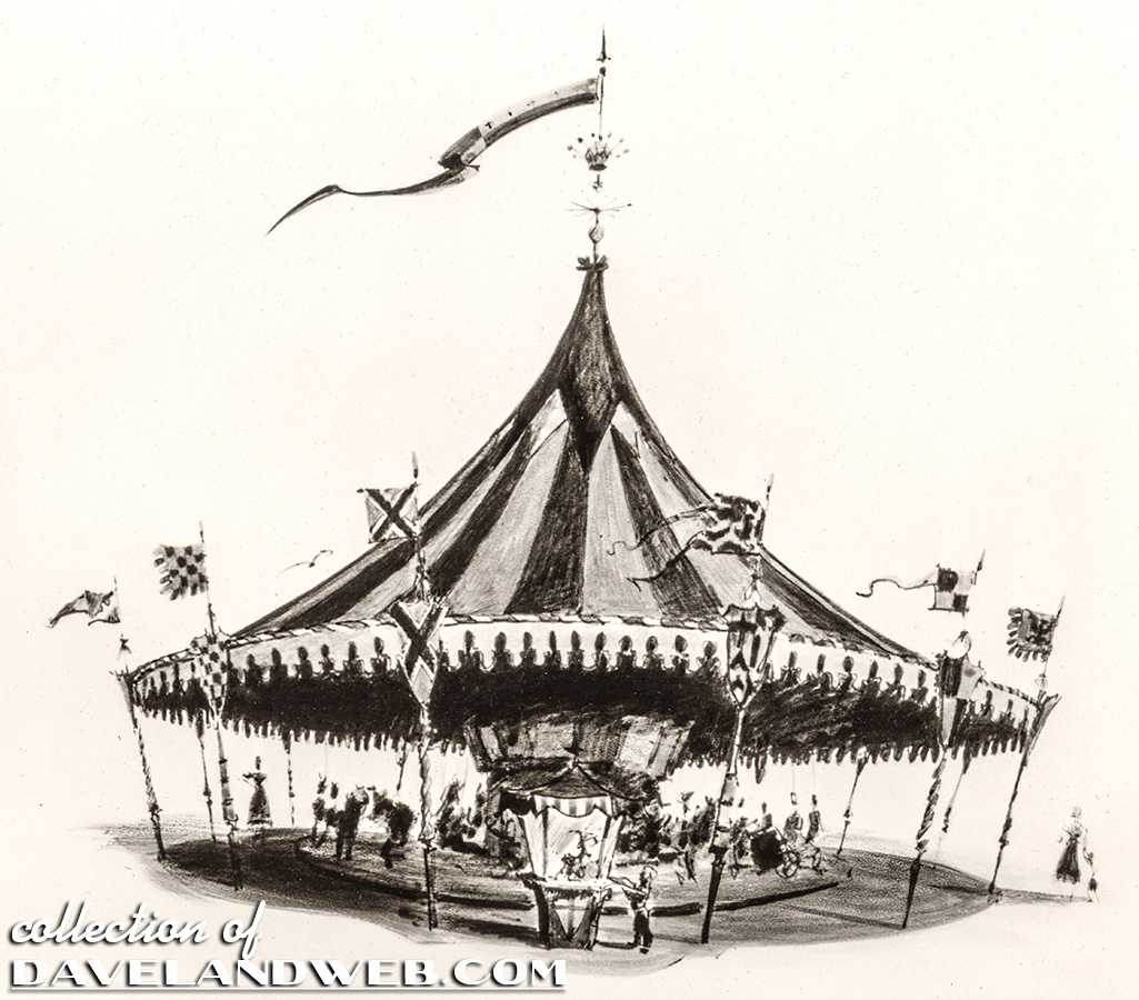
And here is the previously posted Carrousel concept art shown in the middle above Walt’s head:
So far, I do not have any of the JC concept stuff, so you’ll just have to be satisfied with the Tomorrowland art shown in the lower right-hand corner:
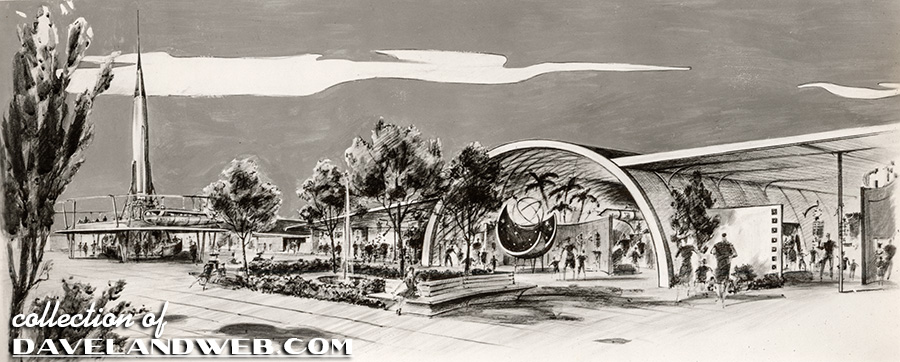
The Tomorrowland images are about the only ones that just really don’t match what was finally constructed, which makes sense since TLand was the last one to be built after the majority of the money spent had already gone to all of the other lands.
See more Disneyland photos at my website.

these are really good,,,, please, keep it up.
ReplyDeleteVery, very nice Dave. I really love the Tomorrowland concept art.
ReplyDeleteWonder why they put the lights on the floor in that first photo? Adds to the goofy feeling.
ReplyDeleteMeanwhile, Walt looks like he has been spending a lot of time outdoors!
I think everybody knows that the back of D-land's castle is the front of the "real" castle in Bavaria built by Mad King Ludwig. I think somewhere along the line, somebody thought the original Romanesque architecture was too grim, so the new "front" was given a hip roof and lots of trim from French Chateaux. An excellent adjustment to the original concept.
ReplyDeleteThe Tomorrowland sketch is interesting. First the amphitheater building looks WAY too much like the old "White Front" stores**. (They were the K-marts of the early 60s).
Second, you'll notice that the rocket ride is elevated on a platform above ground level. Shades of 1967?
----
**Photo Ref:
http://4.bp.blogspot.com/_Ei2Ik5quiI0/Rtx_FSSINJI/AAAAAAAAALY/Ekk50QCEZ2M/s400/white+front+68.jpg
I thought that was a monorail platform that was elevated in the distance.
ReplyDeleteNice work Dave, i'm really enjoying these posts.
ReplyDeleteKatella, I'm getting scared that we're thinking too much alike, the very first thing I thought was "White Front" for the Tomorrowland art!