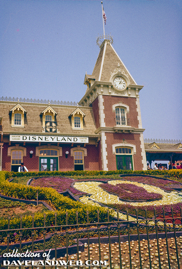
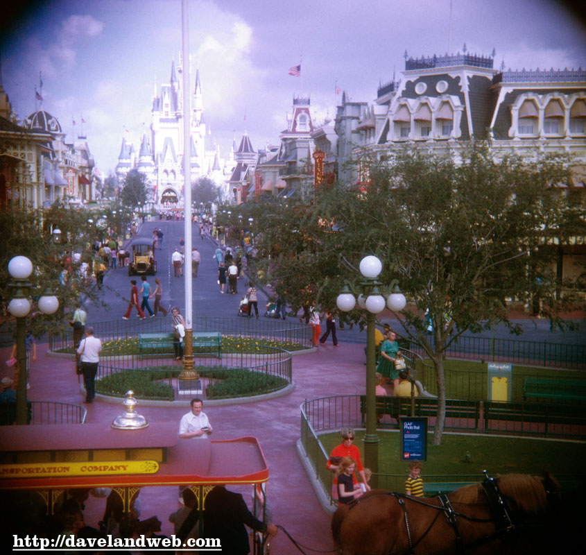
Thought I’d start today’s series off with a little "before and after" restoration comparison. I love the Main Street Train Station; what an awesome building to first see when you go through the gates. The scale and style of buildings at Disneyland’s Main Street really gives you a feel of an old-fashioned midwest Main Street. Personally, I think that the WDW version fails to capture this intimate feel, as it is too large and too overdone. You can definitely see the 1970’s influence in the design of their Main Street:
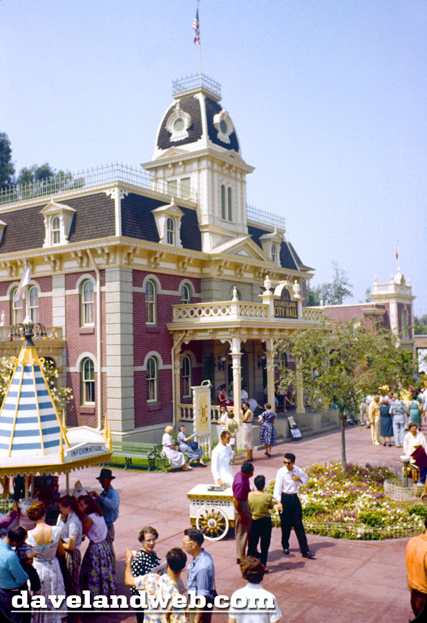
Back to business at hand, which is August 1956, and this Town Square City Hall shot makes me hungry for ice cream. Anybody got a nickel?
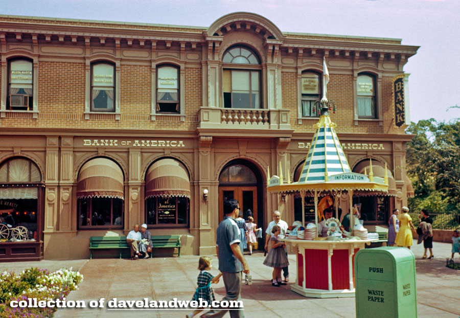
Over by the Bank of America, hat sales seem a little slow today:
Here’s an overview shot of Town Square, with the Moonliner peaking out from the background:
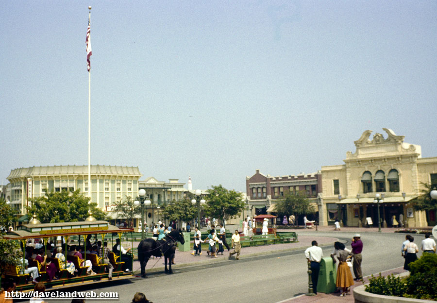
See more vintage & current Main Street photos at my website.

All great photos! I especially like the picture of the Bank of America... you can really see that the upstairs was being used as offices at this point. It must have been warm, most of the windows are open, and one has an air conditioner mounted in it.
ReplyDeleteGreat post, I noticed that window A/C unit too!!! The bank looks super in that photo! The picture of the Florida main street looks funky, it’s not helping me get excited about going there, maybe its better now??
ReplyDeleteLove the shot of the bank building!
ReplyDeleteVDL,
Main St in Florida is bigger, but so is the Castle and everything else!
Both have their own charm, but DL's is still a classic.