Over at the Mice Chat boards, there has been some discussion over the color of the Sleeping Beauty Castle. What began as an innocent question:
"What year did they color the stone on Sleeping Beauty's castle?"
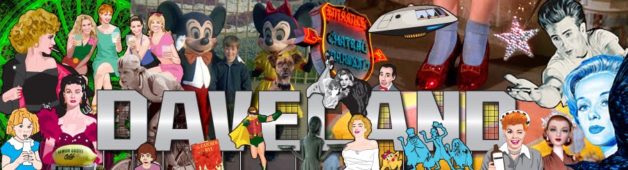
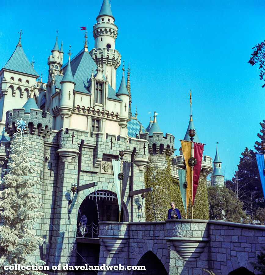
quickly descended into a heated debate over which shade of pink guests preferred. Frankly, I typically am bored with photos of the castle since there are such an abundance of them, and usually gloss over them when I am posting. Today though, I have decided to do a chronological scrapbook showing the evolution of The Sleeping Beauty Castle. For those who want to use my photos as concrete evidence of what shade of pink the castle is or used to be, BEWARE!! With any photo, due to fading, time of day/lighting, the photographer's personal preferences on camera settings or developing, it is fairly accurate to say that color is probably one of the most subjective things you could come up with. Instead, just sit back in your chair, relax, and enjoy my mini photo history. My first shot is from July 18, 1955; also known as Opening Day for the regular folk who were first allowed into the park.
Next up is this 1959 image:
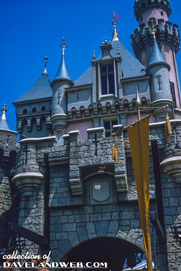
July 1960:
December 1965, when the park was officially ten years old, aka The Tencenniel:
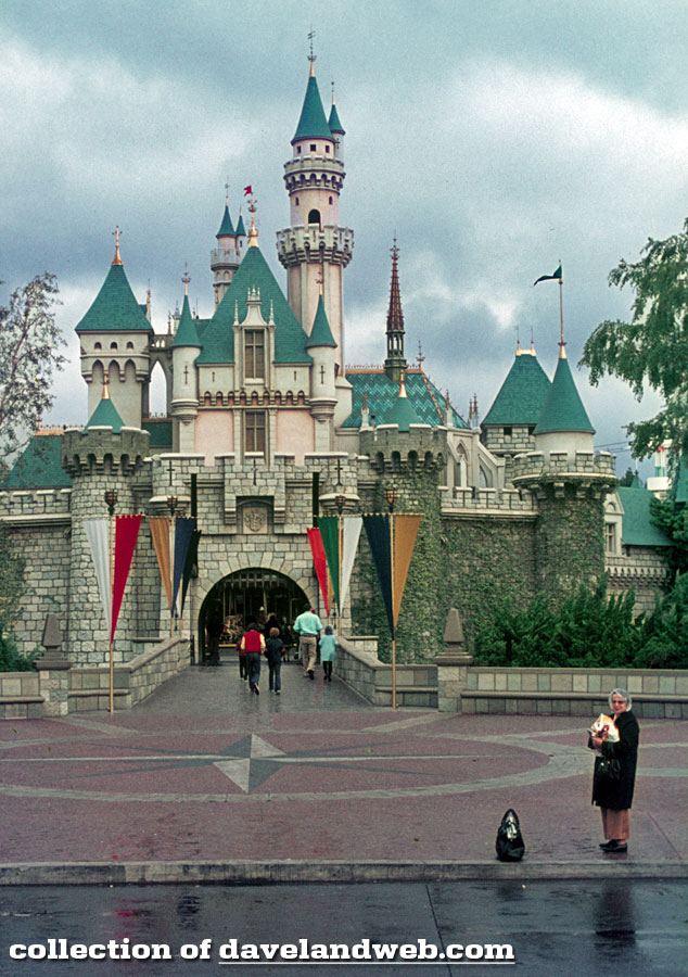
From the decade of polyester comes this rainy day March 1974 shot:
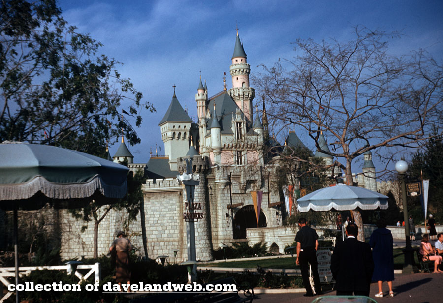
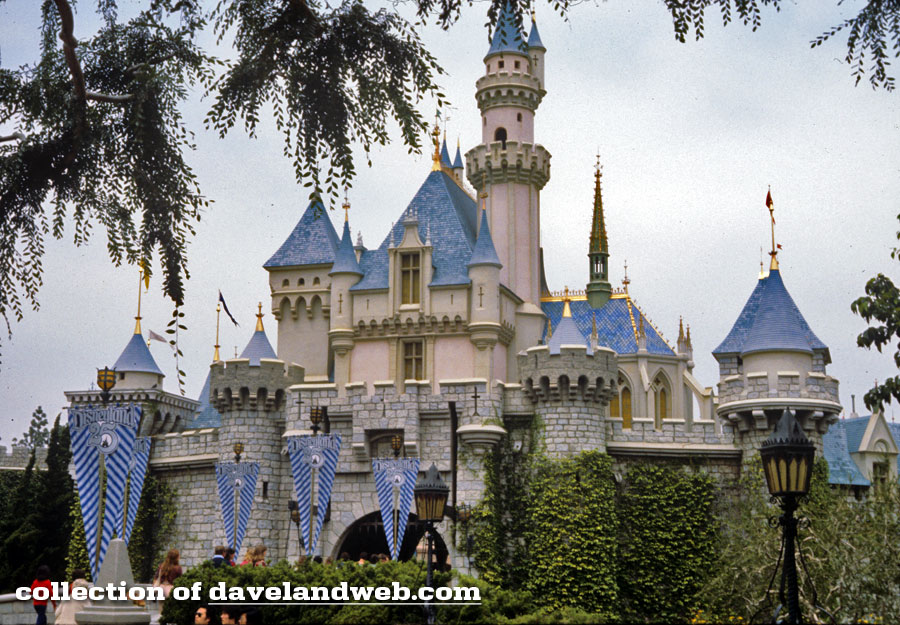
April 10, 1980, when the 25th Anniversary banners were out:
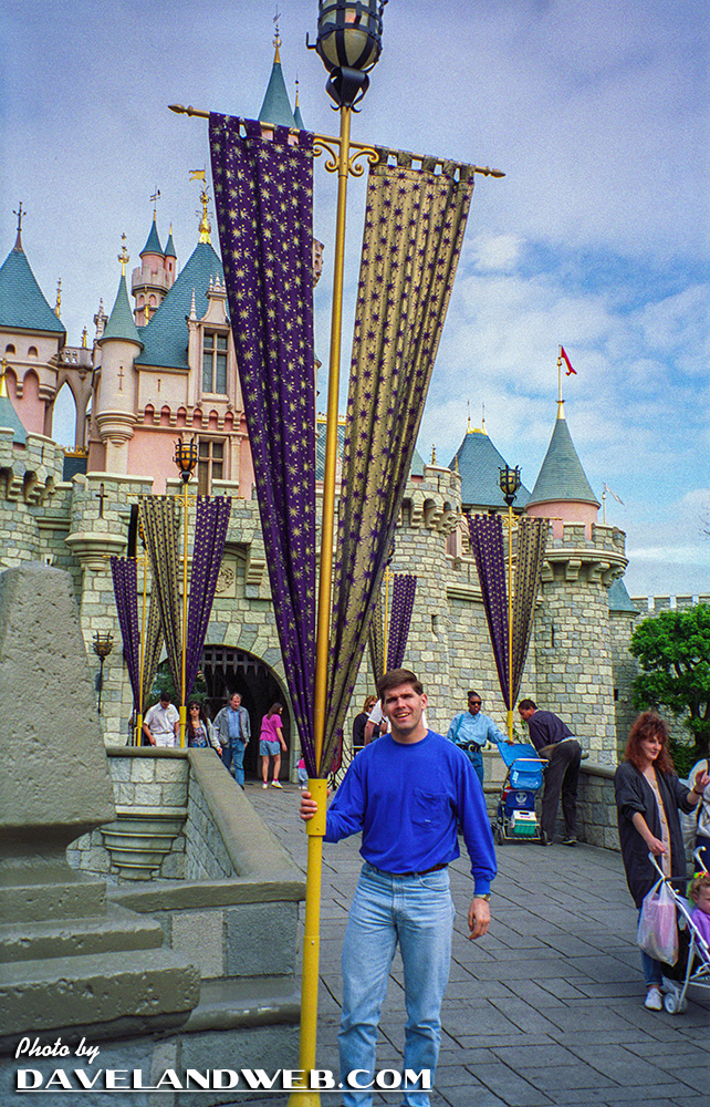
This one came from the second 35mm camera that I owned back in May 1993:
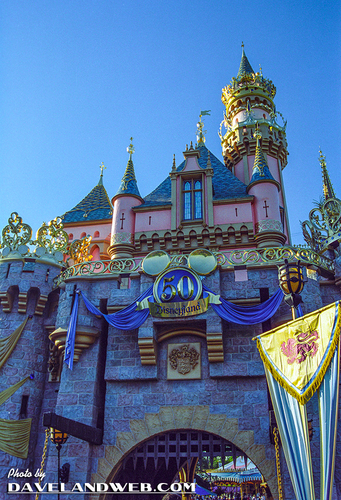
This is probably one of the most controversial photos for today's post, as it features the 50th Anniversary new color scheme and bling. The pink of the castle became more of a salmon color.
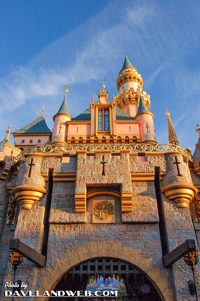
Showing what a difference time of day can make, here's a later afternoon shot from October 2006:
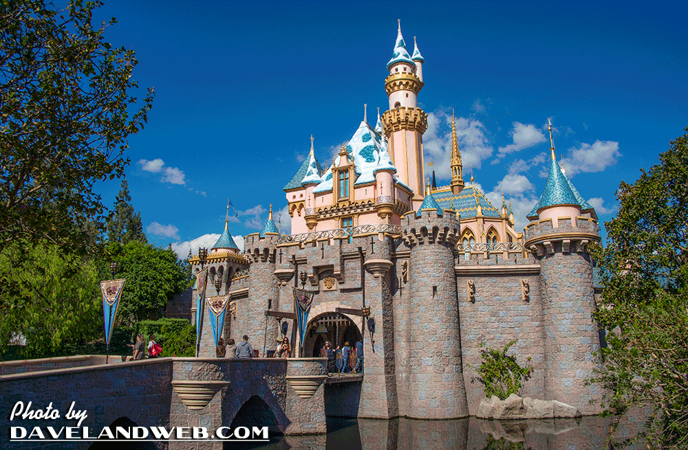
And for my last daytime shot, a genuine FauxD© image from October 2012:
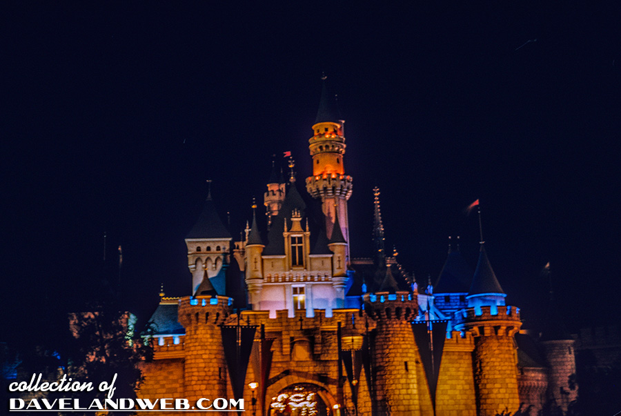
One thing that few would debate is that the castle looks most magical at night, whether it's April 1958:
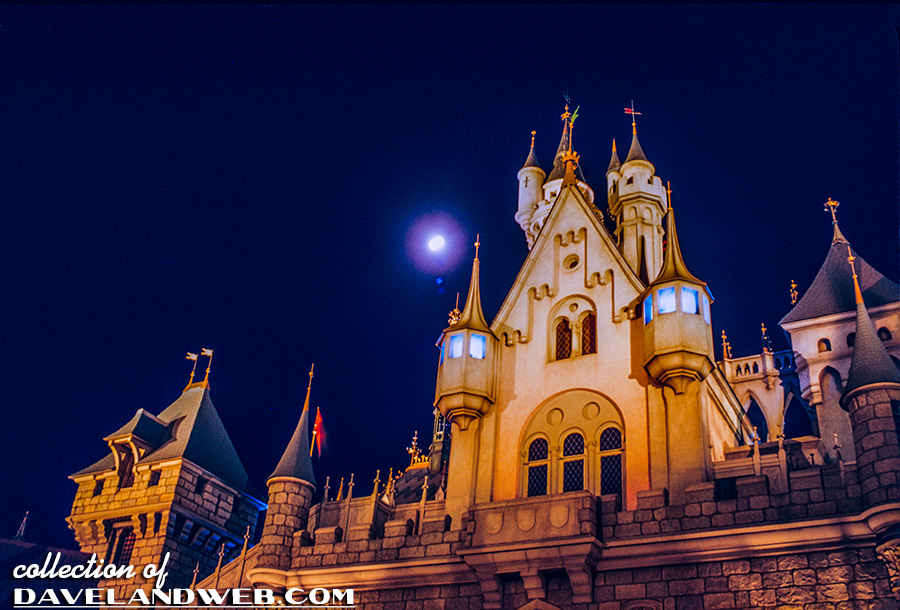
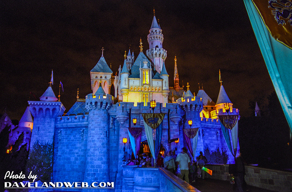
or 2004:
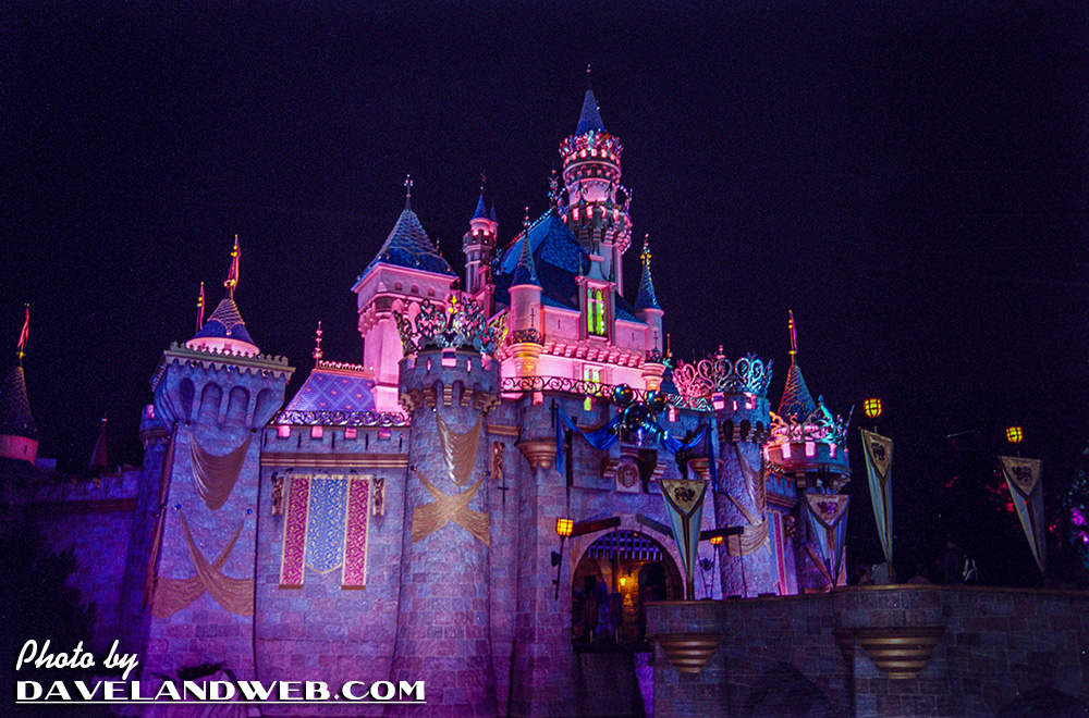
even 2005 when the 50th decor is still out:
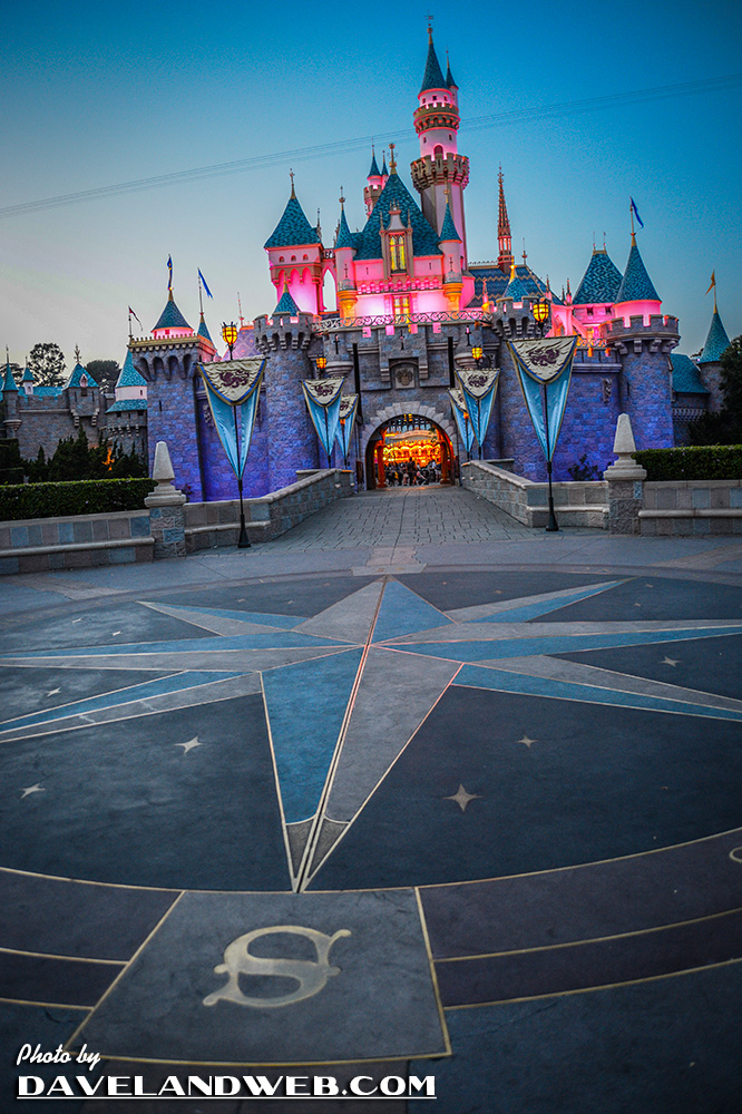
Or during present day:
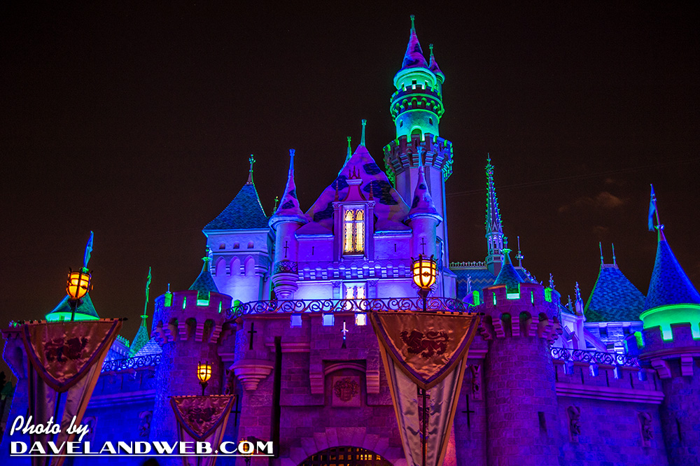
Besides a brighter pink and a more saturated pallette, another change that I don't hear too much about is the amount of glitter and gloss that is in the paint these days, giving the castle more of a sheen. As the main symbol of Disneyland, you can bet that people will have strong opinions about how the castle appears for many years to come.
See more vintage and current Disneyland Sleeping Beauty Castle photos on my Castle photo web pages.
4 comments:
As long as they don't paint it lime green, I'm pretty happy with any slight variation on the color scheme.
That front night shot from 1958 sets off the opening notes of The Wonderful World of Color theme (not the DCA show) in my head!
As far as I can tell in photos, the castle was gray and blue back in the early days. I don't mind a subtle touch of pink, but the salmon color is a bit much.
Perfect timing for this post! I am working on a sculpture that is based on the Castle and want to get the most current color scheme. I haven't been to DLand in a while and my photos are all the salmon pink color. Definitely like the lighter pink :) Course why a castle HAS to be pink is beyond me!
Post a Comment